35 Pet Peeves Interior Designers Have About Your Home

What you see when you walk into your home: a great place to get work done, hang out with friends, or rest your head at the end of the day. What an interior designer sees when they walk into your home: pictures hung wrong, furniture placed weirdly, and rugs so enraging they can hardly give them a second glance. To a trained eye, many of the design choices you’re making in your home are just flat-out wrong—but that doesn’t mean they’re unfixable. With the help of top interior design professionals, we’ve rounded up the biggest interior design mistakes you need to stop making immediately. And if you want to make your home more stylish, check out these 50 Elegant Home Design Ideas From Interior Design Experts.
1
Overly Bright Lighting
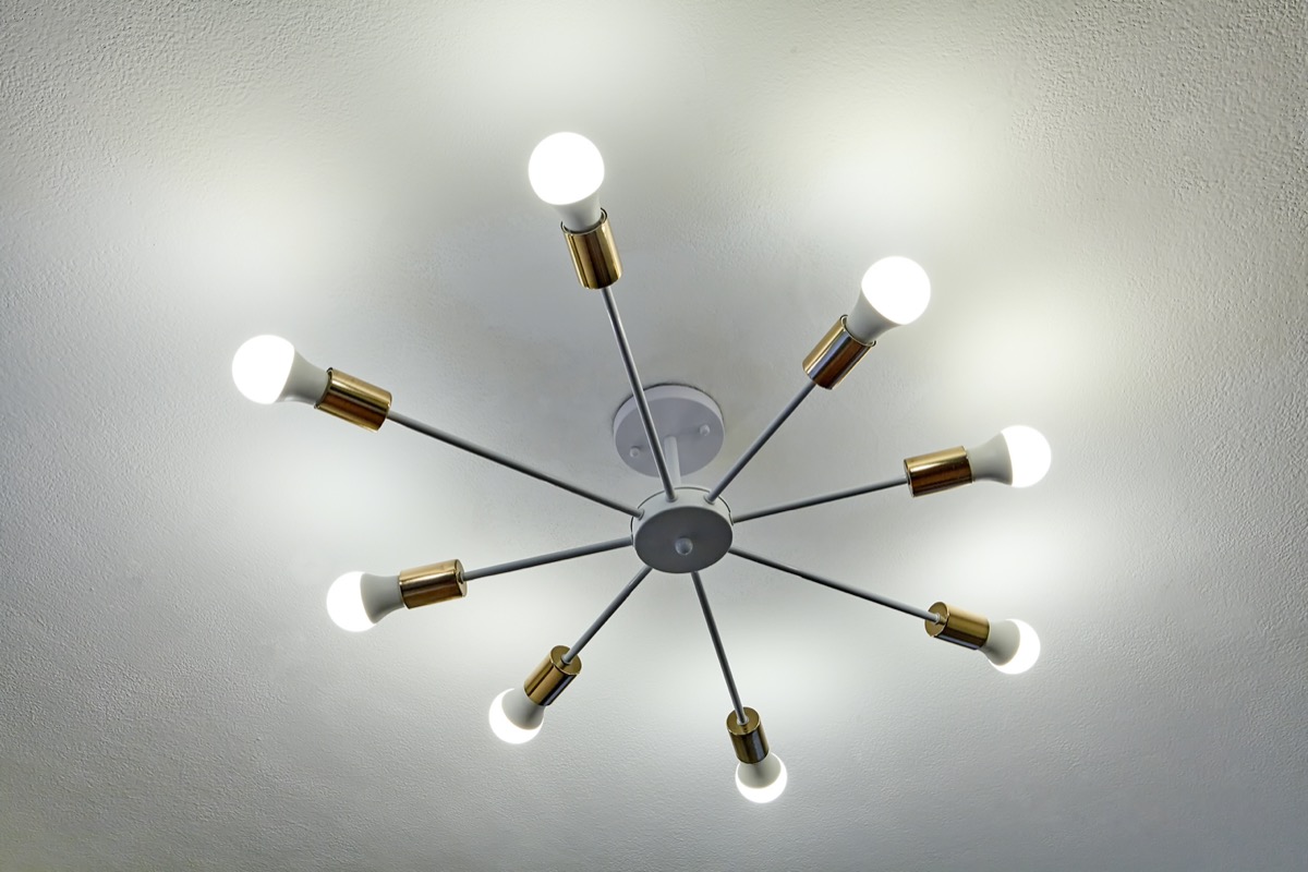
Those painfully bright overhead lights are doing your home no favors in terms of aesthetics.
“Bright and bad lighting can pull a room—and your mood—down,” says Christina Simon, a senior designer with Mark Ashby Design. If you want to strike the right tone, Simon recommends using low-voltage bulbs and adding lamps instead of relying solely on overhead fixtures. And if you want to refresh your space, check out these 40 Super Fun Ways to Decorate Your House This Fall.
2
Can Lighting
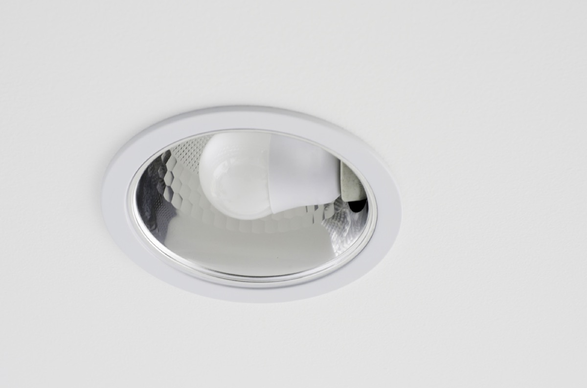
“If I had my way, I would eliminate can lighting all together,” says interior designer Alexis Garrett, who has her own San Diego-based boutique firm.
However, if you’re stuck with recessed lights for the time being, adding in pendant lighting, as well as incorporating some table or floor lamps, can soften the look.
3
Using the Wrong Bulbs
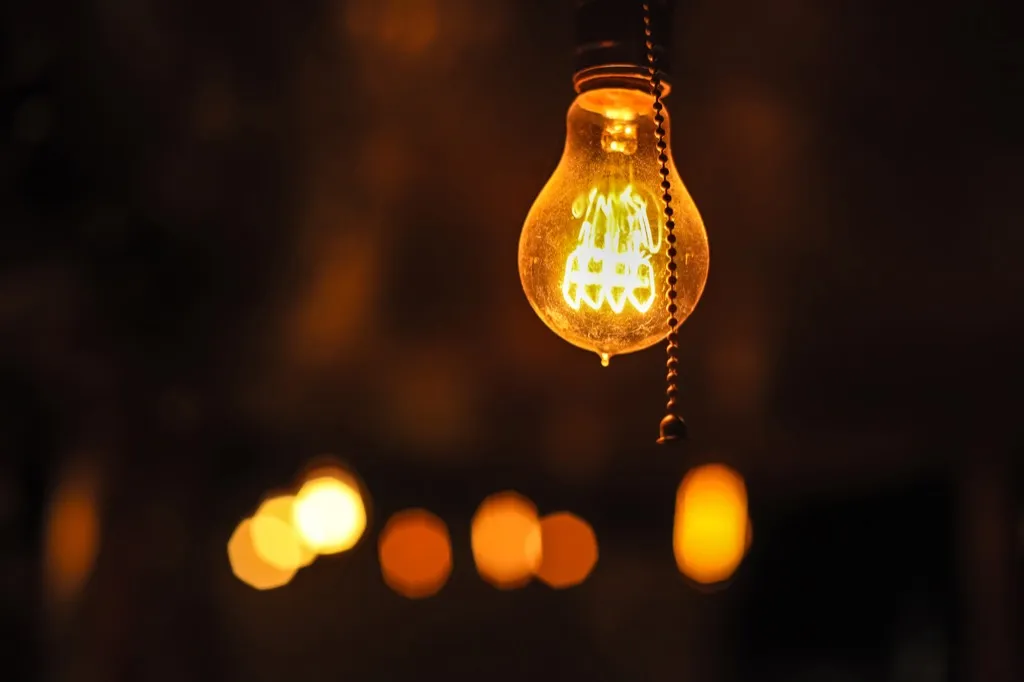
Don’t go out and grab any bulb off the shelf at your local Home Depot. “Bulbs matter!” says Kathryn Nelson, principal and interior designer with Kathryn Nelson Design of Dallas, Texas.
Nelson notes that, while trends like Edison bulbs can be fun, filling a space with them makes it hard to see. On the other hand, 5,000 Kelvin blue-toned lights, while appropriate for hospitals, give off an overly sterile vibe in home environments. Find the right balance for your home and stock up. And if you’re ready to transform your home, check out The One Easy Home Upgrade Interior Designers Recommend for Fall.
4
Monochromatic Living Rooms
You may think that painting your living room taupe and buying furniture and accessories to coordinate makes your space look cohesive, but in reality, you’re making it look drab.
“Doing so gives the room no interest or focal point,” explains interior designer and home stager Susan Young, owner of Color Joy Interiors LLC.
To help brighten up your space without going overboard, “Add accent colors throughout the room with throw pillows, accessories, area rugs, curtains, or other items,” she suggests. And for more great information delivered to your inbox, sign up for our daily newsletter.
5
Gray Walls
While gray was once the go-to neutral for everything from paint to furniture, it’s become so ubiquitous that decorators are turning their backs on the trend. “Every house you go into looks alike after the realtors have encouraged sellers to paint the interior (and sometimes the exterior) gray and white,” says interior designer Leslie Saul of Leslie Saul & Associates. “Cookie cutter minimalist gray interiors have no soul.”
6
Over-the-Top Minimalism
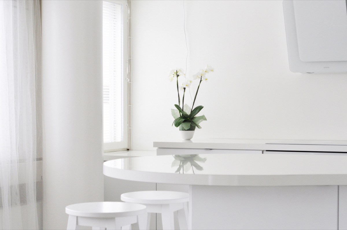
While you might want to keep your home looking clean and serene by forgoing bright colors, doing so can actually lead to something worse. “It’s nauseating when everything starts to look the same,” says interior designer Danielle Relyea of Mill Road Design in Rhinebeck, New York. “A lack of patterns and colors makes everything feel super vanilla.”
7
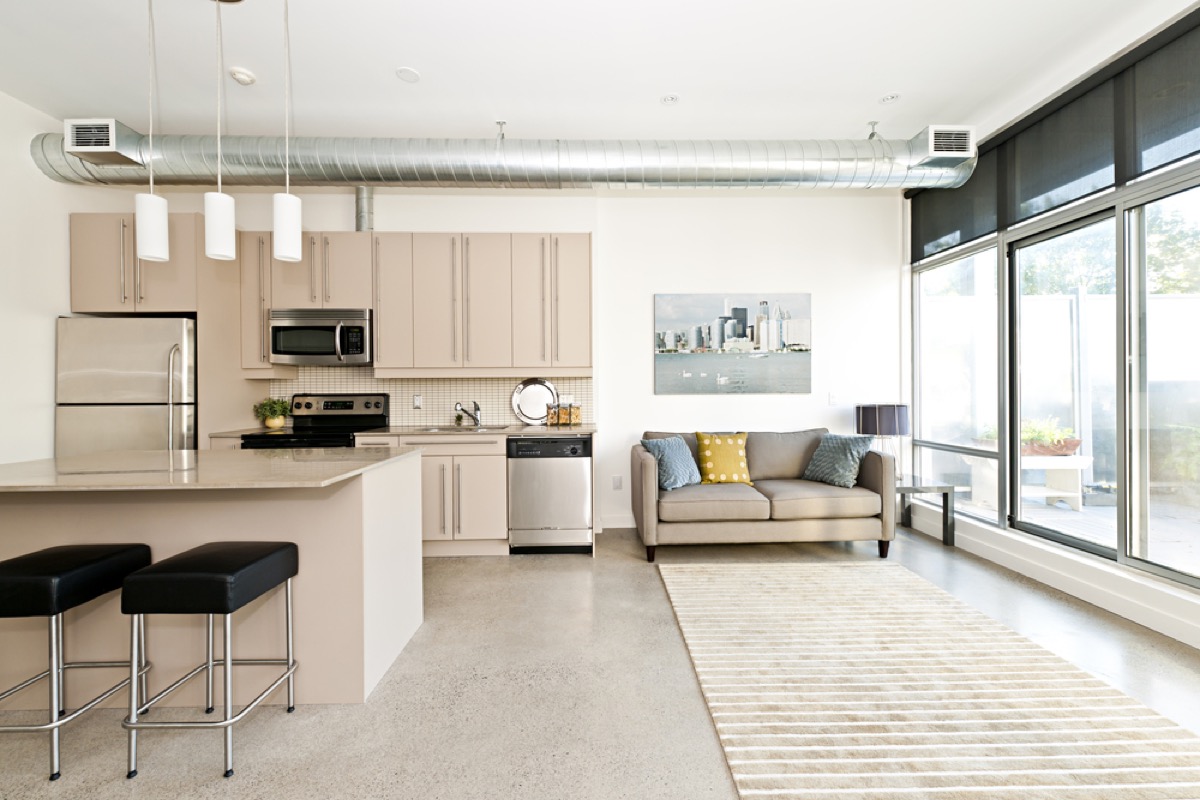
Sterile Kitchens
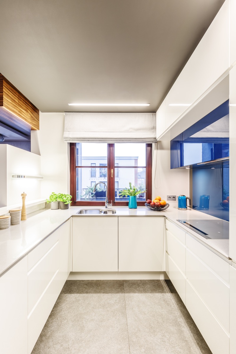
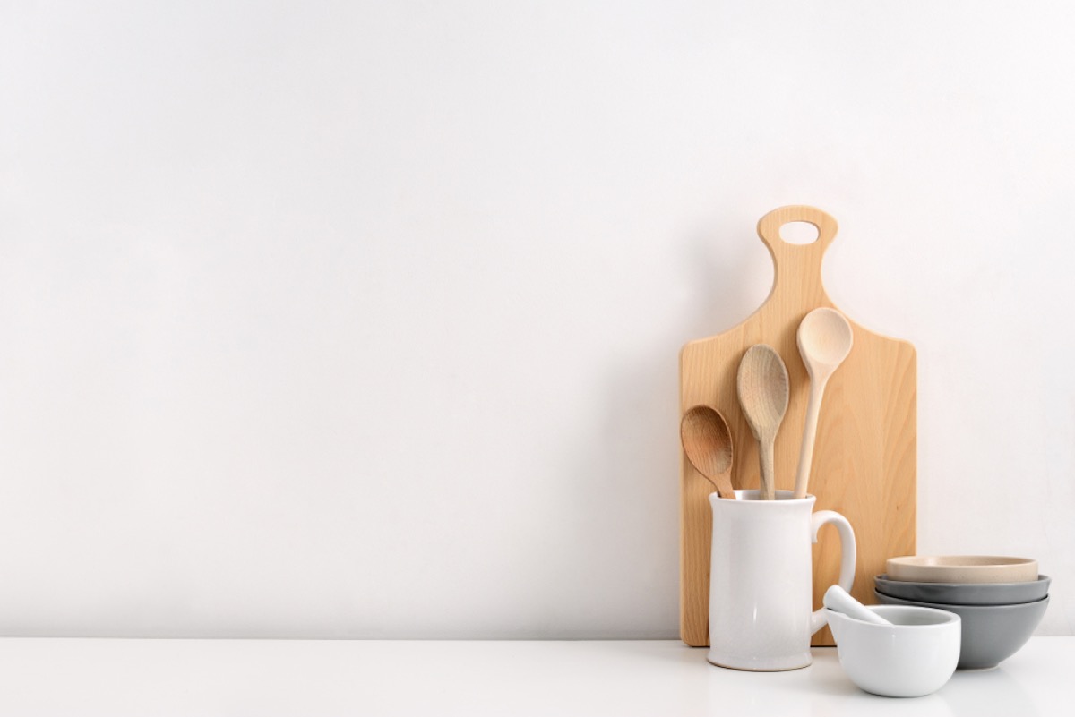
That all-white kitchen may look great to you, but don’t assume it gets the seal of approval from professional decorators. “I have a hard time looking at white cabinetry, white countertops, and white backsplash paired with generic chrome lighting,” says interior designer Julia Longchamps, who’s based in Kent Island, Maryland. “Yes, it looks clean, but reads flat and lifeless.”
Her suggestion? Add gold or polished nickel hardware or oversized rattan pendants to inject some visual intrigue and warmth into the space.
8
Floating Shelves
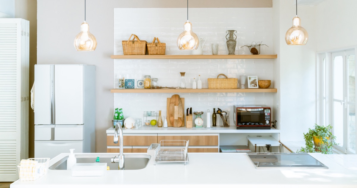
If you have floating shelves in place of upper cabinetry in your kitchen, don’t be surprised if it looks seriously dated in just a few years. “This is a bona fide fad,” says interior designer David Schneider of Pure Home Design in St. Louis, Missouri.“This is not how most people live and will result in partial remodeling of thousands of kitchens over the next 10 or so years.”
Schneider’s main issue with this trend is that if you’re not fastidious about your cleanliness or organization, these shelves become a major source of visible clutter. “People live in their kitchens,” he says. “Most of us need to have a place to put all of our kitchenware, cookware, dishes, and serving pieces away.”
9
Multicolored Glass Backsplashes
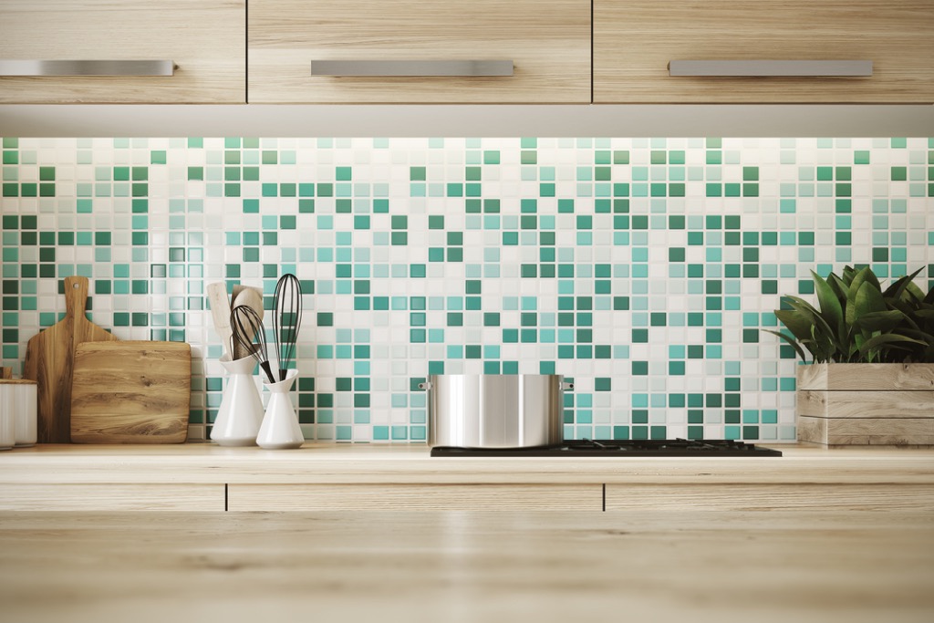
While you might think a multicolored tile backsplash would brighten up your space, it’s usually just a busy mess when installed. “What looks good on a small sample can be horrific on a larger scale,” says Saul.
And since backsplashes are supposed to keep kitchens cleaner, they also don’t serve their purpose very well. “All that grout means they are harder to clean,” Saul explains.
10
No Backsplashes
However, that doesn’t mean forgoing a backsplash altogether is any better. “A pet peeve I have is kitchens with no backsplash,” says designer Belyne Louis-Jacques of Jacques Home Design in New York City. “I think backsplashes in the kitchen are as important as the cabinet knobs and countertops.”
11
Subway Tile
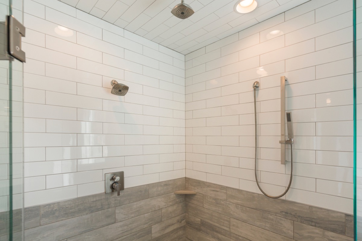
Subway tile may have once been a unique addition to bathrooms, but it’s become so common that interior designers are quickly tiring of the trend.
“Subway tile is completely overdone at this point and I am hoping we will see less and less of it,” says Joe Murphy, an interior design specialist at The Shower Head Store in Cheyenne, Wyoming. “There are so many other interesting, unique, and beautiful tile options available!”
12
Carpeted Bathrooms
While few people like the feeling of a cold floor under their feet, carpeting your bathroom isn’t the solution. “I totally understand that you want luxury on your feet, but adding carpet to a bathroom is never a good idea,” says interior designer Mark Cutler, principal designer at Los Angeles-based design firm Mark Cutler Design, Inc. “If you want luxury, put in a heated floor and call it a day.”
13
Brass Fixtures
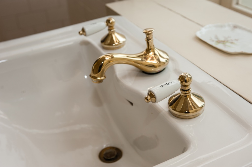
While gold-toned hardware has had a recent resurgence, designers still cite brass fixtures as a major no-no. “The brass train has left the station,” says Cutler. “It no longer signals boho chic or Hollywood glamor or even ’80s retro—it now just looks a little like you embraced a fad and are left holding the bag.”
14
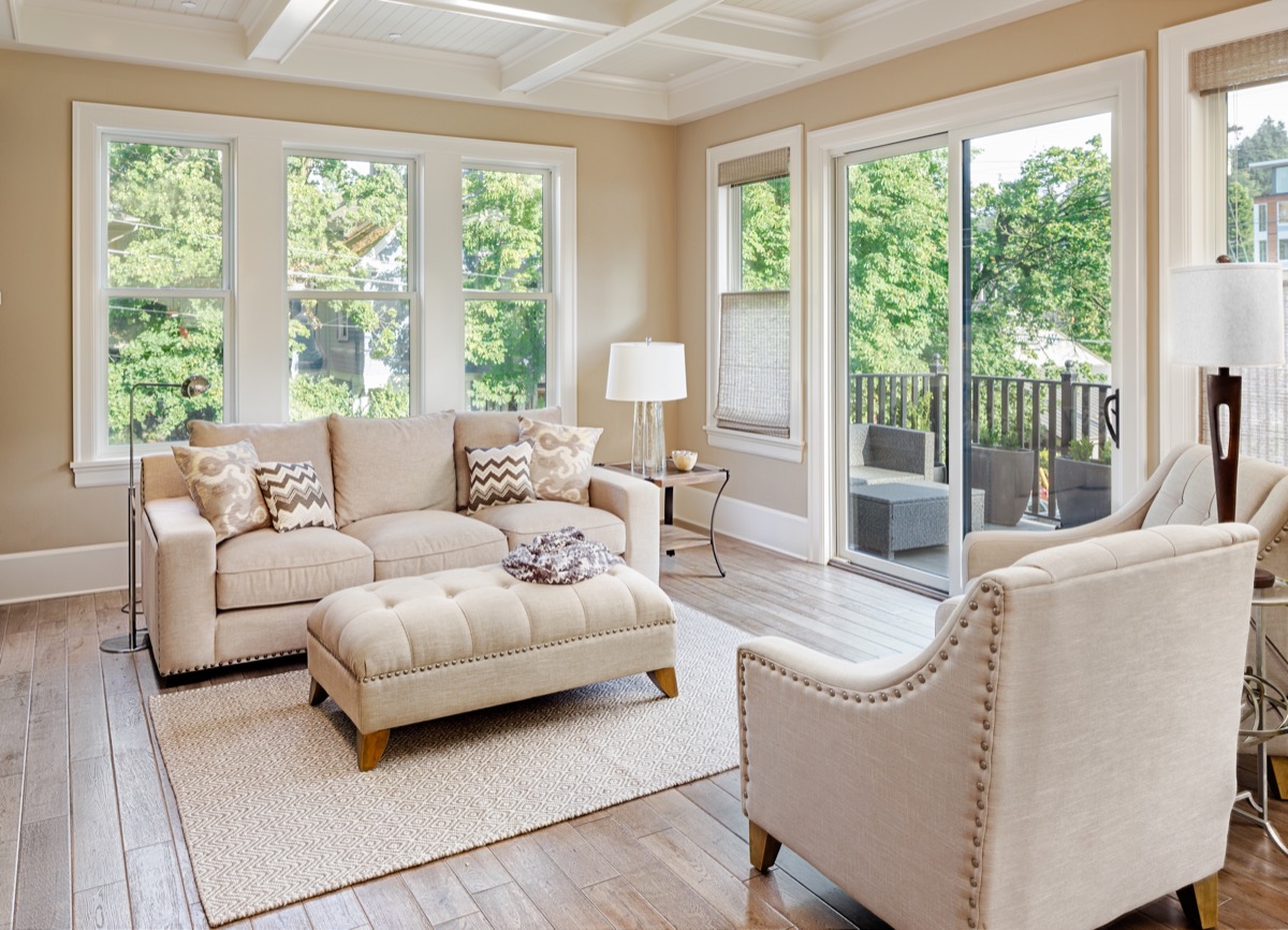
Furniture That Blocks Windows
Natural light makes your home look brighter and more welcoming—but putting furniture in the way of your windows can immediately transform your space for the worse.
“Always keep low-height furniture next to the windows. Low-height furniture makes your room look more airy and bright,” says Julia Turner, design director for home improvement company Ring’s End.
15
Buying Everything New
You may want to freshen up your space with a few new items, but too many brand-new pieces can rob it of much-needed character.
“Layer in vintage finds to prevent your space from resembling a furniture showroom,” suggests interior designer Sarah Barnard, WELL AP + LEED AP, who notes that buying secondhand and vintage items is also a great way to stay on budget and keep your design choices eco-friendly.
16
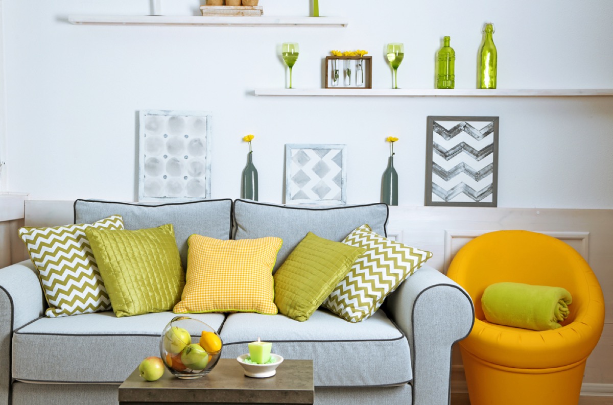
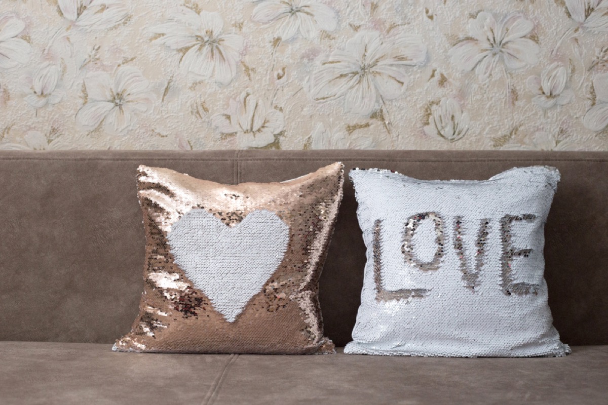
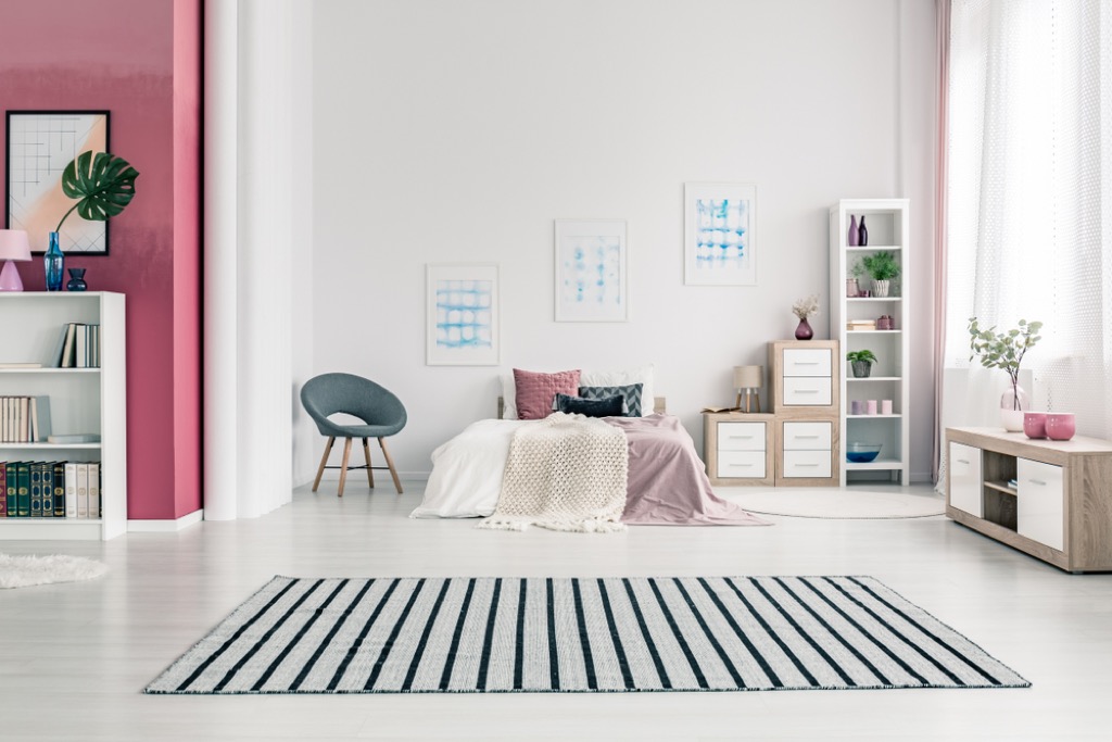
Using Too Many Trendy Items
![]()
![]()
A few trendy pieces can liven up a space—a chevron pattern here or sheepskin rug there—but letting trendy items dominate your space is a major no-no.
“In a short time, this trend may die, leaving your house looking outdated,” explains design expert Jing Xue, co-founder and COO of DecorMatters. Instead, stick to trendy pieces as accents only, not the focal point of a room.
17
Shiplap
Yes, Fixer Upper star Joanna Gaines seems to have made it her mission to include shiplap in every home she designs. But that doesn’t mean most interior designers feel the same. “It is not a look that belongs in most homes and it will become outdated after the Gaineses have faded from view for a year or so,” says Schneider.
Schneider points out that, before its contemporary resurgence, shiplap was typically only used for exterior walls in cheaply-constructed or unfinished homes. Ouch!
18
Barn Wood Walls
While repurposing materials from old buildings is certainly eco-friendly, that doesn’t mean it’s always a great idea from an aesthetic perspective. “The application of the material to an interior finished wall leaves the home owner with a rustic appearance that does not fit in most environments,” says Schneider. “Think grandma’s basement or grandpa’s hunting cabin.”
What’s more, he notes that it’s hard to clean and may even present some health hazards. “It can also have old lead-based paint on it that, in some cases, has been [distressed],” potentially leading to lead poisoning if the dust is inhaled or ingested, according to Schneider.
19
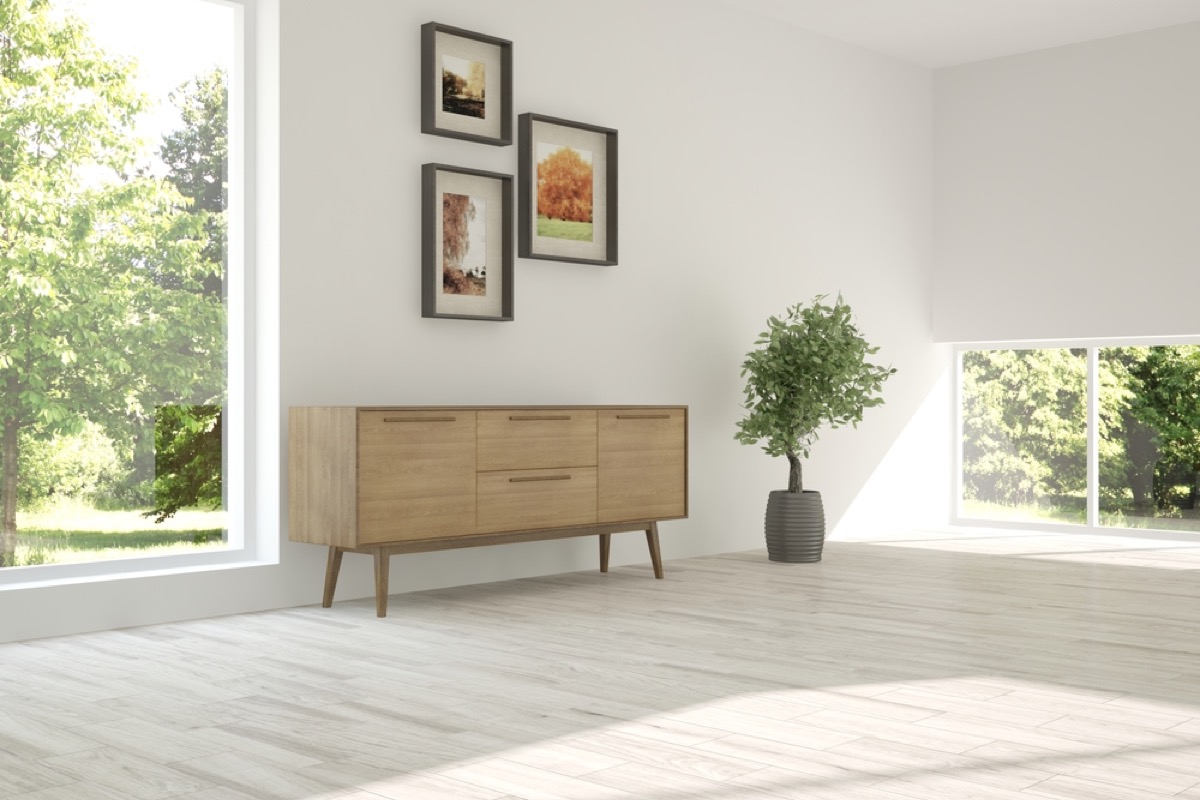
Gallery Walls
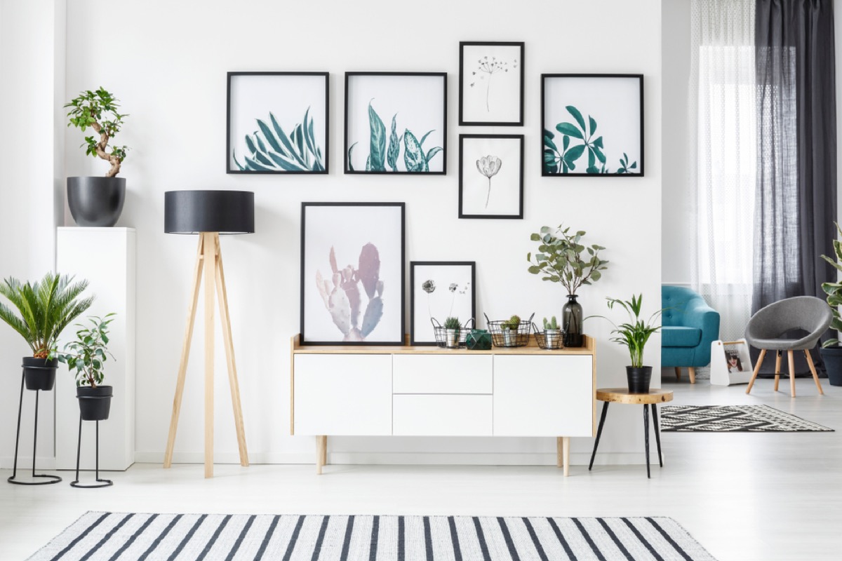
Gallery walls may make the most of small spaces, but that doesn’t mean designers think they’re a good look in most homes. According to home designer Bryan Stoddard of Homewares Insider, all that’s achieved by putting so many pieces on one wall is a look that’s “stuffed and suffocating.”
20
Putting Art on Every Wall
“Every bare wall doesn’t need something on it,” says Washington, D.C.-based interior designer Darlene Molnar. “That just makes the eye jump all over the room.”
A single strategically-placed piece works better, she says.
21
High-Hung Art
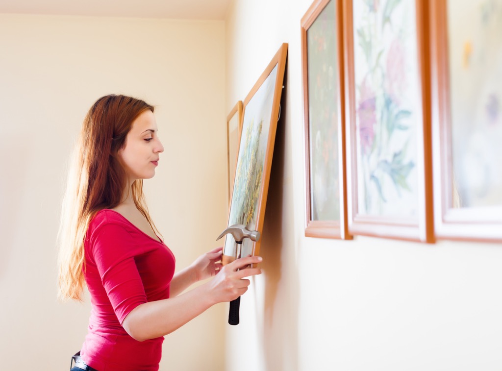
Before you so much as pick up that hammer, try placing your nail a little lower on your wall. “I feel like most art in this world is hung too high,” says Garrett. “My philosophy is that all art should be hung at eye level for the average person.”
Her recommendation? Put your art around five feet off the ground so people can see it easily without straining their necks.
22
Plantation Shutters
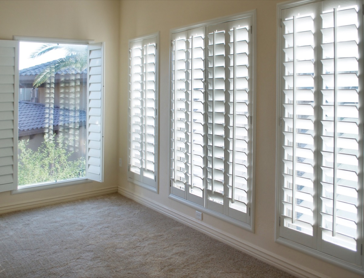
Those plantation shutters on your windows aren’t giving it as much charm as you think. “This is one of the only trends I know that costs a fortune, has been around for 30 years, and still makes people feel guilty about ripping them out,” says Garrett.
The shutters drastically reduce the amount of light a home gets, and “light is one of the most important aspects of a home,” Garrett says.
23
Over-the-Top Drapery
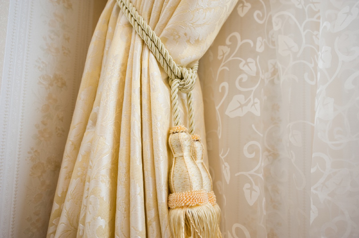
“Nothing spoils good design more than window treatments that aren’t the right size or hung at the wrong height,” says Bevan Talbott, residential interior designer with Bevan & Company in Old Greenwich, Connecticut. “Curtain rods hung across the window frame, (or even worse, on the window frame!) are like a heavy eye brow and bring the ceiling height down and close in the window.” Her recommendation? Move the curtain rods closer to the ceiling to make the room feel larger.
24
Grommet-Topped Curtains
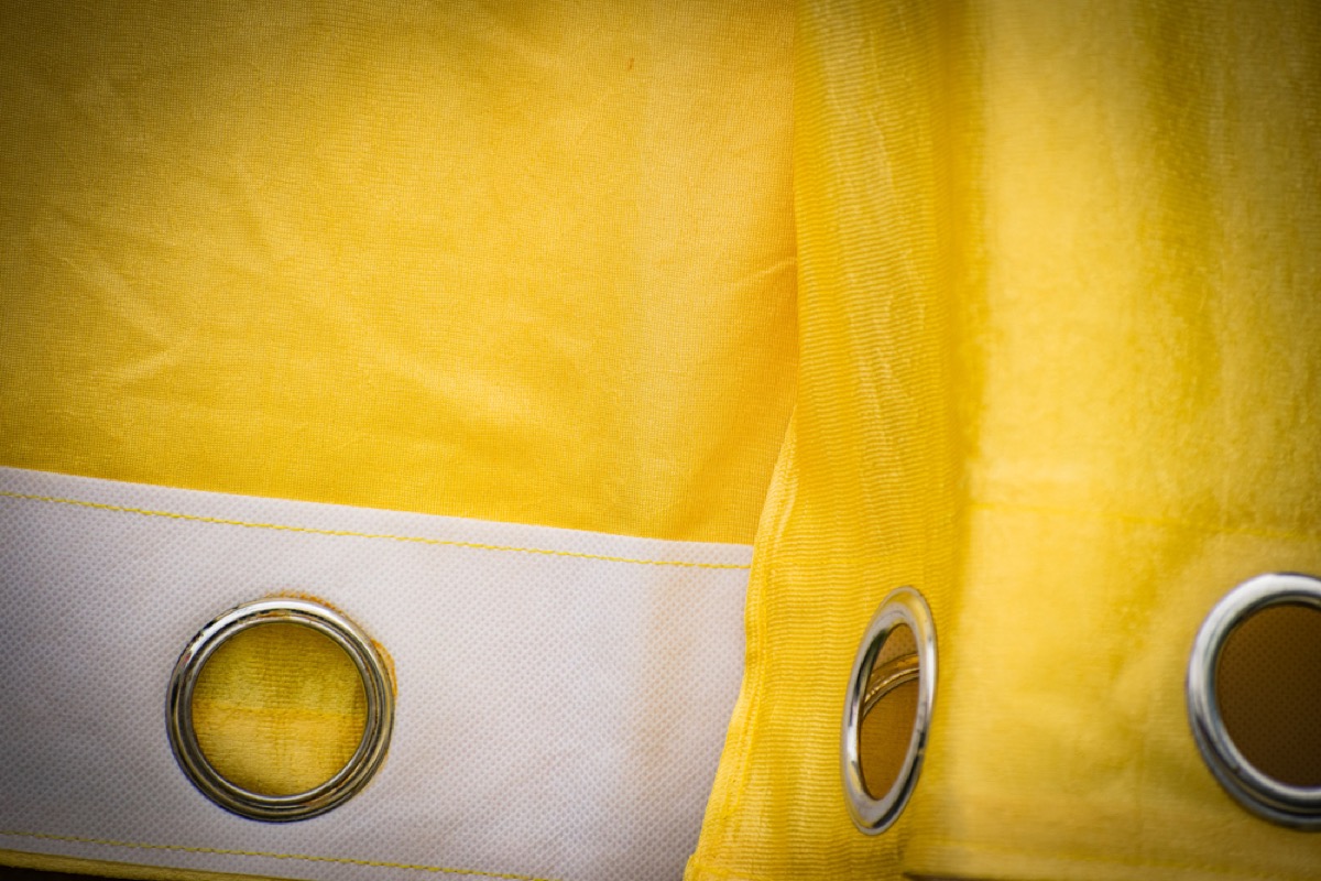
According to the experts, curtain grommets aren’t just cheap-looking—they also earn low marks in terms of functionality. “These are purely decorative,” explains Yaron Linett, principal designer of Formal Traditional in Warrenton, Virginia. “If you do try to pull on them to close them, they normally form a tension lock against the rod and move haltingly. And once you want to reopen them, you need to dress them by hand to set the spacing correctly.”
25
Bare Windows
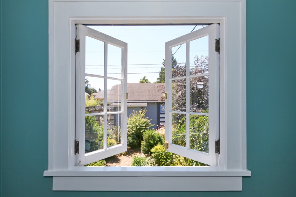
However, leaving those windows uncovered will likely earn you plenty of ire from designers, too. “One of my biggest pet peeves of all is bare windows,” says interior decorator N’Ckyola “Nikki” Green, owner of design firm Xtraordinary by Design in Houston, Texas.
The only exceptions? When you have statement windows, like stained glass; you have a great view; or there’s plenty of privacy, either due to a property’s secluded location or tree coverage.
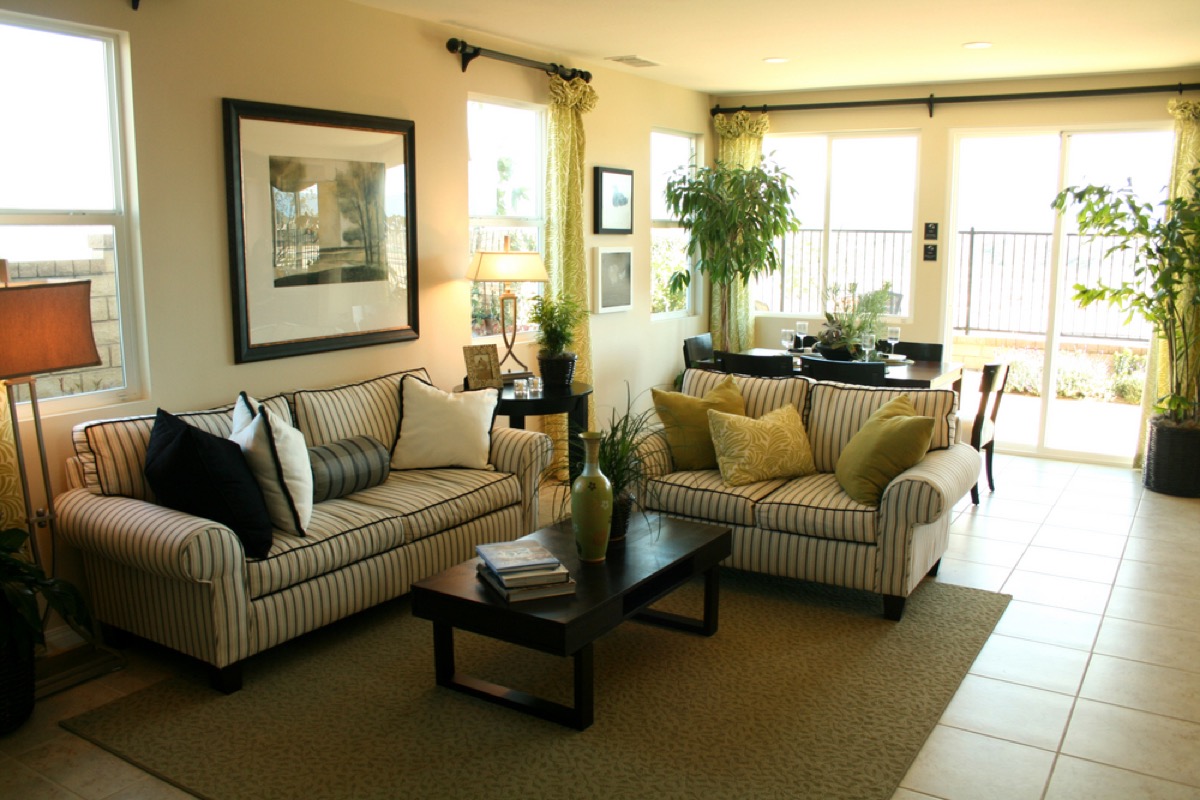
26
Small Furniture in Big Spaces
When buying furniture for a large room, it’s important to invest in pieces of scale. Small pendant lights in mansions with standard-sized furnishings have a tendency to look sloppy, according to Nelson. “Grand interiors will eat up the scale of ‘regular’ furniture,” she says.
27
Overfilling Rooms
Not every inch of space in a room needs something to sit on—and loading up small spaces with furniture is a pretty major design don’t. “Don’t overfill a room,” says interior designer Gwen Snyder Siegal, founder of The Nest Design. Instead, “define function in a space and furnish accordingly.”
28
Keeping Furniture Only Against Walls
Who says that every piece of furniture needs to be pushed up against a wall? “Try floating furniture in a room instead of only using perimeter walls,” suggests Siegal. “There is always a solution for furniture placement that is not only functional to homeowners’ needs, but also visually pleasing.”
29
Matching Bedroom Sets
While it may be convenient to buy an entire bedroom set, doing so won’t score you points with your decorator. “Your bedroom is your oasis. It should be a calming place of respite that reflects your style, not a furniture showroom,” says designer Pattie Kelly, president of Inspired Home Interiors. The one exception to the “no matching furniture” rule? Kelly says that she still recommends buying nightstands as a pair.
30
Oversized Sectionals
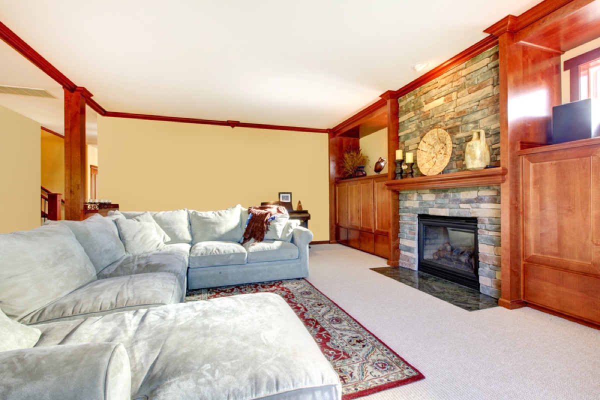
Sure, that sectional is comfortable, but if you don’t have a huge room to accommodate the thing, it’s just going to look out of place. “They really limit what you can do design-wise in a space,” says Marty Basher, home design and organization expert for Modular Closets. Plus, he notes, the beiges and browns these couches typically come in are notoriously hard to complement with art and other textiles.
31
Mermaid Sequins
They’re fun to pet, and they’re cute on kids’ clothing, but don’t even think about adding mermaid sequins to your home design scheme. “Please make it stop,” begs Nelson.
In addition to looking tacky, sequins pop off easily, and can make a huge mess. Oh, and they’re also extremely uncomfortable to lean against.
32
Pattern Overload
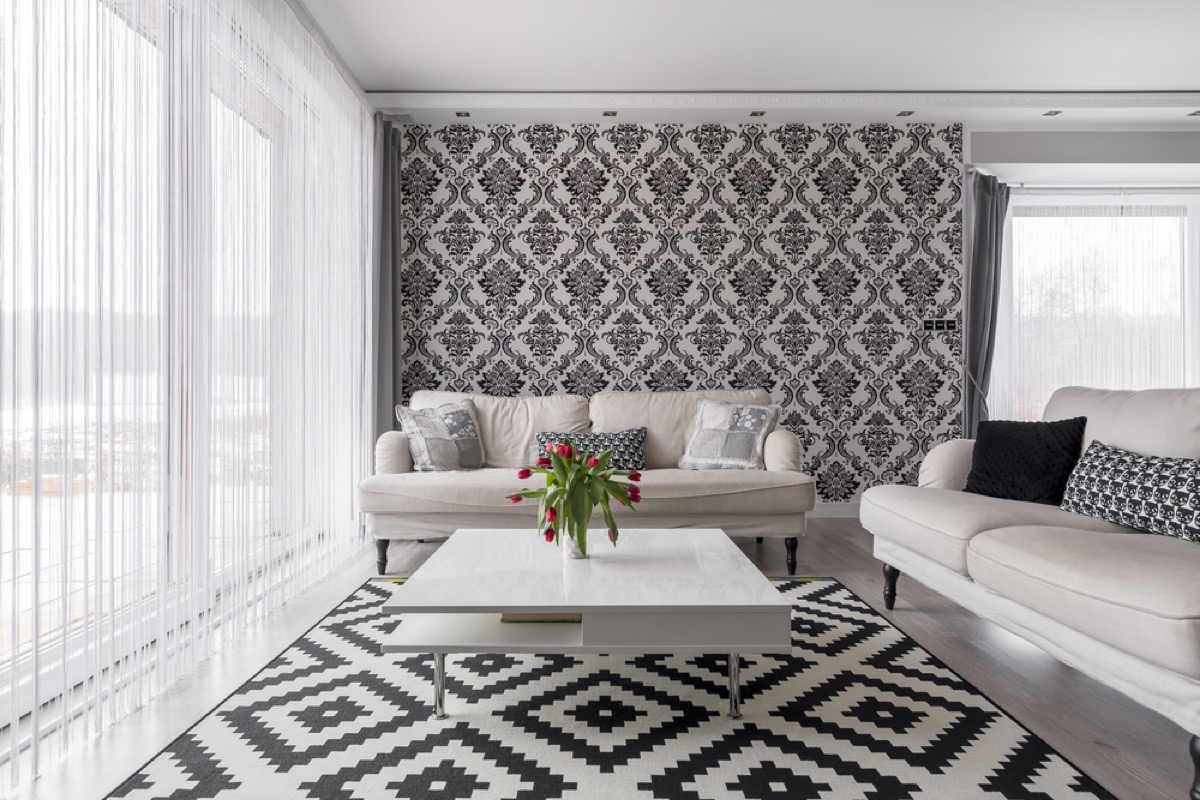
Whether you’re opting for a Pendleton plaid blanket or a Missoni striped throw, patterns can add visual intrigue to your living spaces. However, you can definitely have too much of a good thing. “The cacophony of patterns creates a jumbled, confusing environment that never lets the eye rest, and does not allow for a sense of calm and wellbeing in the space,” says designer Vicente Wolf.
33
Double-Height Foyers
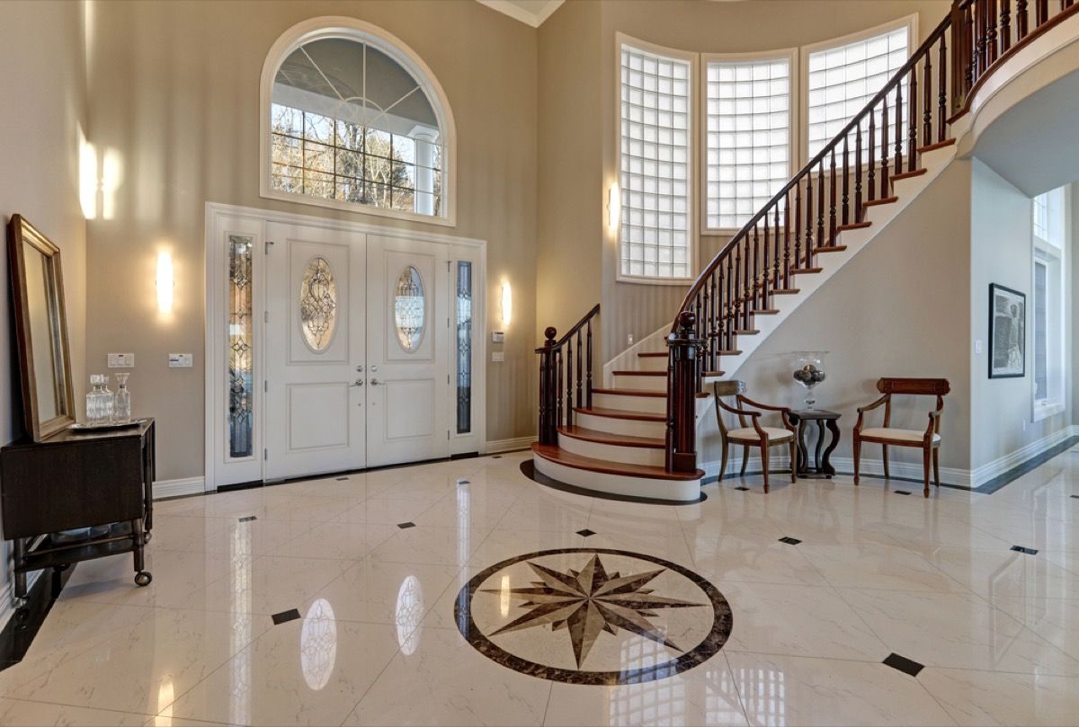
So-called “lawyer foyers”—or double-height entryways—are an eyesore for interior designers. One of the biggest problems with these oversized entries is that they usually “do not have a good starting and ending point for paint or wallpaper, forcing you to use the same color or paper on the second floor,” says interior designer Shannon Connor of Shannon Connor Interiors in Princeton, New Jersey.
“Intimate foyers are a great place to create a vignette and take some decorative risks,” she adds. But double-height ones don’t allow for that.
34
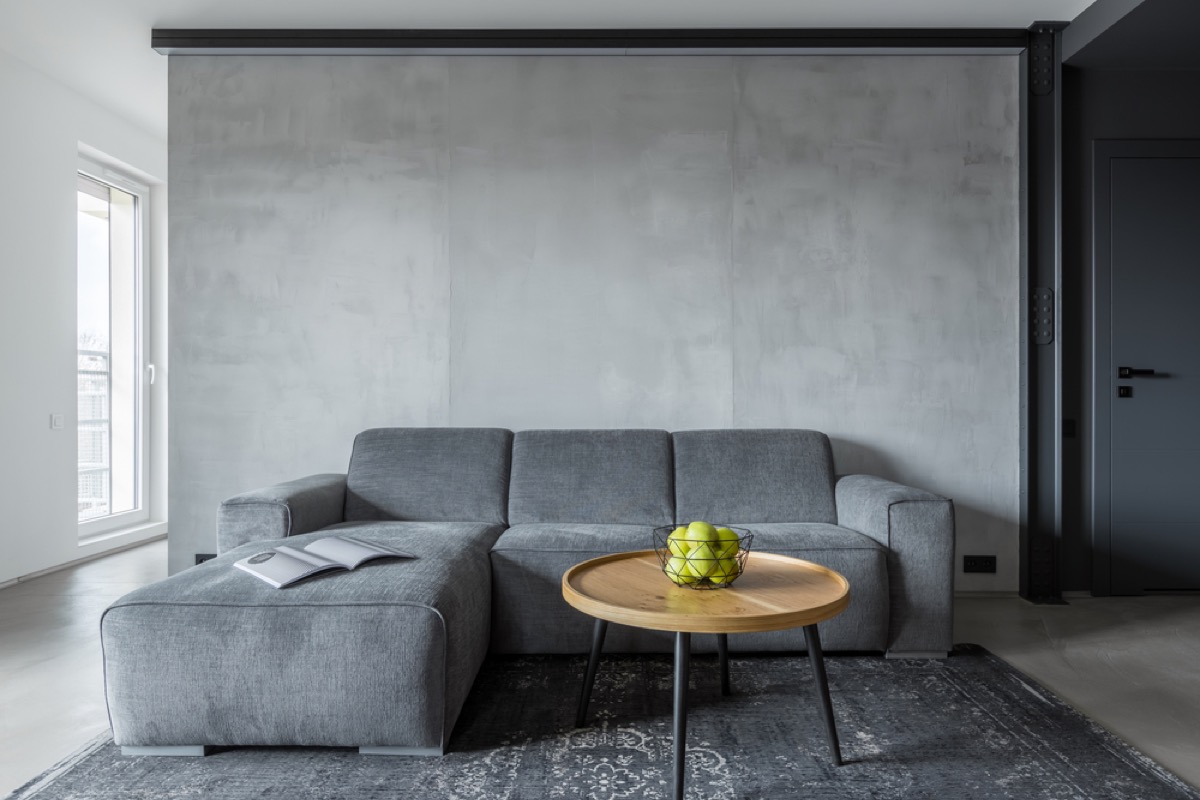
Undersized Rugs
When it comes to rugs, go big—or don’t go home with them. “Large rugs are really expensive, but putting a rug that is too small in your space actually makes your whole room feel small and badly proportioned,” says Cutler.
So, how do you know what size rug to get for your space? It should cover enough of your floor that your furniture sits at least partially atop it, not around it.
35
Outdated House Numbers

Erika Frank, a Los Angeles-based interior designer, says that those standard-issue numbers you can buy at any hardware store are woefully outdated. According to her, the address number on your home is a “design element that doesn’t get enough love.”
“There are a lot of great options out there and interesting ways to ‘dress’ up your home address numbers, like using unique metals or lighting elements,” she says. Try wrought iron or painted metal instead of traditional brass to add some curb appeal. And if you want to liven up your space, check out these 17 Amazing Vintage Home Features That Are Too Charming for Words.