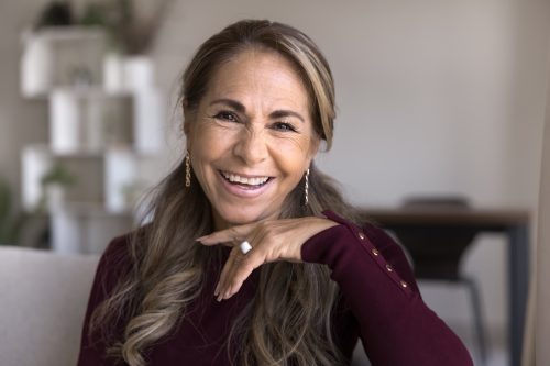
6 Clothing Colors That Make You Look Younger, According to Stylists

As we get older, our style naturally evolves. Maybe that means swapping out tight-fitting tops for feminine blouses or flare-leg jeans for a slimmer boot cut. But sometimes, it’s not as much about the types of clothing but rather the colors. The right shades can instantly brighten your complexion, make you look more energized, and even give the illusion of smoother, more youthful skin. To help you refresh your wardrobe, we asked professional stylists to share the clothing colors that can make you look younger—without feeling like you’re trying too hard.
RELATED: 12 Hairstyles That Can Make You Look Older, Stylists Say.
1. Navy Blue

Certain bold colors can be overpowering as we get older because “our features fade and our hair grays,” explains Elizabeth Kosich, certified image stylist and founder of Elizabeth Kosich Styling. In fact, she says black is the harshest color of all, which is why she recommends replacing it with navy blue.
“It can be your new power neutral,” she says. “You won’t miss black since navy is still an authoritative color, but communicates trust, loyalty, and confidence with a velvet glove.”
2. Magenta

While you may gravitate toward neutrals, you don’t have to give up fun colors completely when you get older. If you’re over 50 and looking to bring more of that wow factor to your wardrobe, Kosich recommends adding a splash of magenta.
“It shows you’re still relevant, in touch, and on-trend—plus it’s a great conversation starter,” she gushes.
The color experts at Pantone describe magenta as a “nuanced crimson red tone that presents a balance between warm and cool,” which Kosich says is the perfect hue for an accent color.
“Think socks, grosgrain belt, rhinestone huggies, statement shoelaces, or a power lip,” she advises. “Have fun with it.”
RELATED: 7 Ways to Dress Trendy Over 60, Stylists Say.
3. Soft White

Believe it or not, certain shades of white may not be as flattering once you reach your 50s.
“As we age and our coloring softens, stark white can be difficult to wear,” cautions Carol Davidson, NYC-based image consultant and style coach. “What’s more, ivory can bring a yellow-green cast to some complexions.”
So what’s the solution? Soft whites.
“A year-round wardrobe staple, soft white is universally flattering to all skin tones,” Davidson says. “Not to mention it can be easier to maintain than a crisp, bright white.”
4. Burgundy

Another hue in the red family you should utilize in your wardrobe is burgundy. It is an “elegant and refined shade that adds a touch of luxury to any ensemble,” Maria Velniceriu, fashion expert and founder of MissMV, says.
According to Velniceriu, you can wear burgundy as a statement color or stick to using it as an accent. “Either way, it injects a sense of maturity and sophistication into one’s style,” she says.
RELATED: The Best Colors to Wear If You Have Gray Hair.
5. Blush Pink

If magenta and burgundy feel too bold for your taste, stick with a softer blush pink.
Vivienne Desurmont, styling expert and founder of Maison Vivienne Paris, says that some people past a certain age may shy away from pink “assuming it’s too youthful or not versatile enough,” but that’s certainly not the case.
“Soft blush pink introduces a subtle touch of femininity and adds a refreshing pop of color to outfits,” Desurmont explains. “This delicate hue complements a range of skin tones and can be incorporated into casual or more formal looks.”
6. Olive Green

Greens have been having their moment recently, and you should take advantage of the trend. Kosich recommends looking out for olive green clothing, as it is a “kinder, gentler neutral green that comes in a range of light, dark, warm and cool hues.”
“Find one that supports your undertone, hair, and eyes best and pair with a splashy accent color like true red to raise the vibration,” Kosich suggests.