The 10 Worst Paint Colors for Your Home, Experts Say
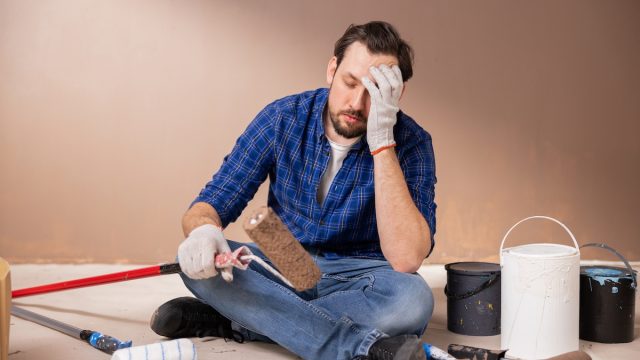
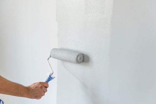
As long as you’re not painting the front of your house pea-green or the kitchen neon pink, you might think your color choices don’t matter much. But the truth is that even the shade of white or gray you put on your walls can make a big difference—both from an aesthetic angle and from a resale value perspective. To help you avoid any potential pitfalls, we consulted interior designers and realtors to find out what the worst paint colors are for your home. Keep reading for their expert advice.
READ THIS NEXT: The Unluckiest Paint Colors, According to Feng Shui Experts.
The 10 Worst Paint Colors for Your Home
1. Bright colors on the front door
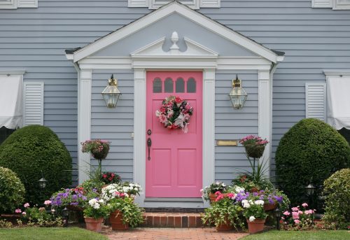
The front door to your house is one of the first things people notice, so you’ll want to be selective about its colors.
Bryson Taggart, a real estate agent with Opendoor who’s licensed in Arizona, Utah, and Idaho, points to Opendoor’s 2023 Home Decor Report, which found that colors like yellow, red, and teal are the least preferred color choices according to 48 percent of homeowner respondents.
Alternatively, 44 percent of homeowners said they prefer neutral front door colors such as white, gray, gray-blue, and gray-green.
2. Bright colors on the exterior
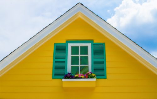
Likewise, you’ll want to avoid painting the entire exterior of your home a bright color.
In this instance, Opendoor data shows that a house’s color is important to one in five homeowners. Forty-one percent of respondents preferred “neutral and warm tones” like beige, tan, and camel, while 21 percent leaned towards “high contrast pallets such as navy with white accents” and another 21 percent towards “white with black accents.”
In particular, one exterior color to stay away from is yellow. An analysis of paint colors conducted by Zillow in 2018 found that using this hue—specifically “creamy bright yellow to a flax yellow” and “warm yellow with brown undertones”—on a house’s exterior actually decreased its value by more than $3,000.
But perhaps the most important consideration with exterior paint colors is what nearby houses look like. “As a general rule, the exterior color of the home should complement other homes in the neighborhood,” explains Taggart. “Otherwise, it might stick out like a sore thumb!”
READ THIS NEXT: 8 Paint Colors That Will Make Any Small Room Feel Instantly Bigger.
3. White in high-traffic areas
“While a crisp, white palette might be tempting for its minimalist charm and the illusion of space it creates, using it in high traffic areas or spaces prone to spills and stains (like the kitchen, the children’s room, or the hallway) might not be the best choice,” points out Artem Kropovinsky, an interior designer and founder of Arsight.
The bathroom is a space where white might be the worst choice, according to Jeneva Aaron, founder of The House Wire. “Stains are very visible on white walls,” and when the bathroom is typically “one of the grossest rooms in the house,” it’s not a smart decision, she says.
4. White in the home office

With so many people working remotely, the need for a comfortable home office is more important than ever. And to make this a reality, experts advise against painting the walls white.
Courtney Keene, director of operations at MyRoofingPal, says the color white can “lead to eye strain and fatigue,” which is already a concern if you’re looking at a computer all day.
Marty Basher, a design expert with Modular Closets, says that in addition to eye fatigue, being surrounded by white walls “can contribute to feelings of anxiety.”
If you were leaning toward a white home office because you thought it would make the room feel bigger, Basher says this is not always the case, as “it can actually make a room feel lifeless and boxy by exaggerating shadows.”
READ THIS NEXT: The Best Colors to Paint Your Bedroom, According to Sleep Experts.
5. “Builder’s beige”
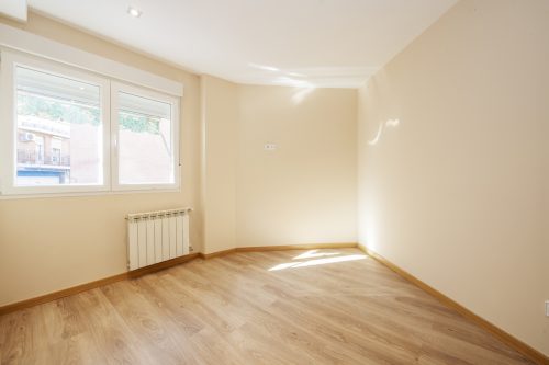
“Builder’s beige” is an industry term used to describe the drab, generic wall color that many new homes come with.
Teri Simone, head of design and marketing at Nieu Cabinet Doors, describes it as a “mix of brown/beige/grey with yellow undertones” and says it “screams builder’s grade, even if it isn’t.”
“Often used in spec homes or large developments, it doesn’t do your home many favors,” she adds. “It typically makes spaces feel darker and dingier, doesn’t lend well to bright white kitchens or crisp marble-looking countertops, and can be very hard to pair with lighter white-oak-toned flooring.”
6. “Millennial gray”
Another neutral color you may want to avoid in large swaths is what’s been dubbed “millennial gray,” according to Amber Shay, national design director at Meritage Homes.
The idea of millennials surrounding themselves in this cool-toned, somewhat-sterile shade of gray took off as a joke on TikTok and even it made it into the Urban Dictionary with the following satirical definition: “The color reflects how Millennials went from non-sense happiness, looking at cartoon network and Nickelodeon in the 90’s to Inflation and depression in the early 2020’s.”
Whether you are, in fact, a millennial, or you’ve just chosen to follow the trend of this seemingly safe wall color, Shay says it’s really gone out of fashion and “has been replaced by greige and warmer tones.”
To her point, according to Fixr’s Paint and Color Trends Report 2023, 40 percent of the surveyed design professionals chose “clay”—a taupe-ish, stone-like gray—as the year’s most popular color. Twenty-seven percent said dark gray/charcoal, 21 percent said greige, and 19 percent said taupe.
For more home advice sent directly to your inbox, sign up for our daily newsletter.
7. Bright, saturated colors
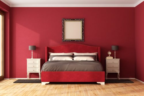
With a few exceptions, bright, saturated colors are not a wise choice for interiors.
According to Opendoor’s research, 13 percent of homebuyers cite “bright or dark paint colors” as their biggest design deal-breaker when househunting; another 13 percent said their biggest turn-off is “inconsistent paint colors.”
“While bright and dark colors can add a sense of whimsy and personality in a home, they can often be considered distracting or too difficult a canvas for buyers when envisioning their own lives in a potential new space,” explains Taggart.
Experts agree that bedrooms are one place to especially avoid them. According to Kropovinsky, “intense, saturated colors such as bright reds, oranges, or neon hues…are stimulating and energetic, which might not be conducive to a calm and relaxing environment.”
Jeneva Aaron, founder of The House Wire, adds that red is particularly bad for bedrooms. “We associate it with danger, so it gets the blood running and the heart beating faster. That’s not the type of feeling you want to have as you’re trying to fall asleep at night.”
Ashley Baskin, real estate agent and board member of Home Life Digest, says the one place she recommends going bold is the bathroom or powder room since it’s a small space that’s closed off from the rest of the house.
8. Black in small spaces

“While black can be dramatic and sophisticated, using it in a small or poorly lit room can make the space feel smaller and darker,” notes Kropovinsky.
“Unless it’s a deliberate design choice aiming for an intimate, cozy feel (and there’s sufficient lighting to balance it), it’s typically better to use black sparingly or as an accent color in such spaces,” he advises.
Very dark paint colors may also affect your chances of selling your home. According to Fixr’s report, only two percent of design professionals surveyed recommended a dark color palette for a home hitting the market.
READ THIS NEXT: The First Things Guests Notice When They Come Into Your Home, Experts Say.
9. Pastel pink
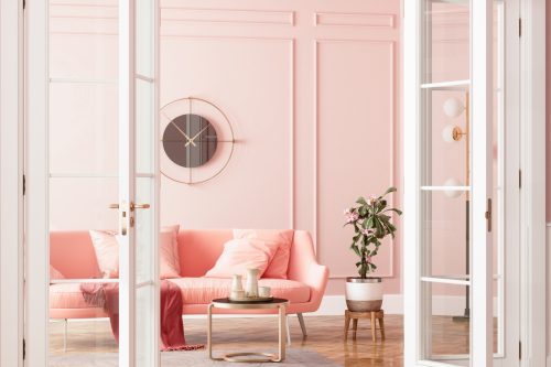
Kropovinsky explains that certain pastels, namely “nursery-associated ones like baby blue or pink,” might make “adult” spaces feel childish or outdated.
“It’s crucial to choose shades that resonate with the room’s purpose and the age and preferences of its occupants,” he says.
Tonya Bruin, CEO of T0 Do-Done, says pastel pink is best left to accent walls, not entire rooms, as it tends to “take over.”
“Whether it be your kitchen, living room, or washroom, you won’t be noticing what’s in the room, but simply that it’s a ‘pink room,'” she says. “For the most part, that isn’t its purpose; it’s meant to be in the background and to blend with the rest of the room’s aesthetic.”
10. Opaque couché

Pantone’s 448 C color, better known as opaque couché, has been deemed the “world’s ugliest color.”
Sam Whittaker, home design expert and editor at The Golden, refers to this dark, green-brown hue as “reminiscent of bile” and says it’s the “worst color you can paint your home.”
In fact, a 2012 study commissioned by the Australian government sought to find the packaging color that would most deter people from buying a pack of cigarettes.
“The agency GfK Bluemoon had 1,000 smokers select the colors they found most visually repellent,” explains Hyperallergic. “Respondents overwhelmingly associated Pantone 448C with words like ‘dirty,’ ‘death,’ and ‘tar.'”
And we’re going to assume those are not adjectives you’d like to be used to describe your home.