The 30 Worst Logo Re-Designs of All Time
Rebranding can be a game-changer for businesses. But it can also be a public-relations disaster. After all, changing an easily identifiable, iconic logo that people have loved for years can all too easily blow up in a business’s face. From confusing graphics to illegible fonts, these bad logo redesigns will go down as some of the worst in history. And when you want to give your professional life a revamp, start with the 40 Best Ways to Jumpstart Your Career!
1
The U.S. Open

In honor of the U.S. Open’s 50th Anniversary, the professional tennis association had New York-based design firm Chermayeff & Geismar & Haviv revamp their logo. The only problem?
The company took decided that the flaming tennis ball that had become such an iconic part of the previous logo should be replaced with a swoosh befitting an airline more than a professional sports competition. And for more visual misfires, check out the 30 Ugliest Sports Uniforms Ever Designed!
2
JCPenney
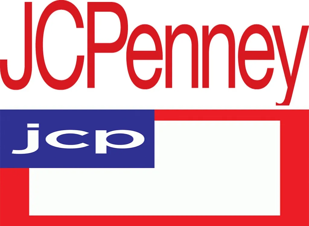
JCPenney’s original logo: clear, easy to read, and uncluttered. The Americana-steeped logo the company it rolled out in 2012? Anything but. One poll said the new logo hurt “consumer awareness” of the brand, and the company even went as far as to issue an apology ad that urged its customers to “come back.” It was a puzzling ordeal, as it came to pass under ex-CEO Ron Johnson, then best known as a branding genius who was responsible for his work on Apple’s retail stores. And for more on your favorite brands, here are the 50 Designer Brand Names You’re Probably Mispronouncing.
3
Hershey’s
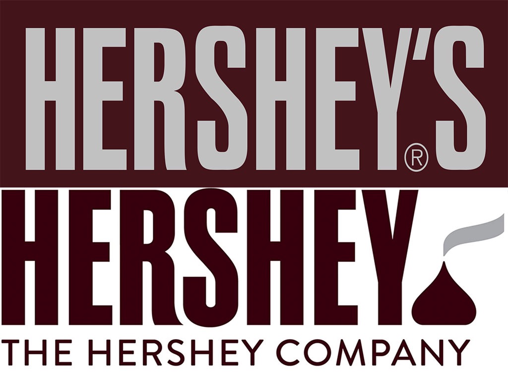
Hershey’s original logo was brilliant in its simplicity, clearly stating the brand’s name while evoking the packaging of their classic candy bars. However, fans were less than thrilled when the company revealed their new logo in 2014, with an essential oil diffuser-looking Hershey Kiss on it, and without the possessive in the company’s former branding. Others pointed out the Kiss’s resemblance to one recognizable emoji. And speaking of emojis, here are the Best New iPhone Emojis Unveiled This Year.
4
American Airlines
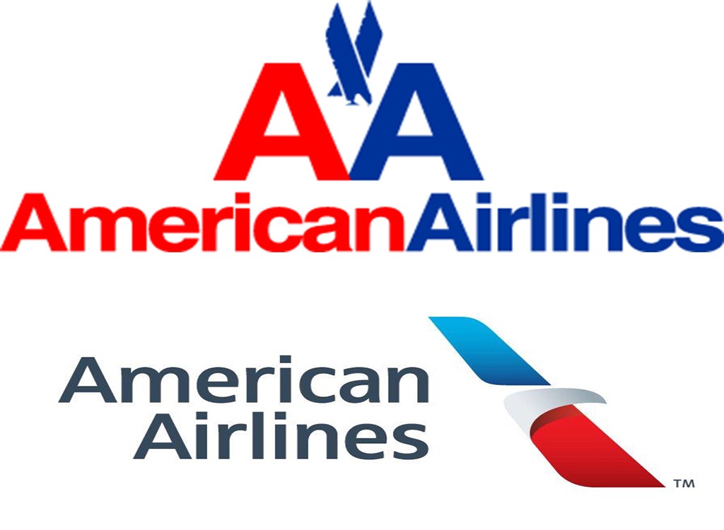
Strong and powerful, American Airlines seemed to be doing fine with the logo it had for 45 years until 2013. Then, the brand decided to make things a whole lot sleeker (and less clear), by taking out their iconic eagle and throwing his profile through a red and blue line. Original logo designer Massimo Vignelli was quoted saying he was utterly appalled by the new design. And for more eyesores, here are the 30 Worst Cars of the Last 30 Years.
5
Kraft
Kraft’s original logo was simple and easily recognizable, making this smiley butterfly redesign in 2009 all the more perplexing.
6
Pepsi
The Pepsi horizontally-striped globe was an iconic part of the soda giant’s branding for more than half a century before the company ditched it in favor of a swoopy mess in 2008. And when you want to do some re-branding of your own, start by tossing the 50 Things No Man Over 40 Should Own.
7
McDonald’s
McDonald’s may have one of the most iconic logos of all time, but the company scrapped its traditional branding for this ’90s-inspired monstrosity from 1995 to 2003.
8
Pizza Hut
Since 1967, Pizza Hut’s logo had been variations on the same theme: the brand’s name, and a little red roof over its head. However, in 2014, the brand decided to switch things up with this ill-advised logo, which kind of looks like it’s been sloppily written in pizza sauce.
9
Reebok
Reebok’s vector logo, a mark often emblazoned on the brand’s athletic attire, got replaced with this generic-looking triangle in 2014 after 28 years. It’s no wonder that retro-inspired shoes bearing the original market are so popular online right now.
10
Marriott Hotels
The Marriott hotel chain’s logo got a serious downgrade in 2013, when it unveiled this swoopy M, which hooked more like an H to countless customers. Oh, and speaking of hotels: Don’t miss these 20 Shocking Facts You Never Knew About Your Hotel Room.
11
Morton Salt
When your brand is based on nostalgia, like Morton Salt, a more modern-looking logo isn’t always such a smart rebrand. Also, they changed her hair color! What horror!
12
Monster
Monster.com is all about getting you the job you want, which was why this sloppy, wrinkled-looking 2014 logo redesign by Siegel+Gale was such a confusing choice. The newer, three-dimensional design feels like a giant step backwards for an Internet company.
13
Oxford Dictionaries
Oxford Dictionaries clearly wanted to distance itself from the gravitas of its old logo, choosing something that looked like the Beats by Dre logo instead. And if you visit the dictionary often, bone up on your spelling with the 25 Most Commonly Misspelled Words in America.
14
Life is Good
Life is Good’s slightly sloppy logo once reflected the whimsical, laid-back vibe the brand had clearly tried to cultivate. Unfortunately, the asymmetrical sun they rolled out in 2015, which the company described as “a symbol of optimism” and “perfectly imperfect,” seemed to entirely miss the mark.
15
Gap
Gap’s classic white-on-blue logo was briefly ditched for this bad rebranding in 2010, before public outcry essentially shamed the company into switching back. The company’s branding now bears a similar logo to the original, but now with dark blue text on a white background. And if you’re a regular retail shopper, make sure you know the 30 Best Ways to Always Save Money on Clothes.
16
Tropicana
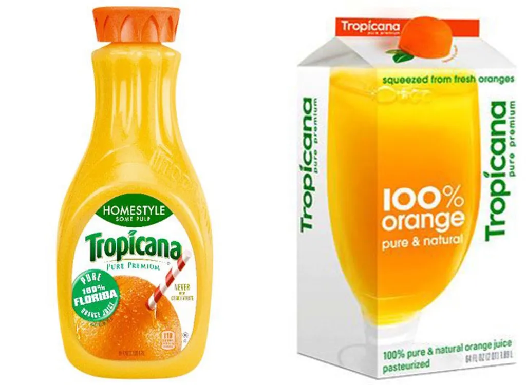
The new logo rolled out by Tropicana in 2009—one that reportedly cost the company $35 million—was about as bland as they come, prompting the company to go back to their previous design just a few months later.
17
PayPal
PayPal traded in their clear and concise branding for this shadowy mess in 2014. Unfortunately, PayPal’s new logo and Pandora’s logo were so similar that the former filed a lawsuit against the latter in 2017.
18
IHOP
IHOP’s original logo was simple and had a nostalgic feel to it. The creepy smile the brand rolled out in 2015? Not so much. Besides: Is that a little too similar to Amazon’s iconic logo?
19
OpenTable
OpenTable’s original logo concept was simple: open tables. It’s turntable-looking new logo, rolled out in 2015, however, proved perplexing to customers.
20
AirBnB

Among the most-maligned logo redesigns of all time, AirBnB’s new logo, which hit the internet in 2013, had plenty of people wondering if it was a Ouija board planchette or a body part.
21
Foursquare
Foursquare’s logo 2014 redesign took the brand from recognizable to anonymous in no time.
22
Wendy’s
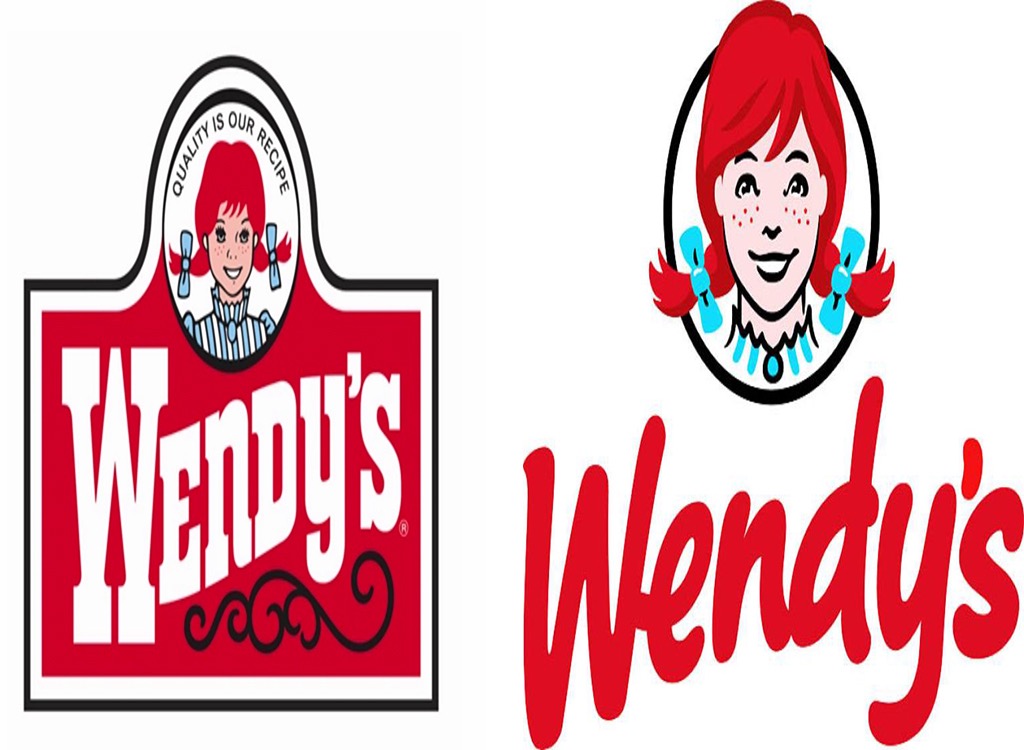
Much like Morton Salt, Wendy’s replaced their old-timey branding in favor of this messy, modern look in 2013. And stranger yet, many fans thought they saw the word “Mom” in the burger mascot’s collar.
23
Best Western
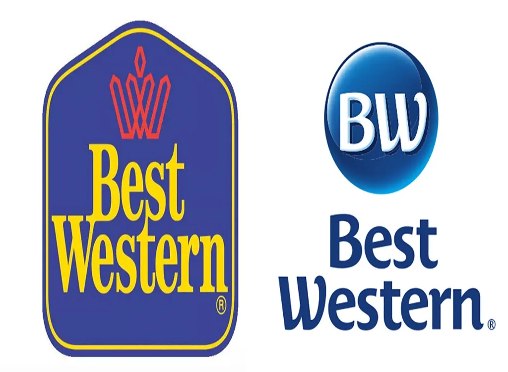
The classic Best Western logo once had a decidedly Western feel. The bland one the company rolled out in 2015, however, made it look like a hotel you’d find at an airport in Scandinavia.
24
Animal Planet

Animal Planet’s old logo made sense: it contained both an animal and a planet. Its 2013 logo redesign, which confusingly turned its M sideways, was considerably less of a hit.
25
Meetup
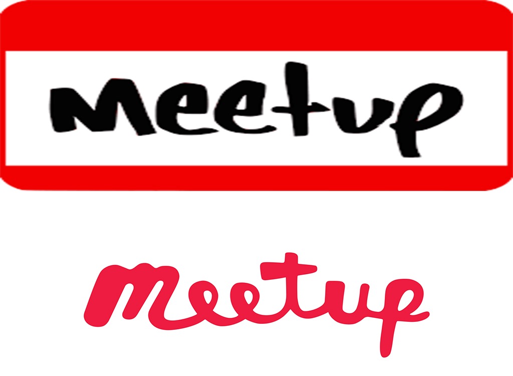
Meetup’s friendly name tag logo seemed like a good choice for the quirky site aimed at helping adults make new friends. The sloppy script logo it trotted out in 2016 hardly had the same charm, however.
26
Mountain Dew
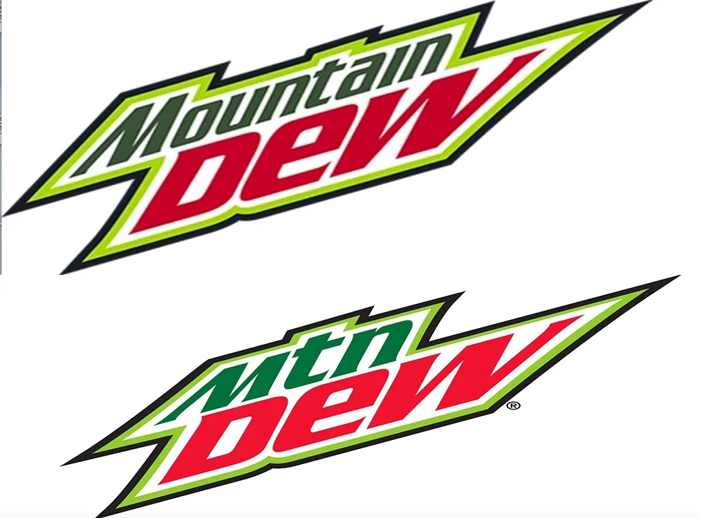
While Mountain Dew’s logos have all been variations on a theme since 1969, the company seemed to think it had a clever idea when it actually removed the brand’s name from packaging in favor of “Mtn Dew” in 2009. Did they think people couldn’t handle the entire word of “Mountain?”
27
WWE
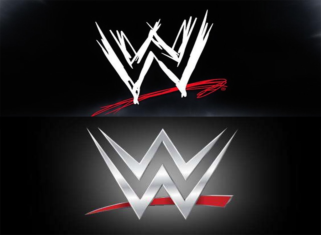
The whole point of wrestling is that it’s a raw, wild form of entertainment, which was reflected in WWE’s logo for years. Unfortunately, the WWE’s cleaned-up logo the brand introduced in 2014 looked more like a label for a big box store. Or Wonder Woman.
28
Bacardi
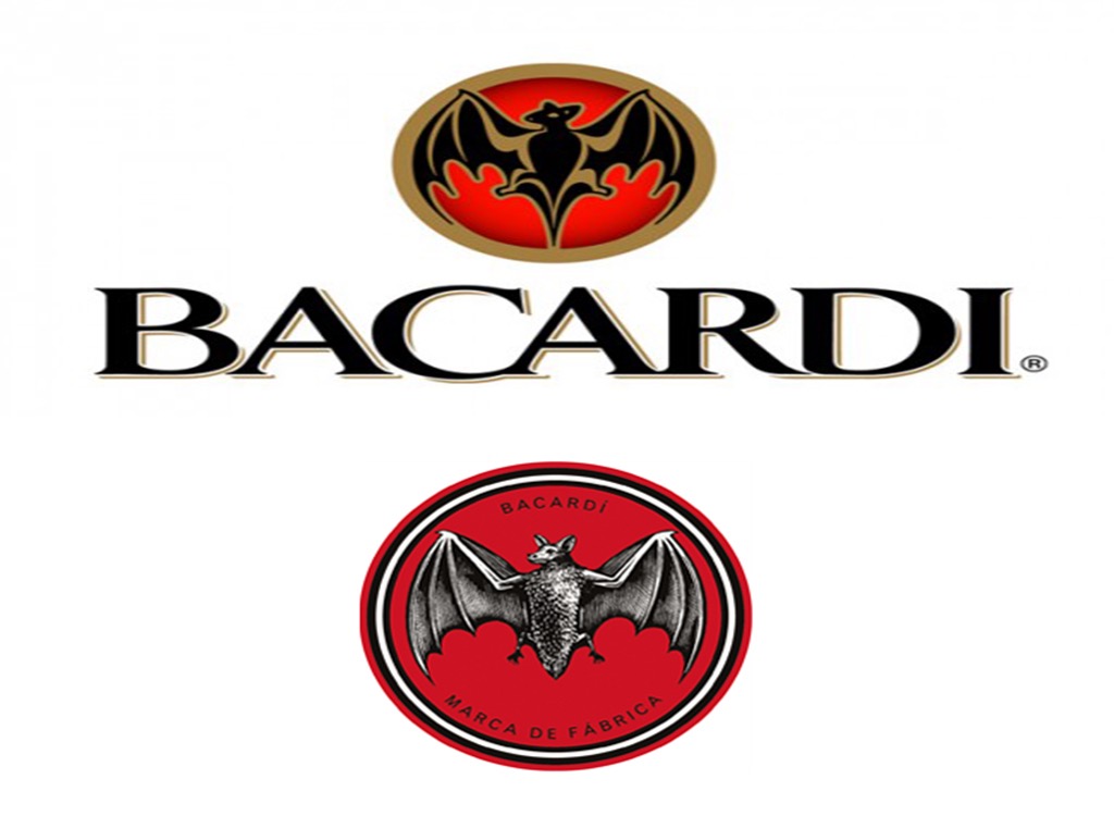
Bacardi’s iconic bat logo had remained largely unchanged since it debuted in 1959. However, in 2014, the then-152-year-old company decided to switch things up, reverting to a more realistic-looking, vintage-inspired bat, and adding the words “Marca de Fabrica,” Spanish for “trade name,” to the bottom, making the company seem more like they’re in the Halloween accessories business than the rum business.
29
Cadillac
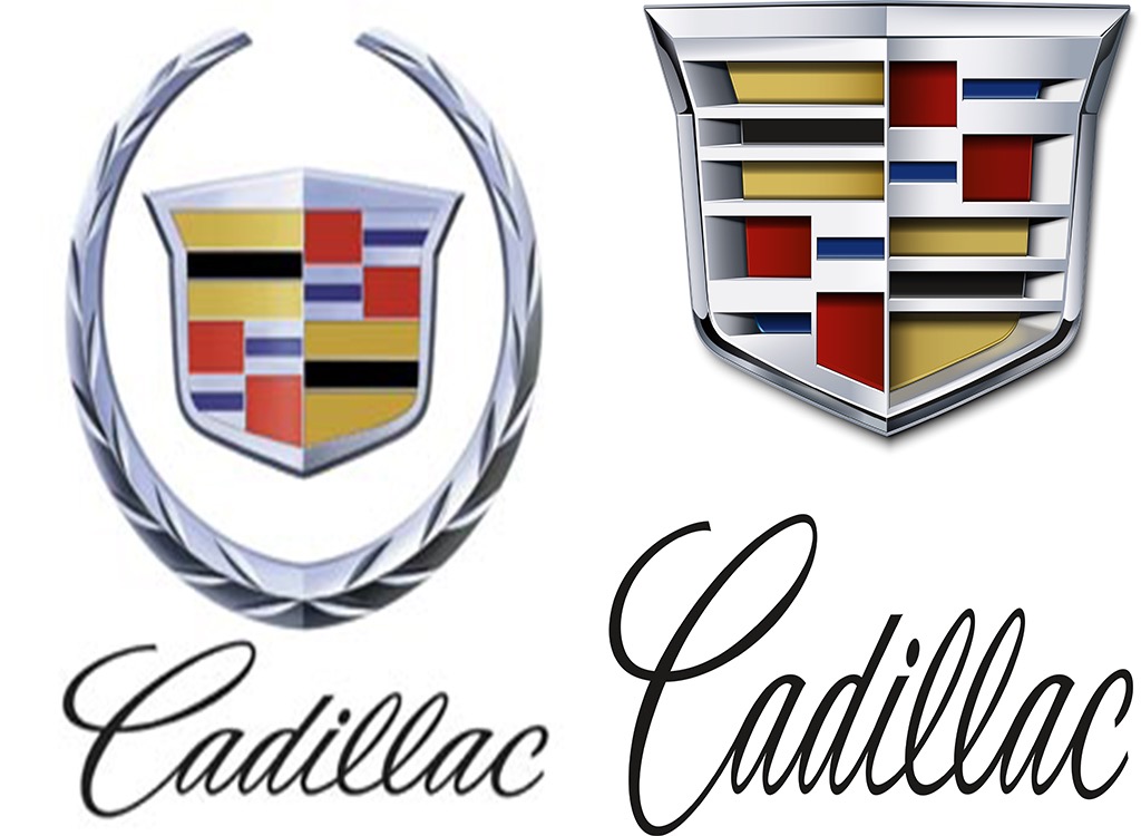
Cadillac’s iconic logo got a not-so-hot makeover in 2014, when the brand removed the laurel wreaths it had used on and off since the 1900s and decided to go with a look more reminiscent of Optimus Prime.
30
Olive Garden
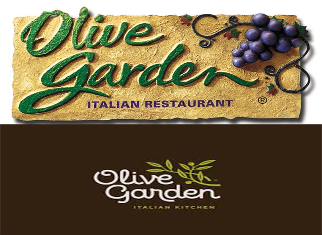
Olive Garden’s old logo gave customers a pretty clear idea what they’d be getting inside the restaurant: a faux-Tuscan restaurant, cheap wine, and a lot of breadsticks. The anonymous new logo, which was introduced during the company’s so-called 2014 “brand renaissance,” got a pretty brutal bashing on social media.
To discover more amazing secrets about living your best life, click here to sign up for our FREE daily newsletter!