23 Home Accents Guaranteed to Ruin Any Room
The accent pieces you choose to put in your home say a lot about your personality. Family photos say you adore your kids. Exotic vases say you love to travel. And unique art says you’ve visited a museum or two. But not every accessory is necessarily complimentary. In fact, some just go to show you had no idea what you were doing when you picked it out.
To help you know what those things are, we’ve devised a definitive list of the knickknacks that’ll ruin any room. And don’t worry—we’ve also included a few simple solutions to bring things up to snuff.
1
Florescent lights
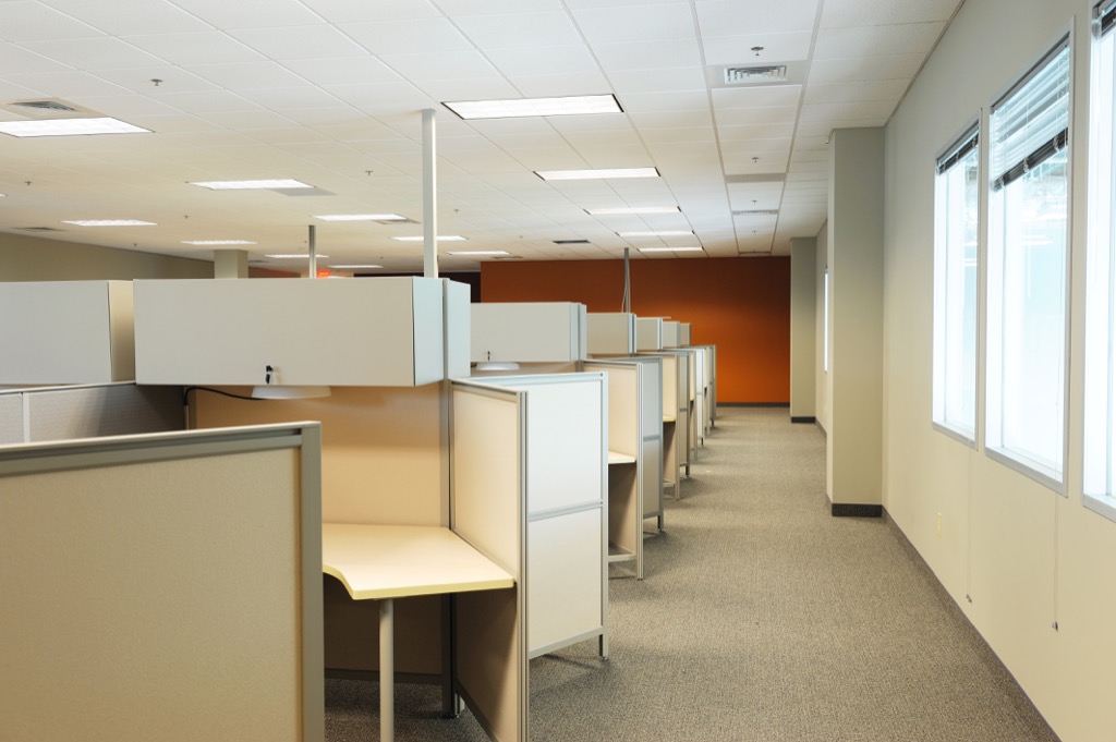
Most of us toil day-in and day-out at drab offices that employ glaring fluorescent lights. They’re harsh, clinical, and ugly—and they shouldn’t be in your home. Toss those outdated fluorescent bulbs and pick up a set of warm incandescent or LED bulbs.
2
Fake plants
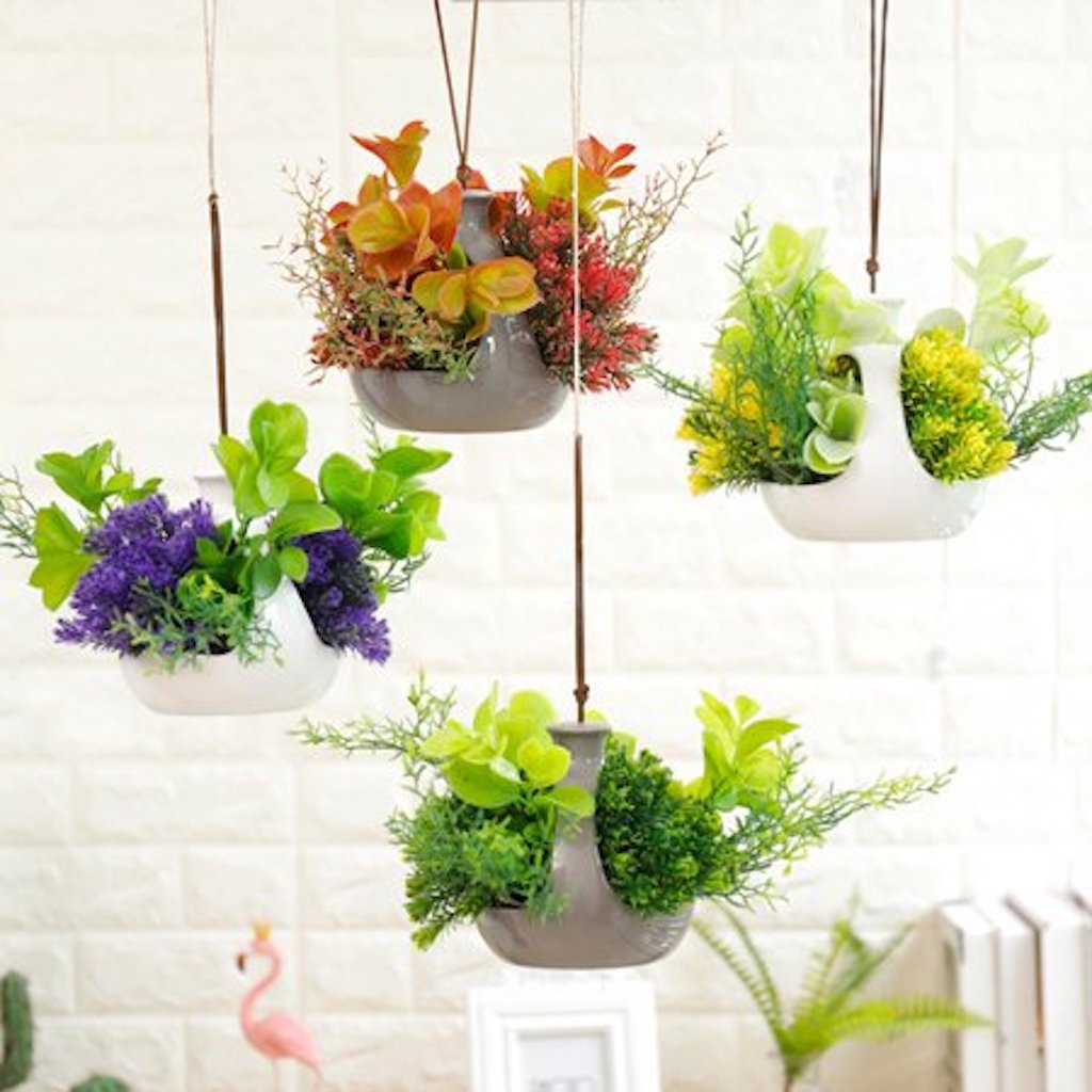
Studies have found that adding a bit of greenery to your home can improve your well-being and even help purify the air. But as you might have suspected, those benefits only apply to real plants. As in, ones that require water. And if you don’t have a green thumb, you shouldn’t go around filling your home with plastic plants and trees. For one, they look cheap. And for another, you’ll have to dust them way too often. Choose a succulent instead. These plants come in lots of shapes and sizes and don’t need much care to thrive.
3
Shiny accessories
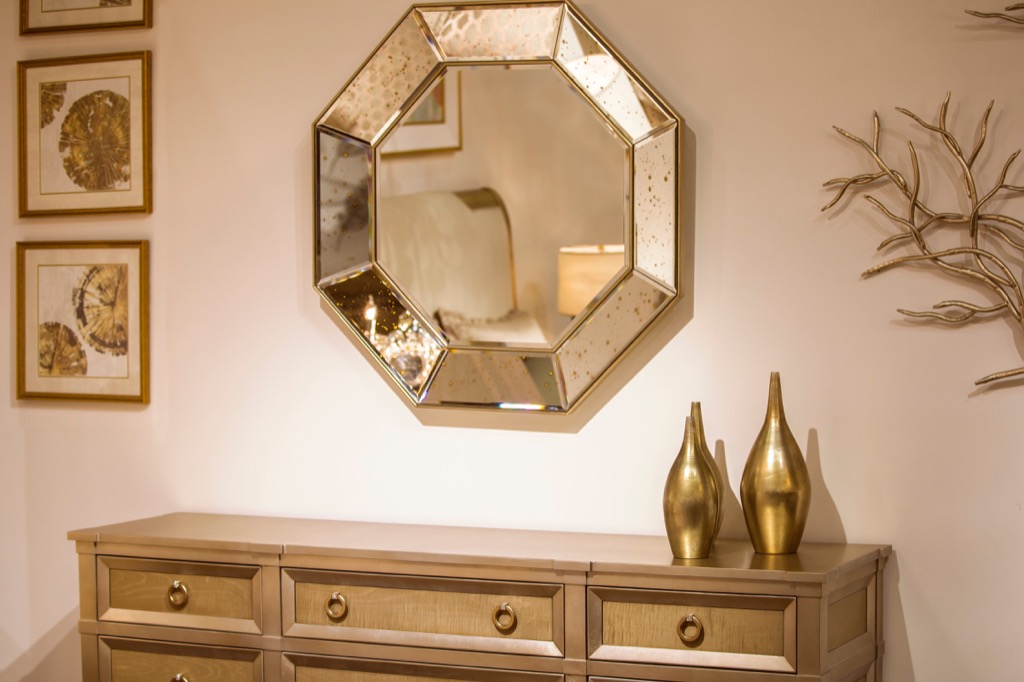
Sparkly accents like metallic backsplashes, shiny throw pillows, and glittery textiles had a major moment a few years back. Unfortunately, they now look dated, and, quite honestly, a bit tacky. Opt for classic jewel tones instead, and keep the metallics on the light fixtures and appliances (where they belong).
4
Posters
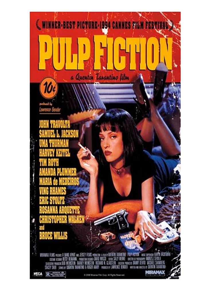
Nothing says “college student” like a poster of an exotic car. And even if you graduated to more sophisticated images—say, a Klimt print or that portrait of Einstein sticking his tongue out—posters still look tacky and cheap. By the time you can afford your own space, you can also afford legitimate artwork. Try your local vintage store or Etsy for some affordable finds. And before you buy anything, check out our guide to Wall Art 101.
5
Stenciling or borders
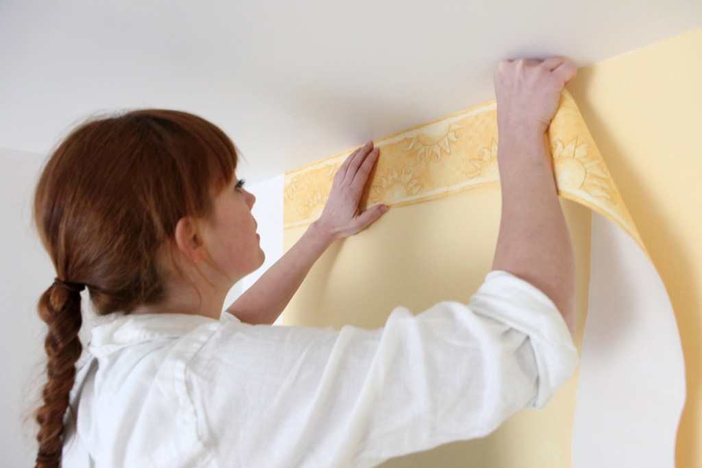
We understand if you just moved into a fixer-upper and haven’t had time to remove the last occupant’s unfortunate attempt at cottage style. But to save the room from further ruination, it’s best to remove or paint over that border or stenciling immediately—especially if it features any type of floral motif.
Instead, opt for a stylish wallpaper design that features geometric patterns or try and mix patterns and textures to build depth and add sophistication. Better yet, hire an interior designer and allow them to do it for you.
6
Mason jars
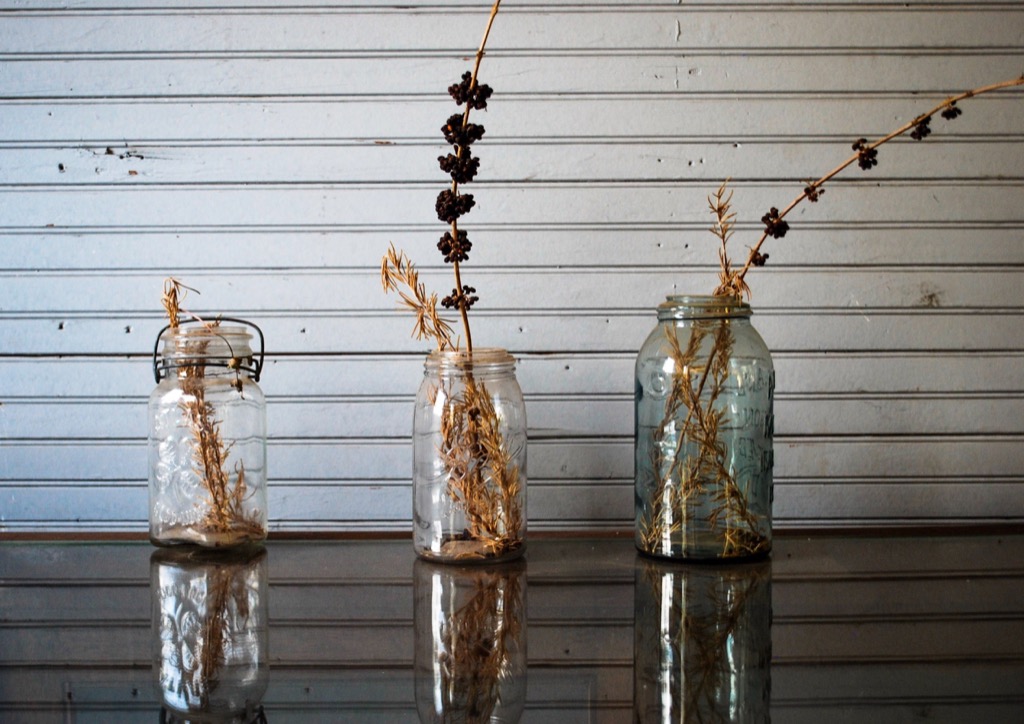
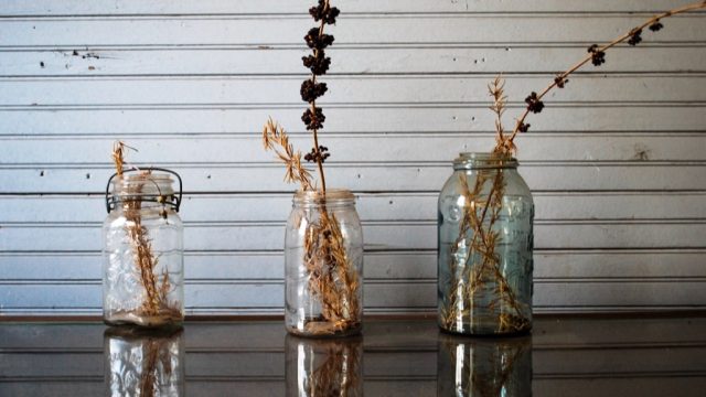
We get it, Mason jars are supremely useful and have been around for hundreds of years. But let’s leave them where they belong—in the pantry behind closed doors. Displaying Mason jars, even in the kitchen for holding utensils, has become an enormous cliché, made worse by the uninspiring trends of barn weddings and kitschy hipster bars. Opt for some local pottery instead, or mix together other vintage glassware in varying colors and styles for a more unique display.
7
Heavy drapes
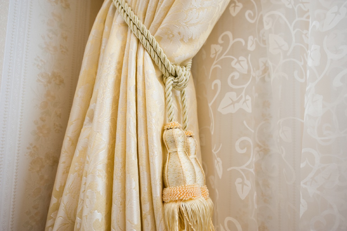
Sure, if you want your home to look like a mortuary, go ahead and keep your 20-pound drapes. If not, get rid of them ASAP. Monster drapes won’t do anything for a room besides collect dust and make the entire space feel depressing and moribund. Try out some truly light and airy curtains made of linen or another fabric that drapes well. And leave the over-the-top valances, swoops, and jabots behind—or risk committing one of the 30 Style Sins that Makes Your Home Look Hopelessly Outdated.
8
Wicker furniture
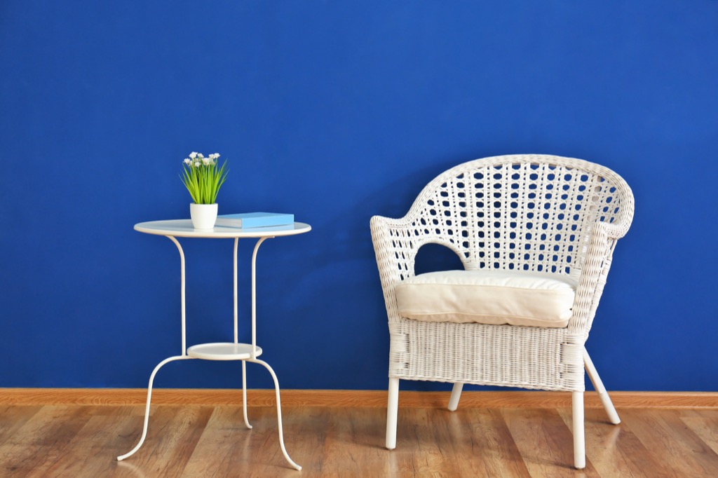
Wicker furniture was super popular in the’90s. And thankfully, 20 years later, we’ve come to our senses. These things look terrible, are super uncomfortable, and are often fitted with over-stuffed cushions in dated fabrics. Plus, they’re always about one-minute away from falling apart. Instead, choose furniture that’s made of actual furniture material, and keep the wicker stuff on the patio.
9
Lace anything
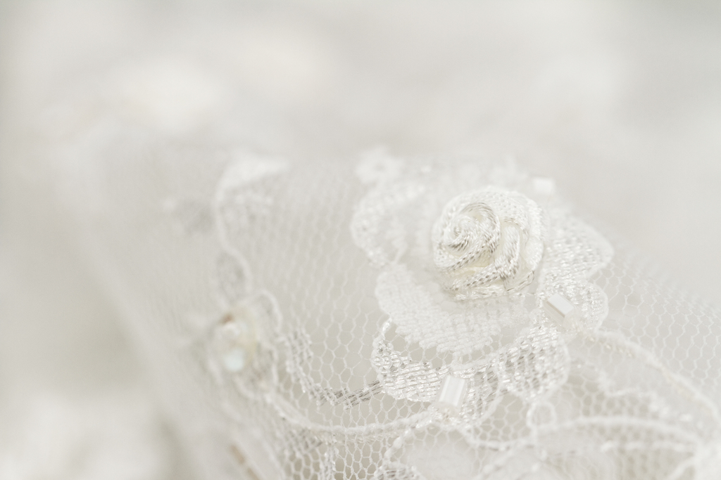
Lace doilies, curtains, and tablecloths scream “I’m old and have given up on cultivating style.” Gather up any and all of the lace in your home and replace them with modern fabrics in bold jewel tones, or textiles with interesting patterns and contrasting textures.
10
Vertical blinds
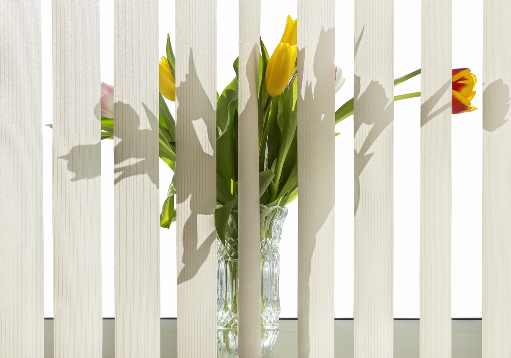
Vertical blinds are both hideous and absolutely terrible at doing their job. Of course, if you want your space to look like it’s straight out of an ’80s condo, then go for it—although you’ll have to put up with that ridiculous clattering sound they make as you shuttle them back and forth. Swap these things out for some airy curtains instead.
11
Cast-iron pipe shelving units

A few years back, a number of DIYers turned to cast-iron pipes to create industrial-looking shelves and towel hangers. It was fun for a while, but the time has passed. Using cast-iron pipes to build anything other than a functional plumbing system looks slapdash and amateur, not cool and stylish. If you still want to rock an industrial vibe, go for classic wood and steel shelving or, for something more modern, floating glass shelves.
12
Edison bulbs

The Edison bulb is another dying trend you should start unscrewing from your home’s fixtures as quickly as possible. Though they give off a warm and cozy feeling, every hipster restaurant and boutique from Brooklyn to the Bay Area is littered with them. Instead of pretending like we just invented the lightbulb and can’t stop marveling at the mysteries of electricity, ditch the bare bulb look and update your style with some beautiful bronze lamps or sophisticated sconces.
13
Bean bag chair
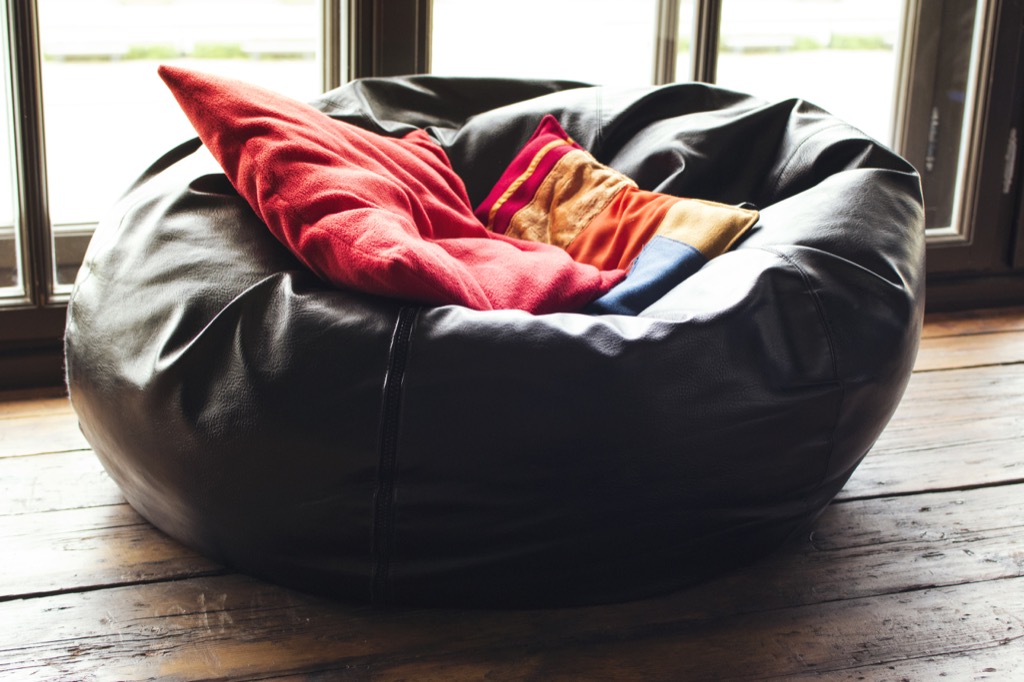
OK, we admit that bean bag chairs can be good fun. But if you must have one in your home, please relegate it to the kid’s playroom or the basement rec room. If you want a chair that’s as playful as it is comfy, look for something like an overstuffed orb-like Atomic Age chair in a bright color.
14
Words on the wall

Posting inspirational text (Believe in Yourself!) or cutesy sayings (Live, Laugh, Love) or literal descriptions of what happens in the room (Eat!) screams that you have an underdeveloped sense of style. Skip putting up any words, in a frame or directly onto the wall, anywhere in your home. Instead, hang family photos or artwork from your kids (mounted in quality frames) that are actually inspiring to you and your loved ones.
15
An accent wall
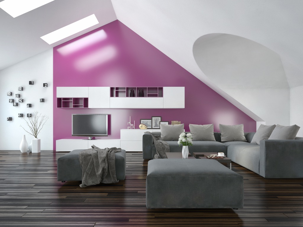
Accent walls can be done well, but not when they’re a horribly off-putting color or out-of-place pattern. Too strong of a color or pattern will be more distracting than anything. Instead, try a subdued color that closely matches the color already on the other walls. The subtle accent will do just that, “accentuate” the area—not make it a distracting focal point.
16
Open shelving
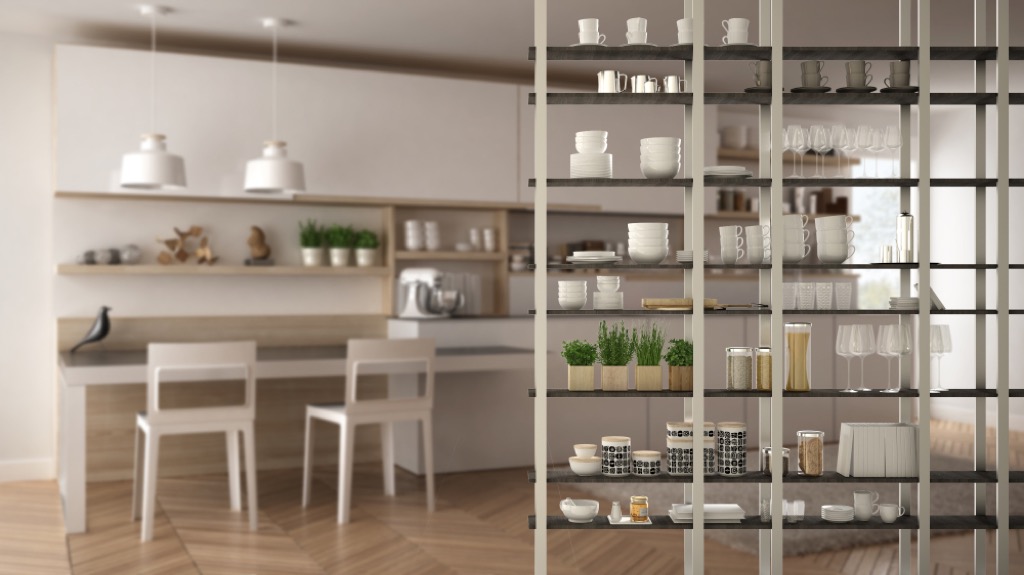
Open shelves are probably one of the biggest (and most controversial) kitchen trends of the past decade. Many folks swear by the ease of access they provide, while others opine that they make the kitchen look messy and cluttered. We say drop this trend and go for cabinets with real doors. Not only will they protect your dishes from dust and grime, but they’ll also give your kitchen a cleaner look.
Sponge paint
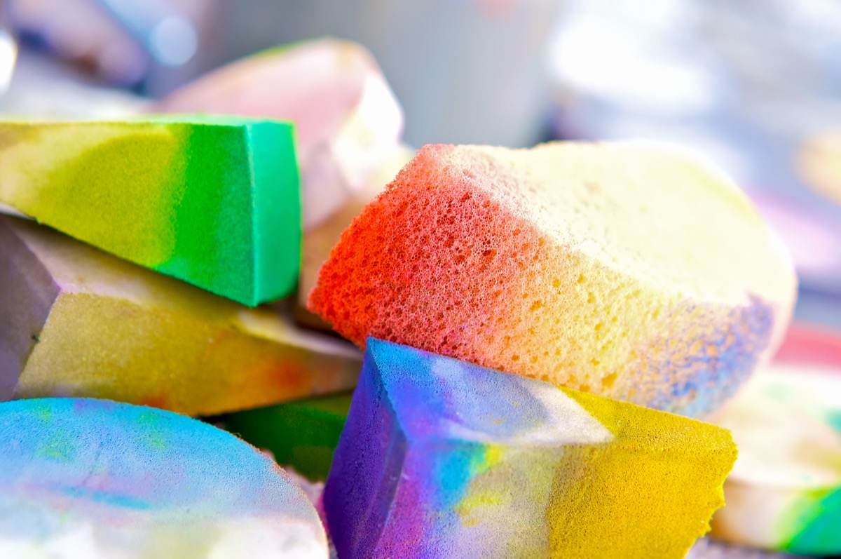
We understand, dabbing sponges on the wall to paint a border (or an entire room!) is a ton of fun. But this paint trend will never be a good look. At best, a sponge-painted wall will look like you simply forgot to finish painting. At worst, it’ll look like a failed child’s art project. Opt for a solid color or a stylish wallpaper.
18
Pallet wood projects
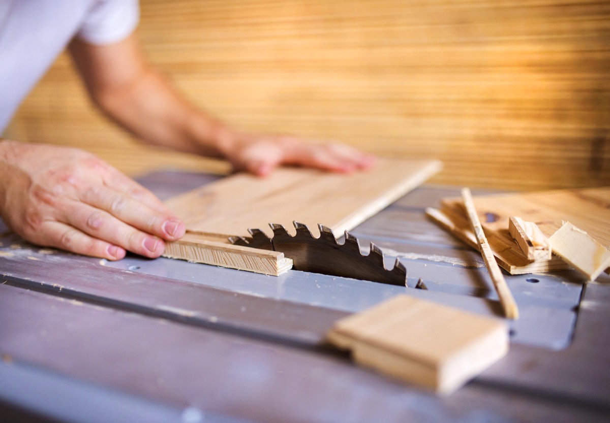
No matter how well you did in your high-school woodworking class, you should never attempt to build your own accent wall or picture frame out of a flimsy wood pallet. For one, pallets are usually made of cheap pine that doesn’t deserve space in your home. And for another, it just won’t age well, as this trend is most certainly on its way out.
19
Granite countertops
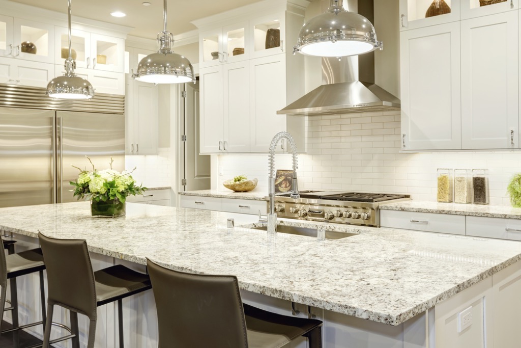
This countertop material burst on the scene 20 years ago—and now it’s way overdone. The veins and patterns that come with dark granite are often too busy and can instantly make your kitchen look dated and gloomy. Instead, choose a lighter countertop with veins that are less hectic. A classic slab of marble with soft gray accents, or a slab of man-made quartz with a matte finish are good places to start.
20
Imitation marble
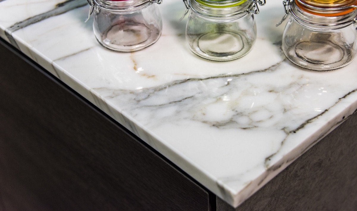
Marble is good. Imitation marble is not. From sconces to countertops, phony marble finishes scream ’80s excess and faux opulence. Replace these imposters with the real thing, or choose something more affordable. Your bathroom doesn’t have to be covered in stone to look expensive.
21
Entertainment center
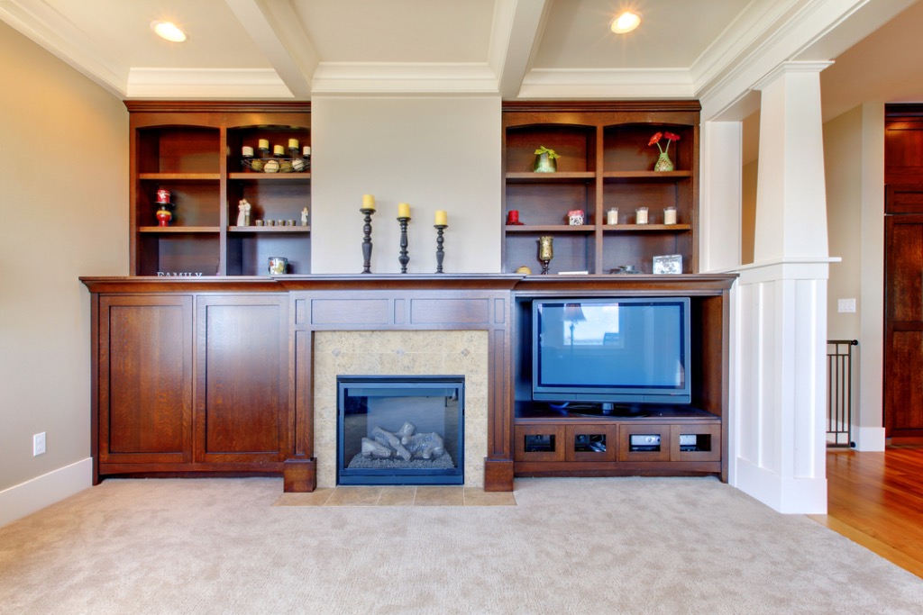
The days of creating a shrine around your new flat-screen TV are long gone. Nothing ruins a living room faster than a hulking mass of an entertainment center—bonus negative points if it’s black and has swinging glass doors. You’ll also want to avoid the recent trend of hanging the TV over the fireplace and mantel. The screen will be way too high and will compete with the majesty of your mantel. Place your television next to the mantel or on the opposite side of the room.
22
Floating rugs
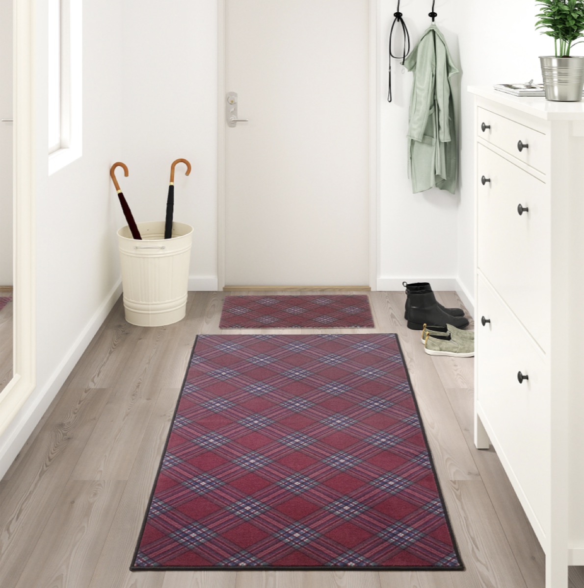
Rugs are an easy way to add drama and dimension to any room. But if you don’t purchase the right size for your space, you’ll end up with a dinky rug that’s not anchored by any pieces of furniture, also referred to as a “floating” rug. This fix is simple: Measure your room before you head to the store and pick up a rug that is big enough so at least the front feet of your furniture will rest on top of it.
23
Hollywood vanity lights
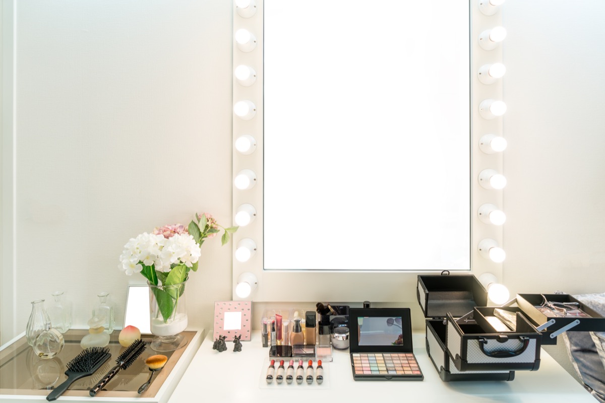
It’s tough to make too many decorating mistakes in the bathroom, but Hollywood lights are one of them. These do serve a purpose if you’re getting made up to star in the newest blockbuster, but in a regular home, they are simply too much. Try some tubular sconces within a nickel or bronze finish to class up your vanity without blinding yourself every morning. And while we’re on the subject of bathrooms, toilet rugs are another major don’t. If you just found out you need to throw out some things in your house, check out 23 Affordable Ways to Completely Re-Do Your Home.
To discover more amazing secrets about living your best life, click here to follow us on Instagram!