30 Secret Messages Hidden in Popular Logos
Though they’re small and relatively simple in design, many company logos are actually pretty complex when it comes to messaging. If you know how to read between the lines (or within the negative space), you’ll find that everything—even the colors of a font or the placement of an arrow—has an intentional meaning that relates back to the company’s core message.
Herein, we’ve gathered some of the craziest and most surprising secret messages hidden in logos. And for more hiding-in-plain-sight secrets you might’ve missed, These Are the Hidden Messages In the Official Royal Wedding Portraits.
1
Wendy’s
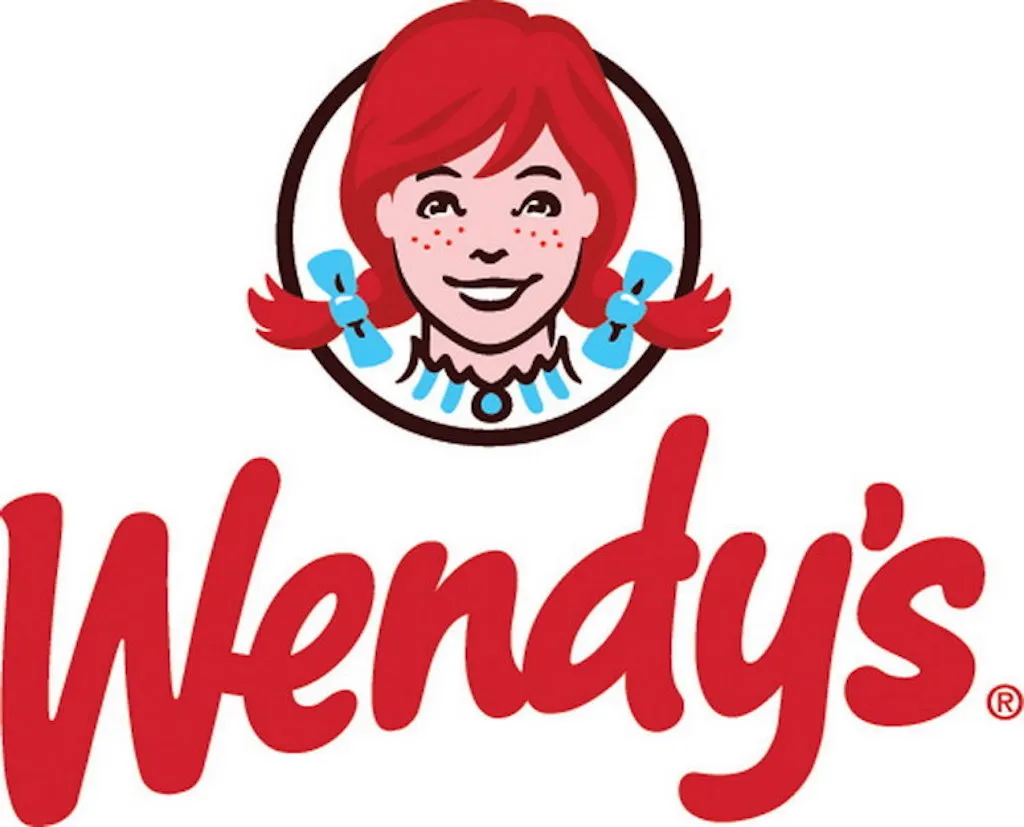
Can you see the secret message? Buried in the ruffles of the little girl’s collar in the Wendy’s logo is the word “mom.” When the hidden word was first discovered by online users, the prevailing theory was that the company snuck the word in there to associate their food with mom’s home cooking. However, Wendy’s has said that the word was unintentional, and any supposed subliminal message doesn’t actually exist (at least not on purpose).
2
Beats by Dre
At first glance, the Beats by Dre logo is little more than a red circle with the letter b inside of it. However, that red circle is actually also supposed to represent a human’s head, and the b is supposed to be a pair of Beats headphones over their ears.
3
Cisco
If you know what the company Cisco does, then you already know that the lines in their logo are meant to represent a digital signal. But what you might not know is that the telecommunications company got its start in San Francisco, and so those lines are also meant to outline the city’s Golden Gate Bridge. Crazy, right? And for more interesting trivia, check out the 50 Fun Facts About the World That Will Put a Smile on Your Face.
4
Amazon

The arrow in the Amazon logo is placed with a very specific purpose in mind. If you look carefully, you’ll see that the arrow connects the letter A to the letter Z, signifying that on the website you’ll find everything you need from A to Z.
5
Gamecube

Every gamer and former ’90s and ’00s kid knows the Nintendo Gamecube well. And as the name suggests, the logo is nice and simple: It’s just a cube encapsulated in a bigger cube. Right?
Well, if you pay close attention to the negative space between the boxes, you’ll actually be able to make out the letters G and C in that same logo. And for games 21st-century games to play, check out these 8 Cutting-Edge Video Games That Will Make You Smarter.
6
The Bronx Zoo
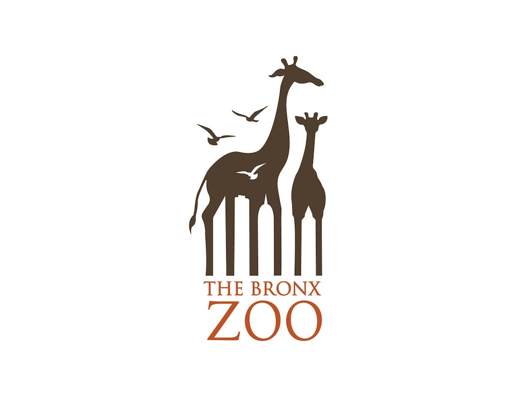
Seeing as the Bronx Zoo’s main attractions are its many animal exhibits, it makes sense that its logo prominently features two giraffes and a few flying birds. And for this specific zoo, being located in a borough of New York City is another huge identifying factor, so it also makes senses that hidden between the legs of the giraffes is the city’s iconic skyline. And for some amazing animal kingdom trivia, meet the 30 Adorable Animals That Are Actually Deadly.
7
Goodwill Industries International
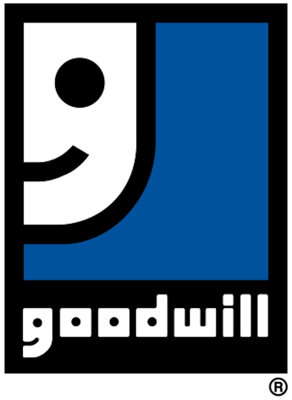
This nonprofit works hard to improve people’s lives and put smiles on their faces, and so it’s fitting that the g in their logo doubles as a smiling face (twice).
8
Hershey’s Kisses
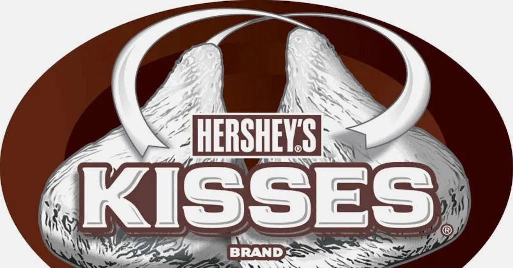
Everyone can easily spot the two giant Hershey’s Kisses featured prominently in the center of the brand’s logo, but what about a third kiss? If you look between the letters K and I and tilt your head to the left, you’ll see the extra kiss squeezed in there.
9
Tostitos
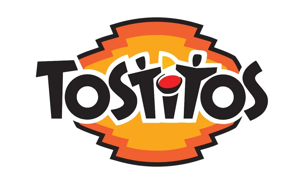
Famous for their tortilla chips and accompanying dips, Tostitos has perhaps one of the best hidden logo messages of all time. The two lowercase t‘s in the logo represent people holding a chip, and the dot on top of the letter i serves as their bowl of salsa.
10
FedEx
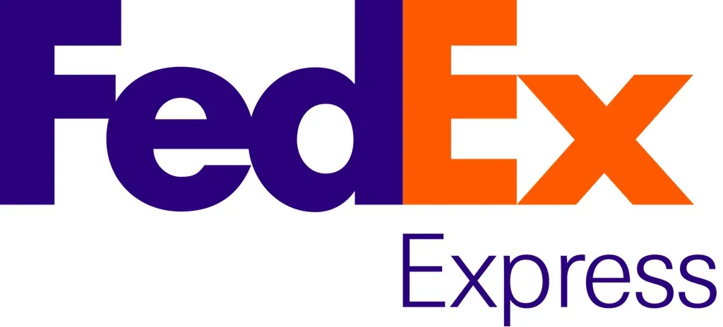
Hidden between the negative space of the letters e and x in the FedEx logo is an arrow pointing to the right. As Lindon Leader, the logo’s designer, explained to Fast Company, that arrow “could connote forward direction, speed, and precision,” but beauty (and meaning) is in the eye of the beholder. And for more interesting business trivia, Here’s Where These Famous Companies Got Their Famous Names.
11
Baskin-Robbins
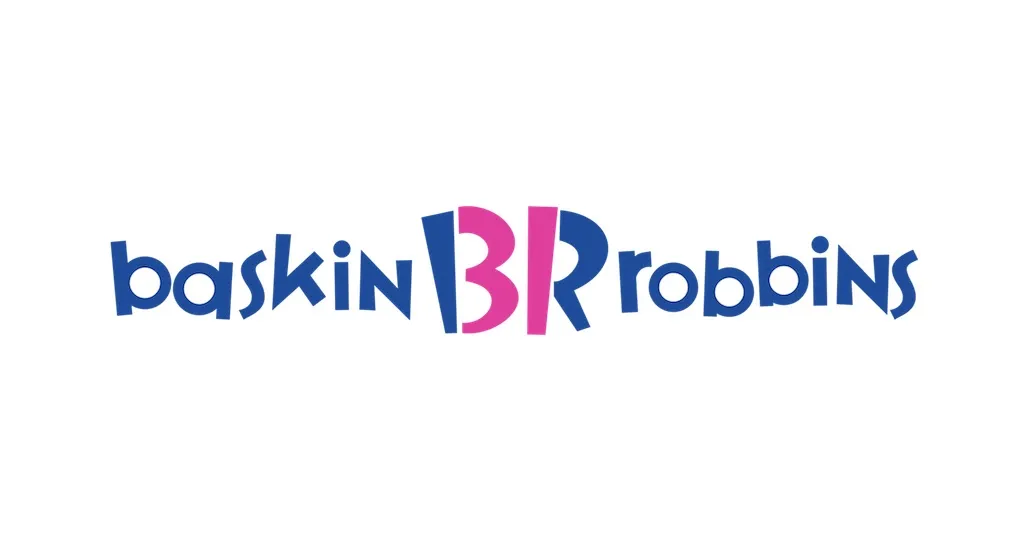
Think about how many flavors of ice cream Baskin-Robbins serves. (If you don’t already know, they serve 31.) With that in mind, take a look at the B and R in the center of the company’s logo, and you should see that very number written in pink.
12
Gillette

To demonstrate the precision of their product, this razor company decided to cut the tips of the letters g and i in their logo as if an actual razor had done it.
13
Hope for African Children Initiative (HACI)
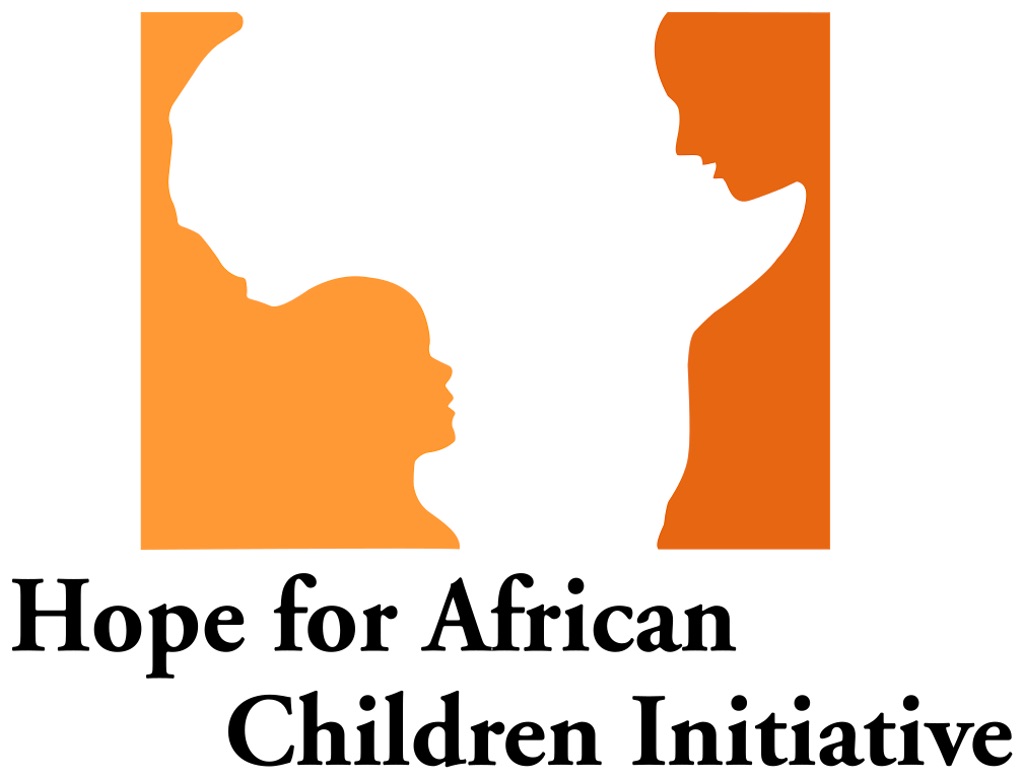
The Hope for African Children Initiative, or HACI, aims to support African communities by making children’s lives better. And in their logo, both the areas they help and the people they serve are represented, seeing as the negative space in the image helps to create both an image of the continent of Africa and a child looking up at an older woman.
14
Jack in the Box
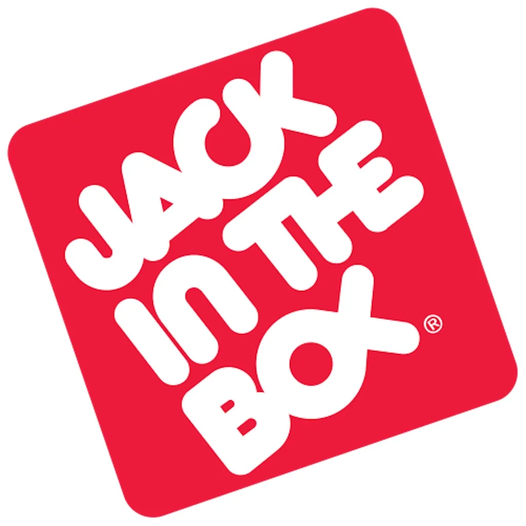
Though no one is entirely sure as to why, the original Jack in the Box logo fused the letters o and x together to create a fish symbol. (One theory: they were really into their fish sandwiches at founding time.)
15
Toblerone
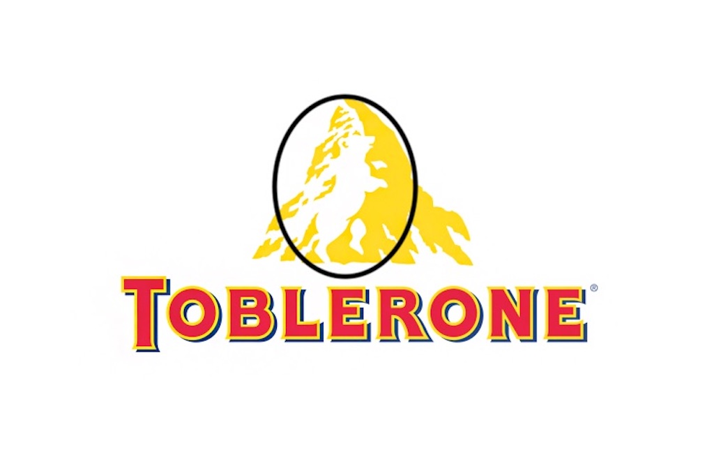
Bern, Switzerland—where Toblerone was founded—is often referred to as the City of Bears. Therefore, when the company created its logo, it decided to hide the outline of a bear in the negative space of the Matterhorn Mountain. And if you love interesting facts, then check out these 30 Life-Changing Inventions That Were Totally Accidental.
16
LG
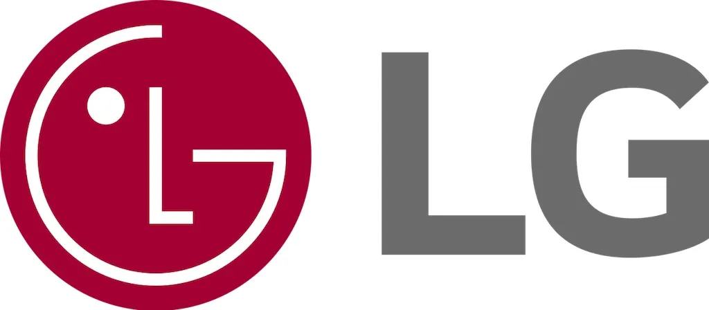
Most people can almost immediately recognize the winking face logo of phone company LG. However, if you look at the logo with a discerning eye, you’ll notice that the company’s iconic winking face is actually compromised of an L (making up the nose) and a G (making up the shape of the face).
17
Pittsburgh Zoo & Aquarium

Look at the negative space on either side of the tree in this logo. With just a little bit of focus, you should be able to see a gorilla on the left and a lion on the right.
18
Chick-Fil-A
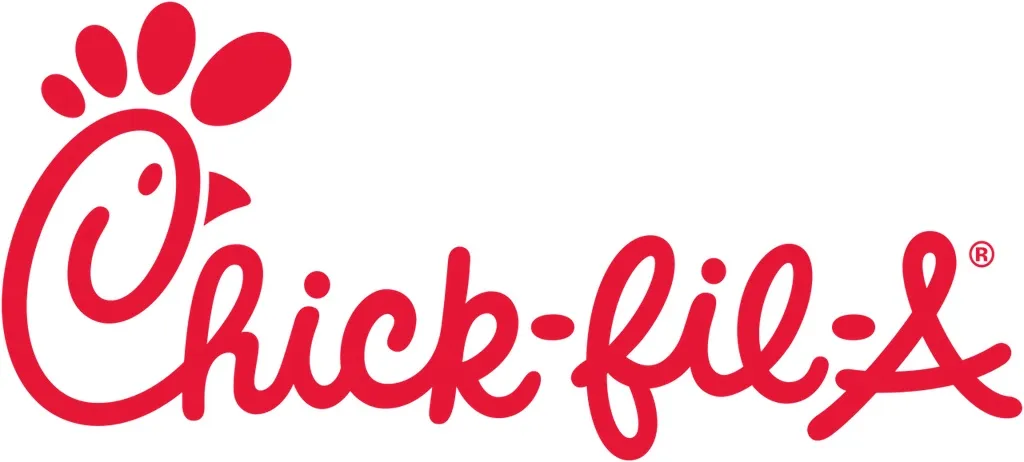
This fast food chain’s slogan is “Eat Mor Chikin,” so it should come as little surprise that the C in their logo doubles as—you guessed it—a chicken.
19
NBC
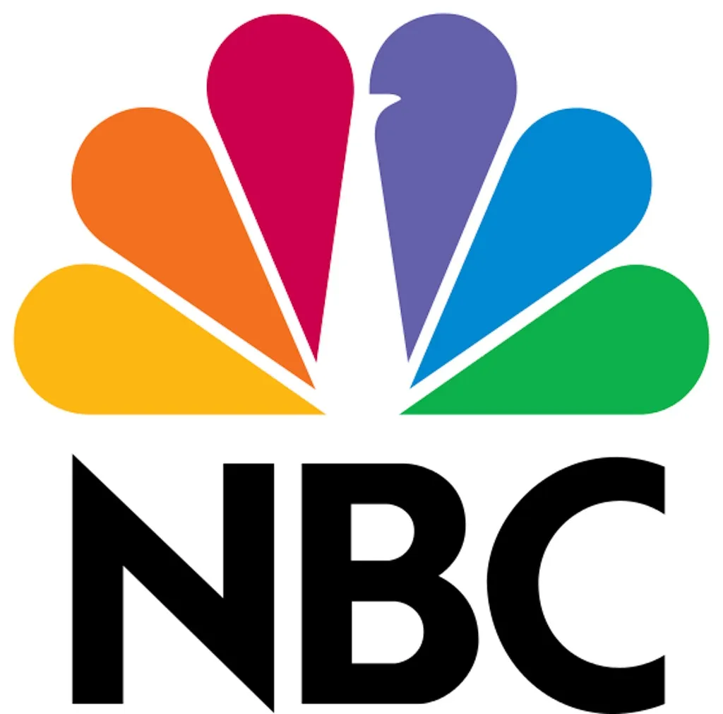
The rainbow colors in the NBC logo are far from random. Rather, combined with the negative white space, these colors create a peacock, intended to represent the company’s pride in the programs they create and the shows they broadcast.
20
Adidas
Ever wonder what those three stripes in the Adidas logo actually meant? Well, the reason that they’re drawn at an angle is because together they represent a mountain, thereby symbolizing the challenges that customers must strive to overcome every day.
21
Google
“There were a lot of different color iterations [of the Google logo]”, said Ruth Kedar, the graphic designer behind the original logo. “We ended up with the primary colors, but instead of having the pattern go in order, we put a secondary color on the L, which brought back the idea that Google doesn’t follow the rules.” And for deeper insight into this iconic brand, don’t miss these 15 Things You Don’t Know about Google.
22
Sun Microsystems
It might not look like much at first glance—but what’s cool about the Sun Microsystems logo is that no matter how you look at it, you’ll still be able to read the word sun.
23
Apple
Though the designer of the Apple logo had nothing in particular in mind when creating the iconic bitten apple, it’s nevertheless managed to pick up several secret messages over the years thanks to a feverous fanbase. Though there are many hidden meanings, of the most beloved is that the apple is meant to represent knowledge, just like the apple in the story of Adam and Eve.
24
Audi

The four circles that comprise the Audi logo represent the four companies that made up the Auto-Union Consortium in 1932: DKW, Horch, Wanderer, and Audi. And you’re automobile aficionado, then check out the 21 Worst Cars of the 21st Century.
25
Carrefour
The name of this French supermarket chain means “crossroads” in English, so it makes sense that their logo features arrows pointing in opposite directions. And bonus: If you focus on the negative space of the logo, you’ll be able to also spot the letter C.
26
Subway
The Subway logo features arrows pointing in opposite directions to represent the entrance and exit of a subway station, symbolizing that you can have delicious fast food on the go.
27
Milwaukee Brewers
From 1978 to 1993, the Milwaukee Brewers used this iconic logo, which combined the lowercase letters m and b to create a baseball glove.
28
Domino’s
When Domino’s first opened, the founders didn’t expect the pizza chain to get as big as it did, and so they intended to add a dot to the dominos in the logo every time a new location opened. However, the company quickly grew too big to do such a thing, and so today the three dots in the logo represent the three original locations.
29
Paramount Pictures
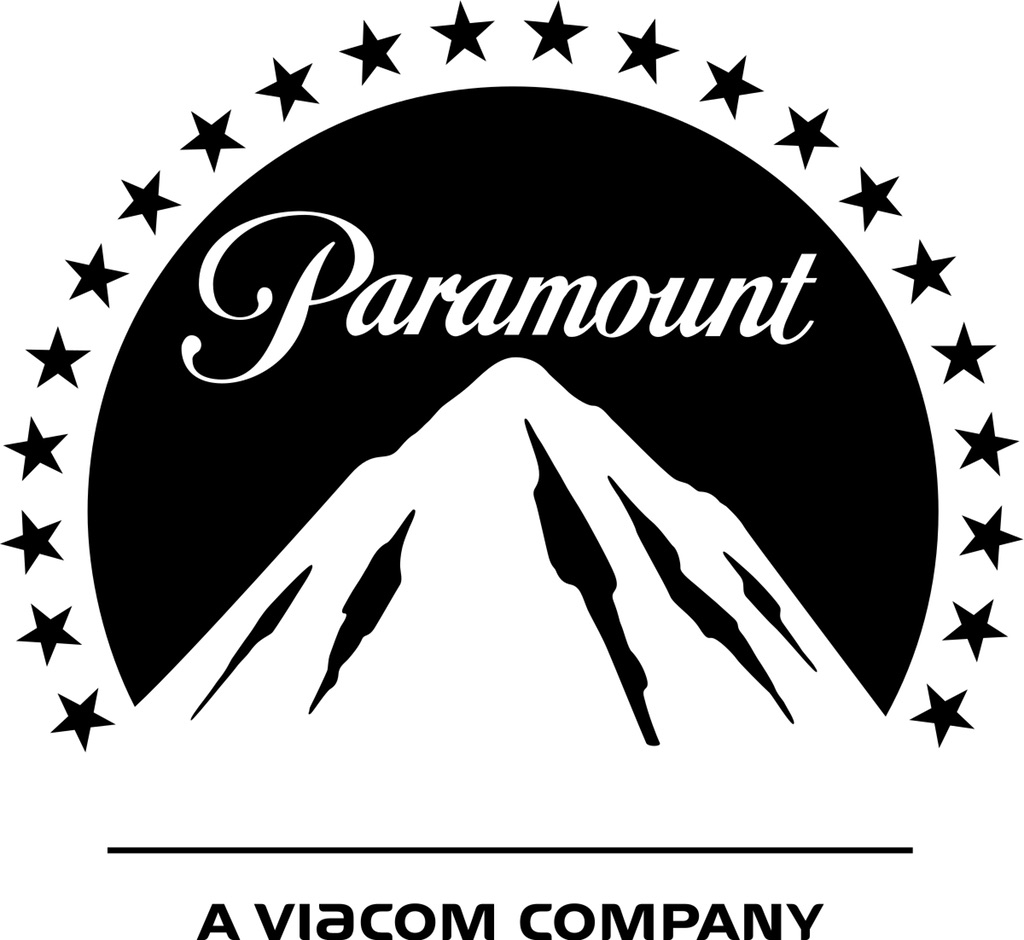
Paramount’s original logo had 24 stars, symbolizing the number of contracted movie stars it had at the time of the logo’s inception. The logo has only had 22 stars since the 1970s, though no one is entirely sure where the other two stars went or why.
30
Pinterest
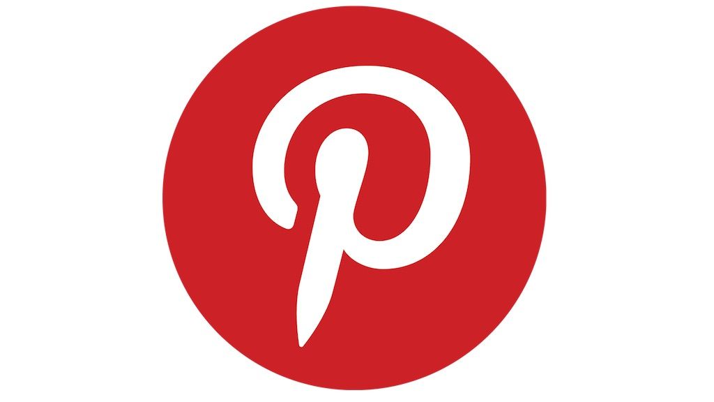
The giant p in the Pinterest logo is more than meets the eye. Of course, it’s quite literally the first letter in the brand’s name, but the way it’s drawn is also meant to look like a push pin (because Pinterest boards—get it?). And for more fascinating trivia about your favorite brands, learn the 15 Things Dictator Bosses Banned at Their Companies.
To discover more amazing secrets about living your best life, click here to sign up for our FREE daily newsletter!