40 Ugliest Interior Design Trends of All Time
Interior design trends say a lot about the times in which they emerged. From the opulent gold accents of the Gilded Age to the vibrant psychedelic patterns of the 1970s, décor mimics what’s going on in society at large. But that doesn’t mean all of these trends are nice to look at. We’ve spent some time uncovering the worst design trends of all time. Read on to find out why you should consider a remodel if any of these 40 looks are in your home.
1
Pink Bathrooms
Pink bathrooms were huge in the middle of the 20th century, largely thanks to First Lady Mamie Eisenhower. She famously redecorated one of the White House bathrooms in pink, which eventually resulted in the nickname “The Pink Palace.”
Pam Kueber of Retro Renovation says that approximately 5 million out of the 20 million homes built between 1946 and 1966 had at least one pink bathroom. Though many have since been redone, be forewarned: This trend is making a comeback.
2
Red Vinyl
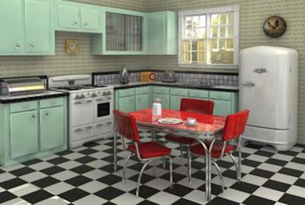
At one point in the 1950s, red vinyl was such a popular design element that it was featured on numerous chairs throughout the United Nations building in New York City. But today, red vinyl only belongs in diners.
3
Linoleum Flooring
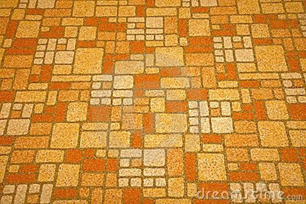
Linoleum flooring was especially popular in the ’50s when bright and vivid colors were the rage.
It was also a hit because it’s economical and easy to clean. But with the great vinyl flooring alternatives we have now, linoleum—especially patterned designs like the one above—has fallen out of favor.
4
Round Beds
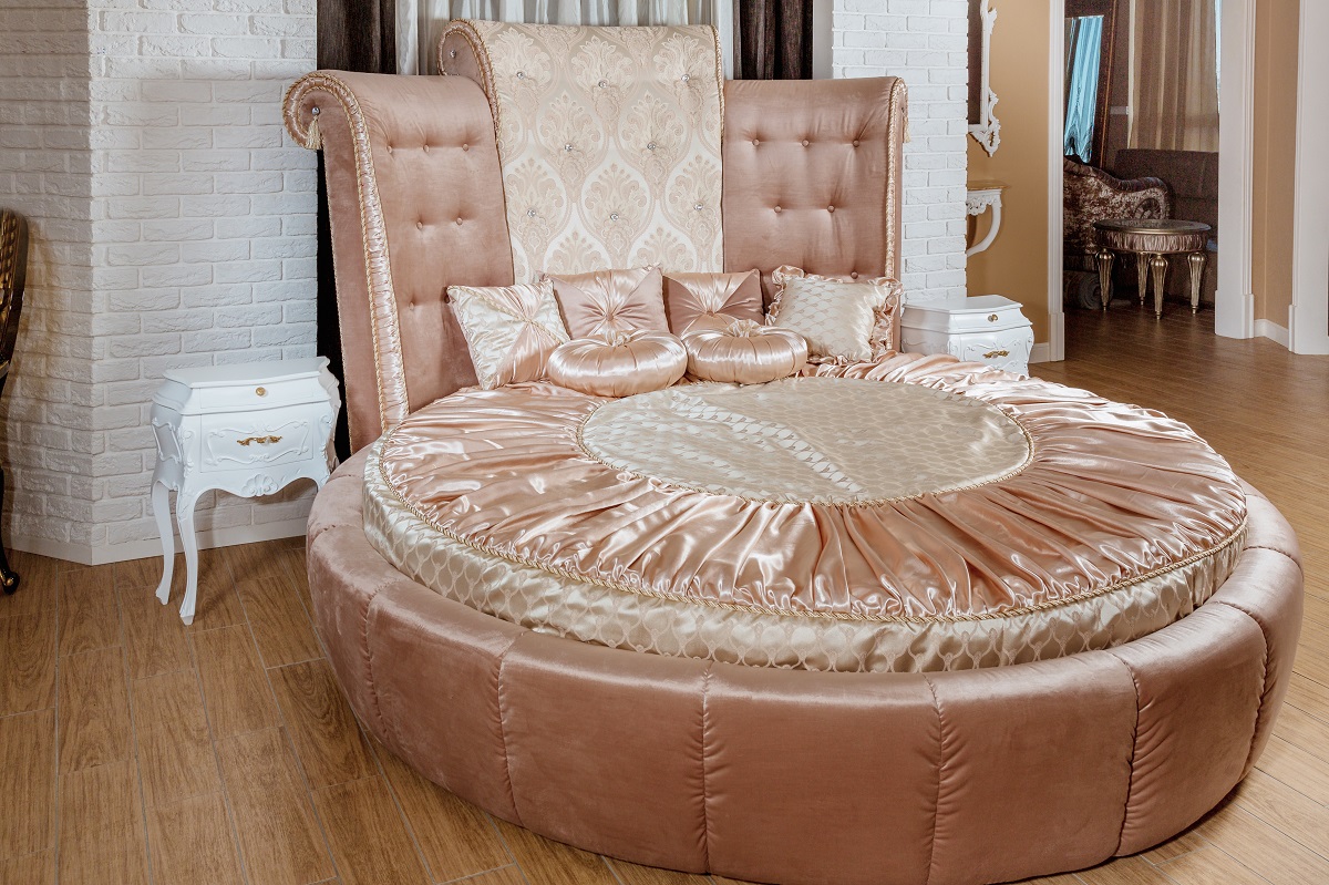
Round beds first made an appearance during the Space Age design revolution in the 1960s. “Gimmicky at first, circular beds quickly found favor in hotels and resorts,” according to The Los Angeles Times’ David A. Keeps.
But these days, they don’t have many fans. According to a 2018 U.K. survey conducted by Samsung on the most hated design trends of all time, 17 percent of voters thought round beds were worse than any other look from the past.
5
Waterbeds
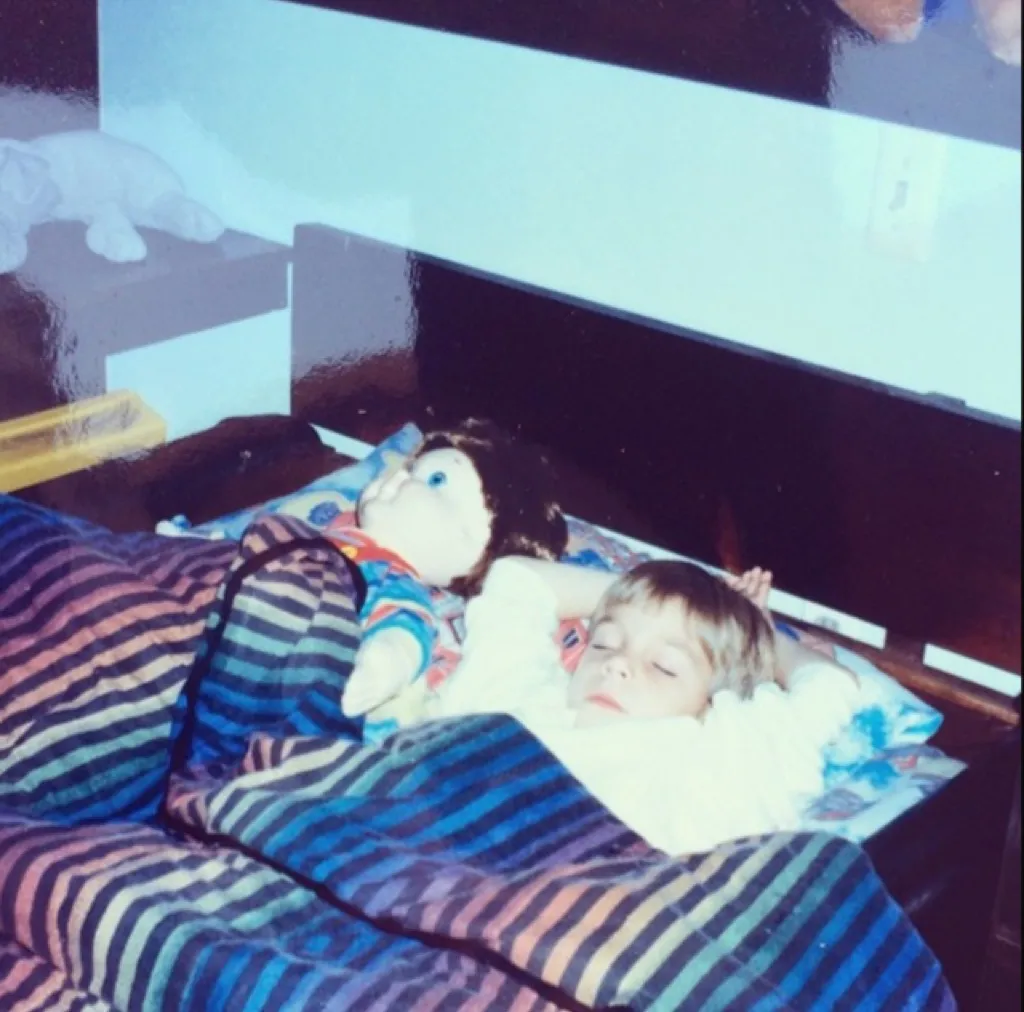
These have been around since the 1800s, but not in the form that gained popularity in the 1960s, ’70s, and ’80s. Teens and twenty-somethings everywhere wanted a waterbed to rock them to sleep.
But they’re not for everyone. According to Samsung’s survey, 25 percent of those surveyed said waterbeds were the worst home trend of the last 50 years.
6
Tie-Dye Furniture
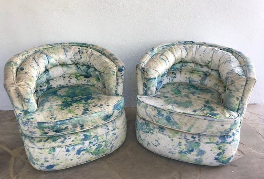
As you can imagine, tie-dye prints were incredibly popular in the 1960s and ’70s, thanks to the emergence of hippie culture. Especially in the early part of the ’70s, tie-dye furniture found its way into millions of homes.
Up Tied, one of the foremost creators of this fabric, won a Coty American Fashion Critics’ Awards for their tie-dye fabric. But you’re more likely to see the chairs above in an interior design museum nowadays.
7
Wood Paneling
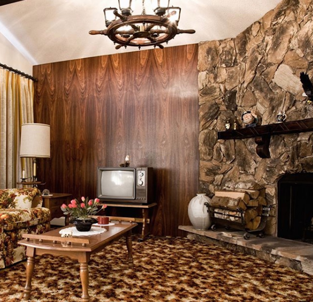
Wood paneling was incredibly popular in the late part of the ’60s and throughout the ’70s, mainly because it was affordable. We now know that heavy dark walls make a room look smaller, so wood paneling has fallen out of favor.
However, according to the National Association of Realtors, this look has come back in the form of accent walls and in lighter colors, courtesy of Joanna Gaines’ affinity for white shiplap.
8
Animal Print Overload
With the premiere of The Graduate in 1967 came the obsession with Mrs. Robinson’s lust for animal print everything, according to Vogue. In fact, thanks to Anne Bancroft’s character, animal print came to signify high class and a certain level of wealth.
Today, however, too much is considered tacky and using the real stuff is just cruel.
9
Avocado Green Bedrooms
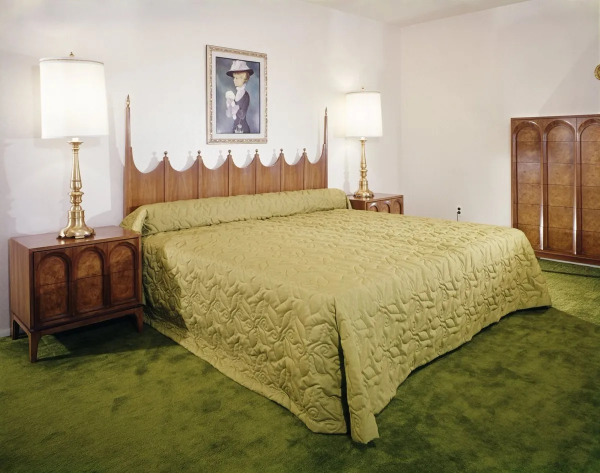
According to Elle Decor, avocado green became especially popular at the close of the Vietnam War in the 1970s. Though avocado toast may be all the rage, covering your bedroom in a color reminiscent of the trendy food is another story.
10
Avocado Green Bathrooms
Avocado bathrooms were also popular in the ’70s. But these days, they’re a major no-no. According to the Samsung survey, avocado green bathrooms are another one of the worst décor trends of all time: 32 percent of voters said it was the worst.
11
Furry Toilet Seat Covers
What could make an avocado bathroom even uglier? A fuzzy toilet seat cover, of course. As it turns out, this was the single most hated décor trend of all time, according to the Samsung survey.
12
Shag Carpeting
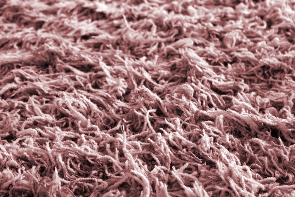
The Brady Brunch greatly influenced every aesthetic in the 1970s. And because of Mike and Carol, shag carpeting was the floor covering to have. “There were highly creative shags… textured sculpted multicolors creating all these different visuals,” explains Emily Morrow of Shaw Floors.
This 1970s trend also played into an affinity many people had for texture. But while they may have felt nice under your feet, shag carpets were very hard to clean, according to Architectural Digest.
13
Carpeted Walls
We get the shag carpets, but carpeted bathrooms? That does not give us the warm and fuzzy feeling. There are many obvious problems with carpeted walls (vacuuming, for one), but hey, they do add texture.
14
Vertical Blinds

First invented by Edward and Frederick Bopp in 1950, vertical blinds were a hit from the 1970s through the ’90s. While they may be practical, today they just feel like a relic of the past.
15
Tartan Everything
In past decades, overdoing a design was a fashion statement itself. For instance, take the plaid trend that dominated the 1970s. One tartan pattern was often splashed across entire rooms, creating the dreaded kaleidoscope effect.
Again, in moderation, plaid isn’t terrible, but in excess, it reeks of loud (and outdated) style.
16
Beaded Curtains
As the world was falling in love with The Mary Tyler Moore Show in the ’70s, they were also ogling the beaded curtains in quirky neighbor Rhoda Morgenstern’s apartment.
“Although Rhoda was branded an eccentric, her love beads were right on track,” The New York Times’ Stephen Treffinger wrote. “Bead curtains give a gentle sense of separation. They filter light but allow plenty through. They give a sense of privacy while providing a view. They are the ultimate noncurtain, whether used in a window or doorway, or as a room divider.”
Sure, you can still get these kinds of blinds on Etsy today. But we recommend spending your money elsewhere.
17
Wicker Furniture Indoors
Like many ’70s trends that were influenced by earthiness, indoor wicker furniture was an attempt for homeowners to bring elements of the earth and the outdoors into their home. Again, it speaks to the hippie influence that was shaping the country during the latter half of the ’70s.
18
TV Cupboards
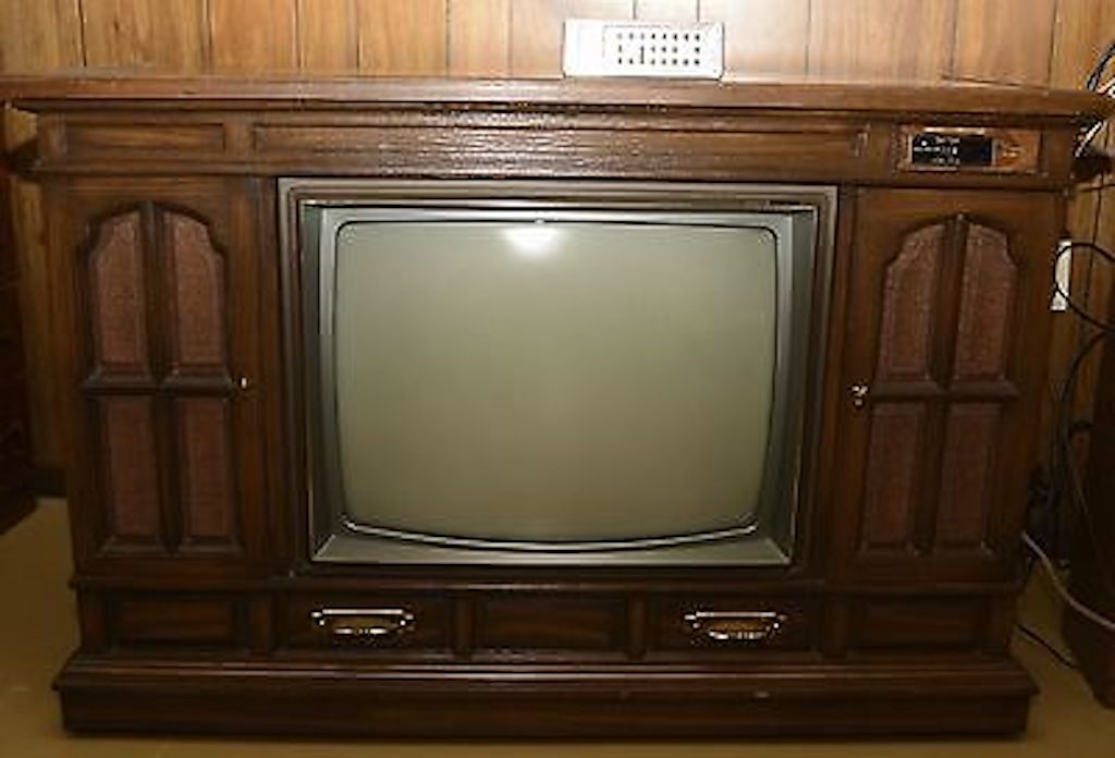
As televisions were growing in size, so were the cupboards that inevitably contained them. These pieces of furniture made it possible for homeowners to hide their TVs and the cords and bulk that came with them. But in turn, they just looked big and bulky themselves.
19
Harvest Gold Appliances
Like avocado green, harvest gold was used on many appliances, from refrigerators to dishwashers. Unfortunately, this gloomy 1970s and ’80s look paved the way for even darker tones in the ’90s. “Harvest Gold gets a deservedly bad rap,” design site Lonny wrote.
That said, it has made a bit of a comeback in a more subtle fashion. “This time around, the color feels a bit more muted and subtle—not nearly as brash as my childhood!” designer Scot Meacham Wood told House Beautiful.
20
Floral Takeover
Florals are used as accents in today’s interior décor looks, but they were once the focal point of nearly every bedroom in the 1980s.
As Architectural Digest‘s Megan Deem wrote: “Even city dwellers could dream they were sleeping in pastoral England, thanks to Laura Ashley’s matching floral bedding.”
21
Dusty Pastels
In the 1980s, there was an unquenchable thirst for all things muted pastel. Dusty blue and pink were especially popular during this era, extending beyond interior design and into the world of fashion, too. In the late ’80s, with shows like Miami Vice, “pastels had a ‘mini moment,'” Leatrice Eiseman, executive director of the Pantone Color Institute, told Fast Company.
The Southwestern aesthetic was also trendy during this time, and thus, dusty peaches and turquoises also became popular.
22
Ruffled Bedding
Most homeowners now forfeit bedskirts in the name of minimalism, but they were quite the fashion statement in the 1980s. And they usually had as many ruffles as possible.
In fact, everything on your bed often resembled a pile of pastel ruffles in the ’80s. The goal was to look like you lived as a Victorian family would. Goal accomplished, we guess?
23
Floral Chintz Furniture
Chintz gained so much popularity in the 1980s that it became an obsession. Even the Prince of Chintz himself, iconic designer Mario Buatta, admitted to Vogue: “Chintz was overdone in the ‘80s.”
In the U.K. in the ’90s, Ikea came up with a “Chuck out your Chintz” ad, which showed housewives violently tossing their floral drapes and furniture into an Ikea dumpster. You get the picture.
24
Rag-Rolled Walls
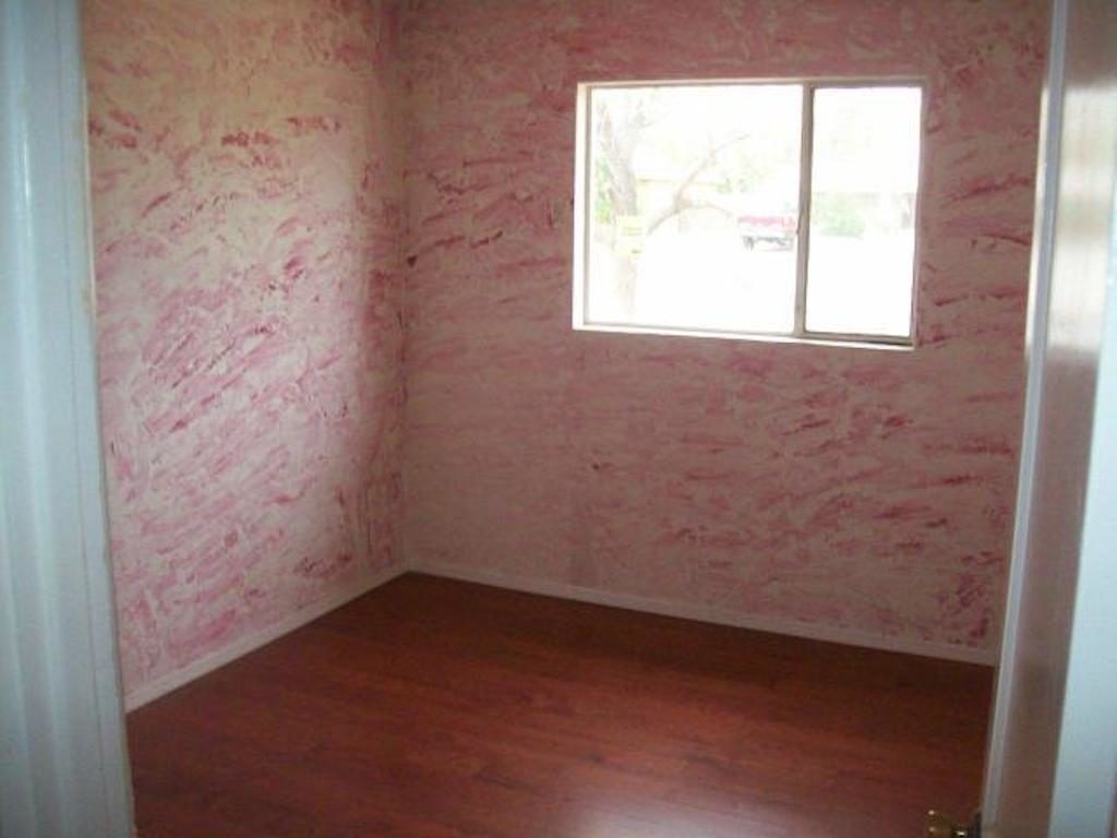
This trend—which involved dipping cloth in paint and smudging it on the walls—emerged in the 1980s. According to Ideal Home, it was an attempt to hide imperfections and to create a kind of aged look “found on old porcelain or rustic stoneware.”
But unfortunately, it’s pretty unconvincing. A few nix and marks here and there probably would’ve been better.
25
Glass Blocks
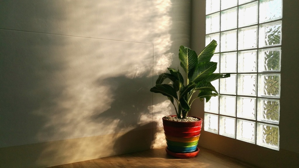
In the 1980s and ’90s, glass blocks were used as room separators and in showers, as a way to improve lighting.
Since then, we’ve found more efficient (and stylish) ways to keep spaces light, like skylights and open floor plans. And thank goodness because these blocks scream dated.
26
Popcorn Ceiling
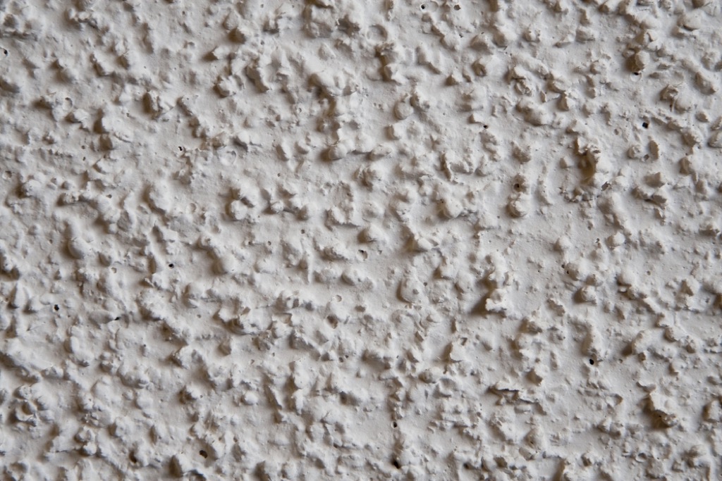
The only design element more outdated than glass blocks might be popcorn ceilings. In the ’80s and ’90s, this ’60s style came back in full force as homeowners again wanted texture, texture, and more texture.
Now, it’s one of the first things new homebuyers want to remove. But be warned, it can cost up to $1,500 to do so.
27
Sponge Walls
While using your own artistic flair in your home is a great idea, bringing this ’90s DIY trend back is not the way to go about it. This textured effect only makes your home look cheap, says Complex’s Leigh Silver.
28
Fake Fruit
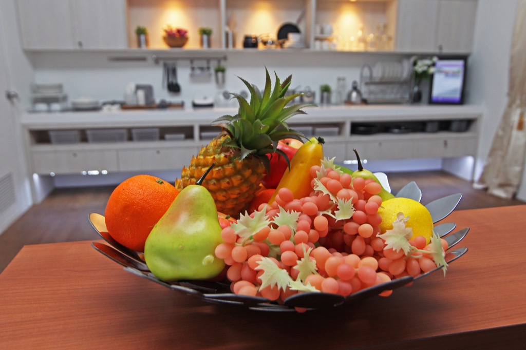
While it’s always a good idea to fill your home with real fruits and vegetables, using fake substitutes—as was the style in the 1990s—makes your home look outdated and cold.
29
Fake Flowers
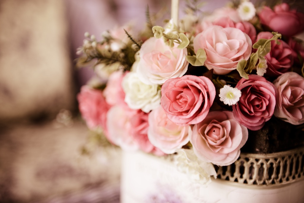
Just like the fake produce, keeping fake flowers around—which was also common in the ’90s—only makes your home seem less inviting and stale. The real deal is worth splurging on, especially since it’s been scientifically proven that keeping real flowers and plants around significantly boosts your overall health.
30
Tribal Decorations
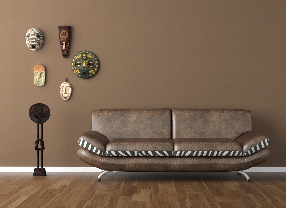
While it’s always interesting and personable to add cultural touches to your home, opting for trendy tribal prints of the 1990s isn’t the best approach. Mass-produced tribal decorations, like the one pictured above, now just seem tacky and inappropriate.
31
Heavy Drapery
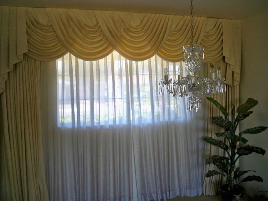
In contrast to the light-obsessed interior designers of the 21st century, the ’90s favored a darker ambiance—and heavy drapery was the perfect way to achieve it.
A few decades ago, it was completely acceptable to drown all of the outside light in obsessive amounts of fabric. Can you imagine?
32
Decorative Border Wallpaper
According to Elle Decor, though many retro wallpaper looks are coming back (like these ’60s-inspired geometric prints), ’90s decorative borders (like the one pictured above) are outdated.
We can’t imagine you’ll see them anywhere besides a doctor’s office or baby nursery in the future. At least, we hope not.
33
Gold Fixtures
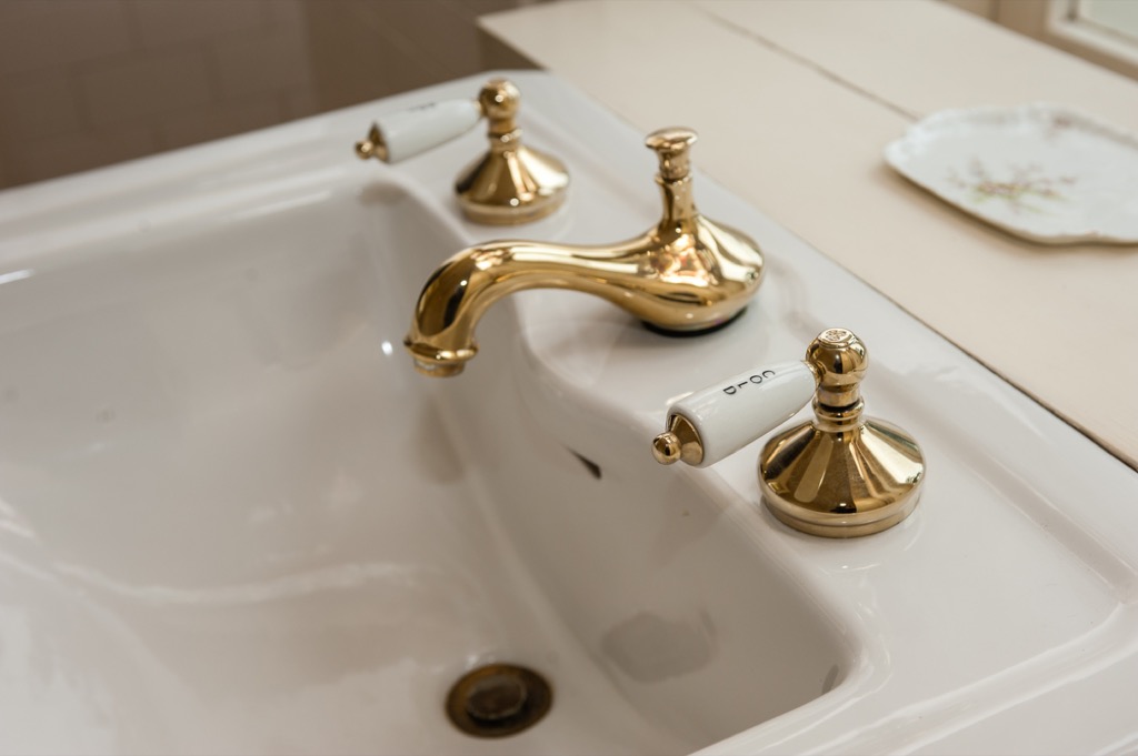
Especially in the latter part of the ’90s, gold fixtures were a staple of every “modern” home, according to Realtor.com.
Decades later, homeowners and designers have learned to steer clear of this finish since they often chip and appear cheap and outdated, especially when compared to the tough look of stainless steel.
34
Shabby Chic Décor
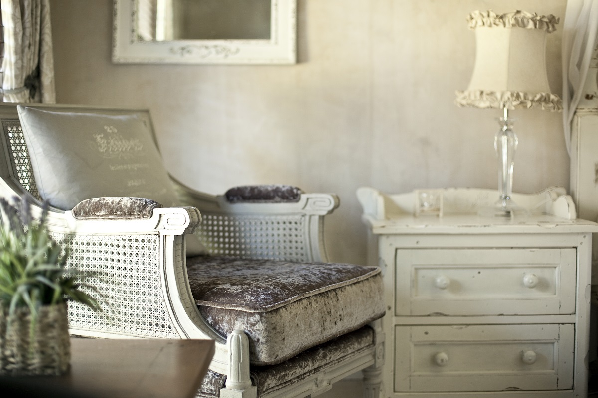
Shabby chic reached peak popularity in the 1990s—and eventually lost steam around the close of the millennium, according to The Chicago Tribune.
The term—first coined by Rachel Ashwell, a British designer who has a series of Shabby Chic books—spawned a design movement. But the shabby chic look is far less luxurious now than it was in the ’90s. Besides, why buy something that looks old when you can just get a vintage, less expensive piece instead?
35
Hunter Green Walls
Hunter green paint is another example of how the dark and gloomy look dominated the 1990s. The color gained a huge following when it was featured in an Eclectic Style Interior Design magazine spread in 1998.
Now, 20 years later, we know dark colors are best for accent walls. “The key is, instead of painting the entire space in a dark color, to just paint one wall (or a single element like a bookcase),” wrote Apartment Therapy’s Nancy Mitchell. “Dark colors read as receding from the viewer, so the accent wall visually enlarges the space (and sets up a nice contrast that can make the rest of the space seem brighter by comparison).”
36
Inflatable Furniture
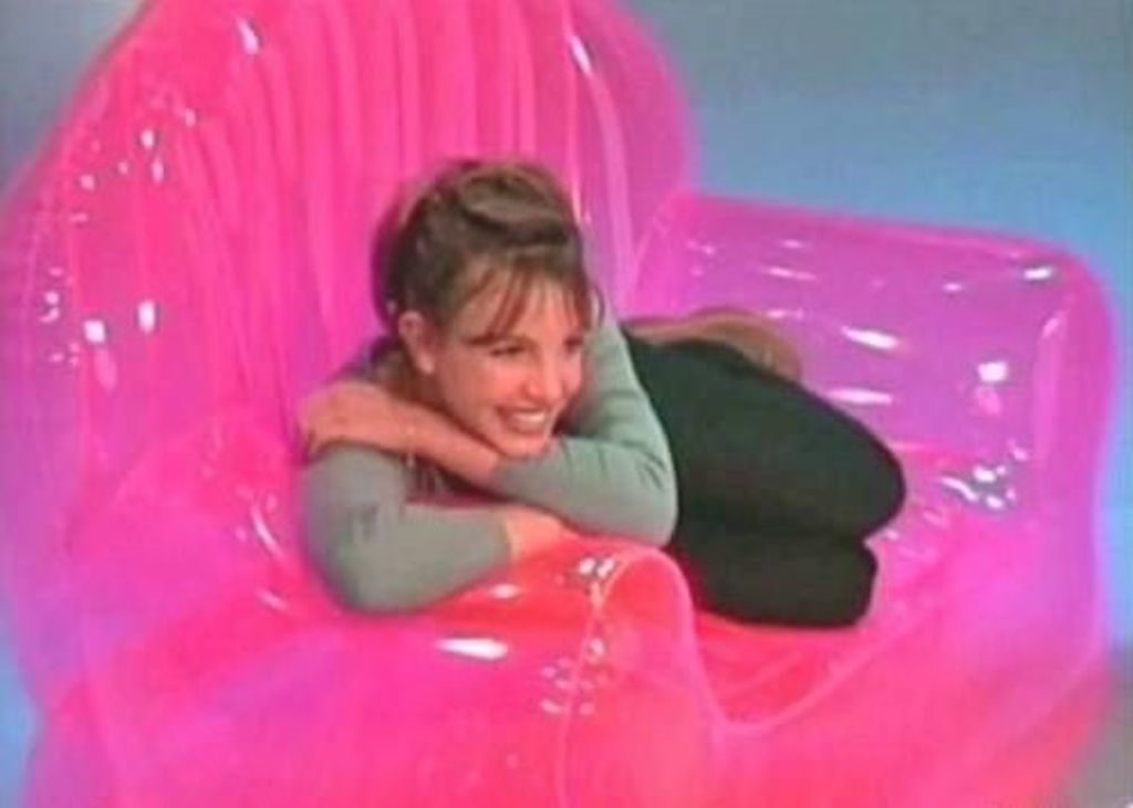
Just like many children of the ’90s, I admittedly participated in the inflatable furniture trend, which was brought back from the 1960s. It was hard to resist. After all, Britney Spears seemed to love her big pink inflatable chair.
Despite being a huge hit in the early 2000s, we can all agree that anything you blow up just looks cheap.
37
Bean Bag Chairs
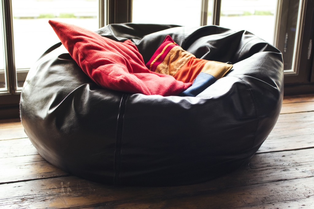
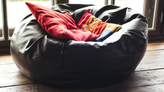
Parents in the early 2000s got a good laugh when their children asked for a bean bag chair. These casual accent pieces rose to prominence initially in the 1970s, and then returned from the dead 30 years later. Considering how difficult they are to get out of, we should put bean bag chairs to rest.
38
Inspirational Wall Quotes
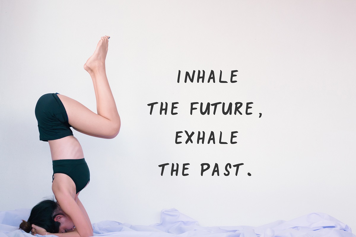
In the past few decades, homeowners have tried to save money and get personal by taking on many DIY home projects. This need for a more “unique” space eventually led people to stencil inspirational quotes on their walls. But while these phrases may be great to live by, they shouldn’t necessarily become décor.
As it turns out, 19 percent of those surveyed by Samsung said this is their least favorite trend in design history.
39
Taxidermy
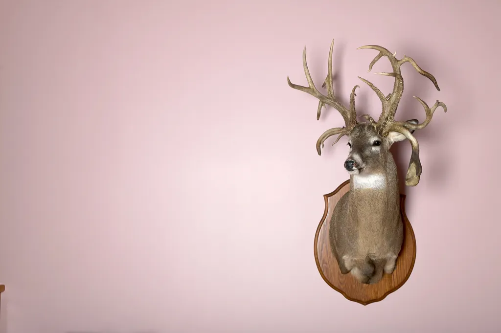
Taxidermy is also overwhelmingly loathed, according to the Samsung survey. It was voted the second-most hated décor trend among those surveyed. That said, this art form—which dates all the way back to the 1600s—has never fully gone away.
As Elle explained: “A new vanguard of young, female and ethically-minded taxidermists have come to the fore, distinguished by their mantra of never killing for the sake of taxidermy and more attracted to taxidermy for the idea of creating something in the Etsy-shop sense.”
40
Nautical Décor
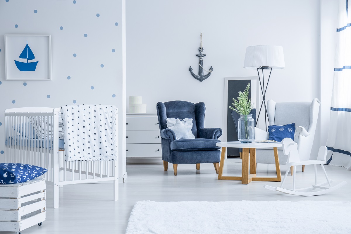
While this trend has been around for decades, its most egregious element is that many have the tendency to go overboard with it. Elle Decor suggests ditching the cheesy and typical nautical accents, like anchors and seashells, and opting instead for objects that reflect a more natural beach escape, like driftwood and coral.
To discover more amazing secrets about living your best life, click here to follow us on Instagram!