These Are the Ugliest Flags on the Planet
Few states love their flags as much as Texans so, donning it on T-shirts, baseball hats, and even their cars. Go anywhere in Canada and you’ll see the iconic red-and-white maple leaf. And the American flag is just about everywhere (despite the fact that U.S. law prohibits using it as attire).
But, just as some countries and communities are represented by truly iconic flags, there are some that are a bit questionable (to put it nicely)—designs so ridiculous, they’re sure to vex even the world’s most ardent vexillologists. Here are the greatest offenders.
1
Tampa, Florida
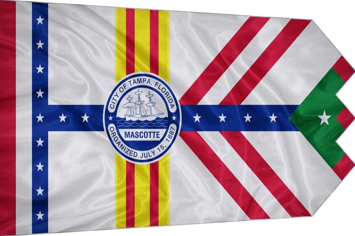
In 1930, the city of Tampa adopted its first flag—based on a mockup not by a graphic designer but by an accountant. (Cue the “Don’t quit your day job” jokes.) According to the Tampa Bay Times, most Tampeños have no clue the city even has a flag, but those who are aware aren’t exactly fans.
“I was proud to carry it because I’m proud to represent our city. But I’m not proud this is the flag that represents our city,” said one city council member, who served as a flag bearer at a recent public event.
2
Illinois State
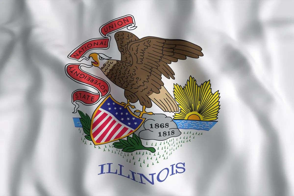
The Illinois state flag has all the makings of a great flag, they’re just not quite right. For instance, why is that eagle severing a banner of the state’s motto? Or is he actually regurgitating the state’s motto? And why are the years in that order—wouldn’t it make more sense to have 1818 (the year Illinois became a state) on top of 1868 (the year this flag was designed)?
What’s even more confusing is that the good people of Illinois have proven capable of designing a worthy flag. Just look at the Illinois centennial commemorative flag, a blue-and-white starred design—and a veritable master class in the use of negative space—that wouldn’t look out of place in a museum. How this state flag remains is beyond us.
3
River Gee County (Liberia)
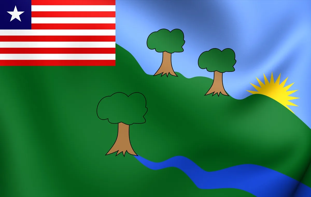
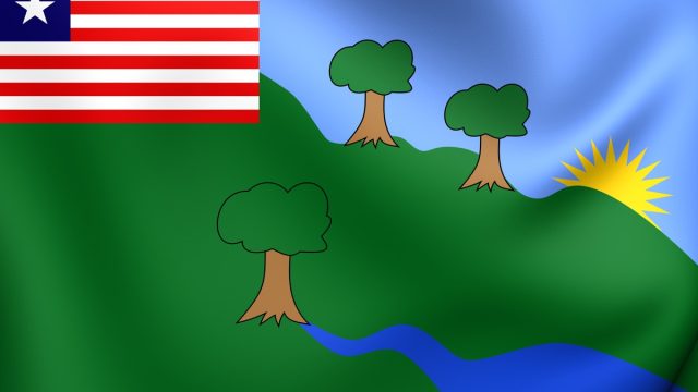
If you’re a U.S. citizen, you’re not allowed to poke fun at the Liberian flag, since it’s essentially a pared down version of the American flag (with one star, rather than 50, and 11 stripes, rather than 13). The flags for each of the 15 counties of Liberia, on the other hand, are totally fair game.
For starters, each county’s flag is just a smaller version of the national one. (Can you imagine if every U.S. state had a haphazardly affixed American flag in the upper lefthand corner?) The art for each is a departure from what you’d think of as “traditional”—all bright primary colors and abstract silhouettes.
But the old flag for River Gee County put a twist on the formula by adding definitive black outlines, and the result looks like something you might find at an elementary school art fair. To the credit of River Gee County officials, the flag has since been redesigned. Now, county buildings fly something that you simply have to see for yourself.
4
Calgary, Alberta

Is this a flag or the pendant of a 1980s-era baseball team? Calgary’s flag features a white cowboy hat (a beloved symbol of the city, which hosts the annual Calgary Stampede and is known for its white hatting ceremonies) and a giant “C” that kind of looks like a horseshoe. It’s off-center and, combined with white bands on the top and bottom, it looks more like something that should be on a vintage sports jersey than flying above city hall.
5
Cyprus

On an all-white backdrop, an orange silhouette of Cypress hovers above a pair of olive branches. And those olive branches aren’t just decorative—they symbolize peace between Greece and Turkey, two nations that infamously warred over claims to the island, dating all the back to the days of the Mycenaean Greeks in the 15th century B.C.E. (Cyprus didn’t become an independent state until 1960.)
As a flat image, sure, the design passes muster. But the moment some bright sunlight illuminates the flag, it becomes less a symbol of unity and more a game of squinting, as you can see in the above photo.
6
Indonesia
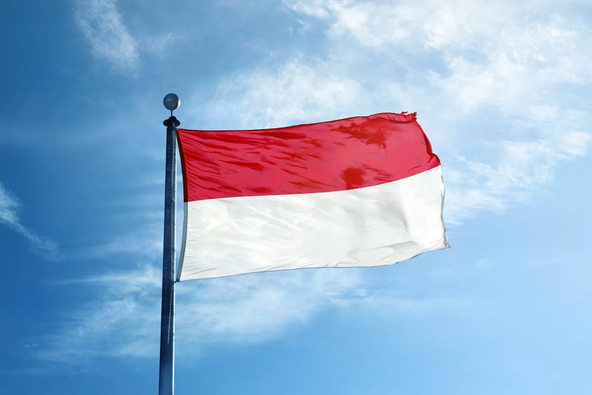
The design of Indonesia’s flag—horizontal split dual color-blocking, with red on top and white on bottom—isn’t bad, per se. It’s just that we’ve seen this flag, which was adopted in 1945, before—many times, in fact. Look at the flag of Monaco (adopted in 1881). Or the flag of Tarija, Bolivia (which has no identifiable adoption date, but is likely ancient, since Tarija was incorporated in the 16th century). Even the flag of Poland (adopted in 1919) is this design but flipped upside down. At least Singapore had the originality to slap a moon and stars on the top half of their flag (adopted in 1959).
7
Turkmenistan
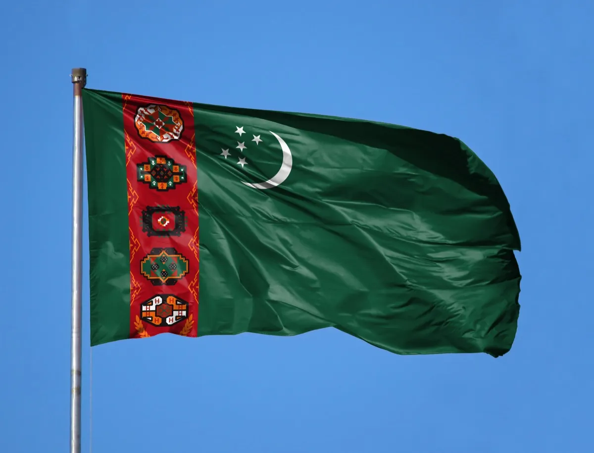
The individual elements of Turkmenistan’s national flag are all lovely: a dark green background, representing the Islamic religion; a white crescent and five stars, representing the nation’s bright future and the five senses, respectively; and a deep red column complete with five intricate patterns, representing each of the country’s five major tribes.
It’s a well-intentioned design, and looks fantastic up close. On a flag, though, the detail is a bit too intricate to be fully appreciated. If you view it from a far distance, it becomes muddied to the point that it looks like a red blur.
8
Central African Republic
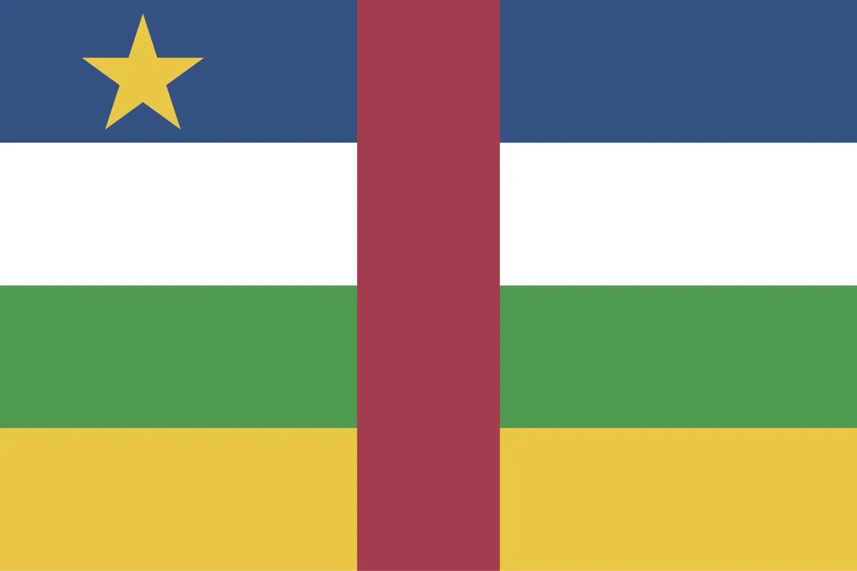
The flag for this country in the center of Africa looks like it was a perfectly fine flag of four complementary colored stripes—dark blue, white, green, and yellow—with a single yellow star in the top left corner balancing the stripe at the bottom. Then there’s that vivid red stripe right down the center, making for a severely overcrowded and unbalanced piece of graphic design.
9
Honorable Mention: Pocatello, Idaho

We’d be remiss to talk about the ugliest flags on the planet without mentioning the flag of Pocatello, Idaho. No, that’s not their flag above. That’s Pocatello’s redone flag, which was unveiled in 2017—but not until a firestorm of press surrounded their old one.
After being dubbed the “Worst City Flag in North America” in a 2015 TED Talk, Pocatello opened up a call for redesigns. (You can see the old flag—in all its Clip Art glory—in this 2018 TEDx Talk detailing the redesign process.) More than 700 entries poured in from all across the globe. The result, as you can see for yourself with the winning entry above, is truly stunning. It’s proof that even the ugliest flag ducklings can blossom into full-fledged banner beauties. And for more design fails, see the 40 Ugliest Interior Design Trends of All Time.
To discover more amazing secrets about living your best life, click here to follow us on Instagram!