20 Common Decorating Tips You Should Always Ignore
Your home should be a sanctuary, a place that provides respite from the chaos of your everyday life. However, for many people—particularly those who adhere to every design rule in the book—many of the design tips reiterated on blogs, TV shows, shelter magazines, and even designers themselves can actually make spaces less comfortable, less functional, and less put-together. Before you waste hours poring over Pinterest or eliminate a chunk of your savings by having a designer reassess your space, familiarize yourself with all the common decorating tips you should definitely ignore. And if you’re ready to upgrade your space, start with these 50 Great Ways to Make Your Home Less Boring.
1
Your home has to have a specific style.
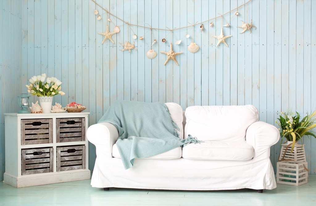
Many people believe that if part of your home is decorated in a certain style, the whole space has to look the same way. However, just because you have a Victorian-inspired living room with crown moldings and intricate archways doesn’t mean your kitchen and bathrooms should necessarily maintain that charming, yet anachronistic, aesthetic.
“It’s pure baloney that your home need to showcase a specific ‘style,'” says interior designer Denise Gianna of New York-based Denise Gianna Designs. “The best style is a mix of what you love, what works best for your lifestyle, and is arranged according to the flow of your life.”
2
Every room needs an accent wall.
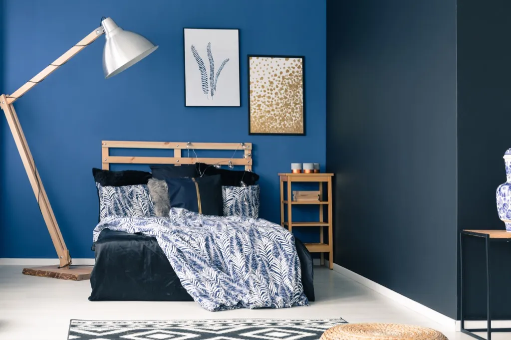
While many design magazines and shows will tell you that every room needs a focal point, like an accent wall, this rule simply doesn’t work in every home. “I love a good highlight wall. But it not necessary or even a good idea for every person or space. Ignore this advice unless you love a color so much you want it represented eight feet high in your home,” says Gianna.
3
You should look to design sites for inspiration.

Though there are countless great design resources online, imagining that your home will look like a shoot from the pages of Architectural Digest just because you’ve thumbed through a few magazines will leave you feeling disappointed in the long run. “They set you up for disappointment and wildly unrealistic expectations of: your budget, your space, your spouse or yourself (for DIYers), and what the process and time frame really is for any size design project,” says Gianna.
4
Built-ins make your home look too old-fashioned.
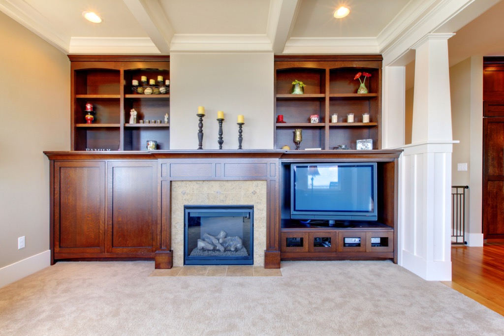
While many people see built-in bookcases and cabinets as outdated uses of space, ditching them for freestanding storage doesn’t actually make your home look more modern. Instead of removing your built-ins, try wallpapering them, adding new molding, or giving them a fresh coat of paint to brighten things up.
5
Accent pillows should adorn every seating space.
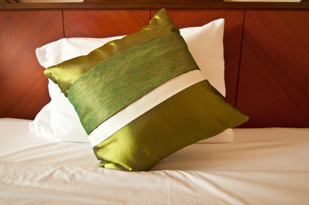
When did we decide that every couch and chair needed a pillow on it? Adding throw pillows to every seating area in your house not only makes them all less functional, it can make an otherwise put-together space look cluttered.
6
Every room needs a mirror.

Though it’s true that mirrors can brighten spaces and make rooms look bigger, the idea that every room needs one isn’t a design principal worth adhering to. Uncovered windows, well-lit rooms, and light-colored paint can all have the same effect.
7
You should always go for smaller furniture.
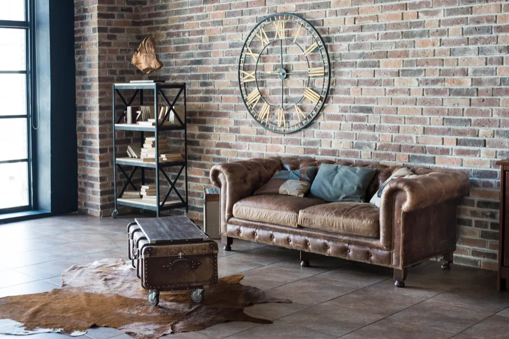
It stands to reason that having large furniture can make a room look smaller, but in fact, the opposite is frequently true. When you have smaller items of furniture, you tend to collect more of them in a single space, making the room look small and cluttered. Instead, opt for just a few large pieces and the space will feel more open in an instant.
8
All-white rooms are always elegant.
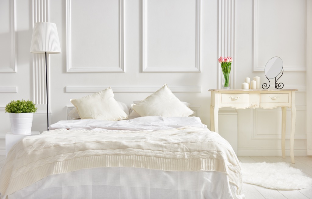
While Scandinavian minimalist design has a time and place, the idea that all-white rooms are always elegant is far from true. In fact, many all-white spaces simply look unfinished or cold, and not as elegantly modern as those who decorate them initially imagine them to be.
9
You should always do what your interior designer says.

Designers may be professionals in their field, but that doesn’t mean their word is gospel. “Most people need a little help with color choice. And that’s fine: ask a professional for their advice before searching and if you are still not sure what to choose, ask them for their professional opinion,” says Gianna. However, “no one gets a vote who isn’t buying the paint or personally living with the color on a daily basis. Period.”
10
Style trumps comfort when it comes to seating.
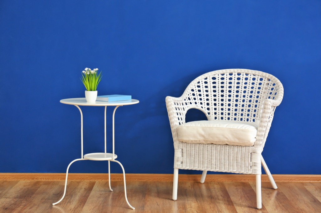
While having an Eames chair or an antique fainting couch in your living room may give it an air of elegance, you shouldn’t allow your aesthetic preferences to trump your comfort. After all, if you’re trying to impress guests with your taste, but don’t even have a place for them to sit comfortably, nobody will remember the décor.
11
Never wallpaper if you can paint.
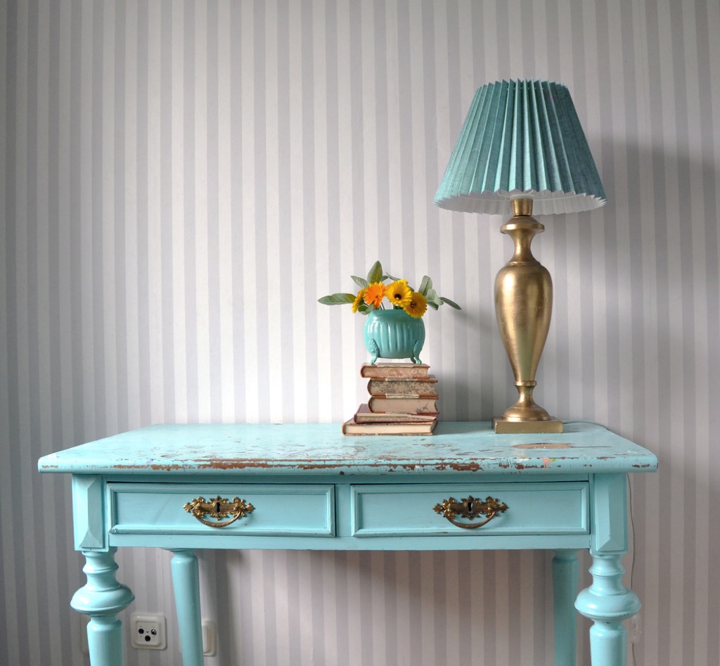
Though painting is undeniably easier than hanging wallpaper, that doesn’t mean you should eschew the latter process entirely. And while some people may equate wallpaper with stodgy, old-fashioned design schemes, there are countless designers making beautiful, modern prints that won’t make your home look like it hasn’t been redecorated in the better part of a century. Better yet, there are plenty of removable wallpapers on the market, making it easy to change your space as you see fit.
12
Carpeting makes spaces look more cohesive.
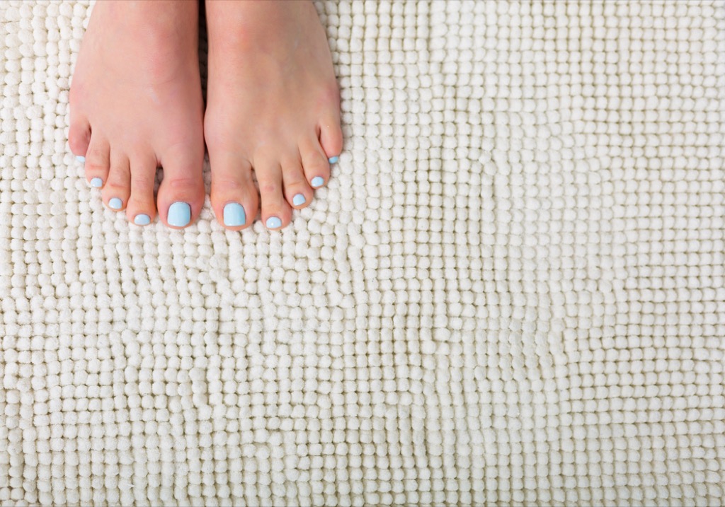
While carpeting can certainly turn a hardwood floor into a softer surface, don’t rely on it to make your home look more elegant. After years of wear and tear, carpeting gets dingy and unattractive, and there’s been a significant shift in favor of hardwood floors in recent years, anyway.
13
Furniture should be pushed against the walls whenever possible.
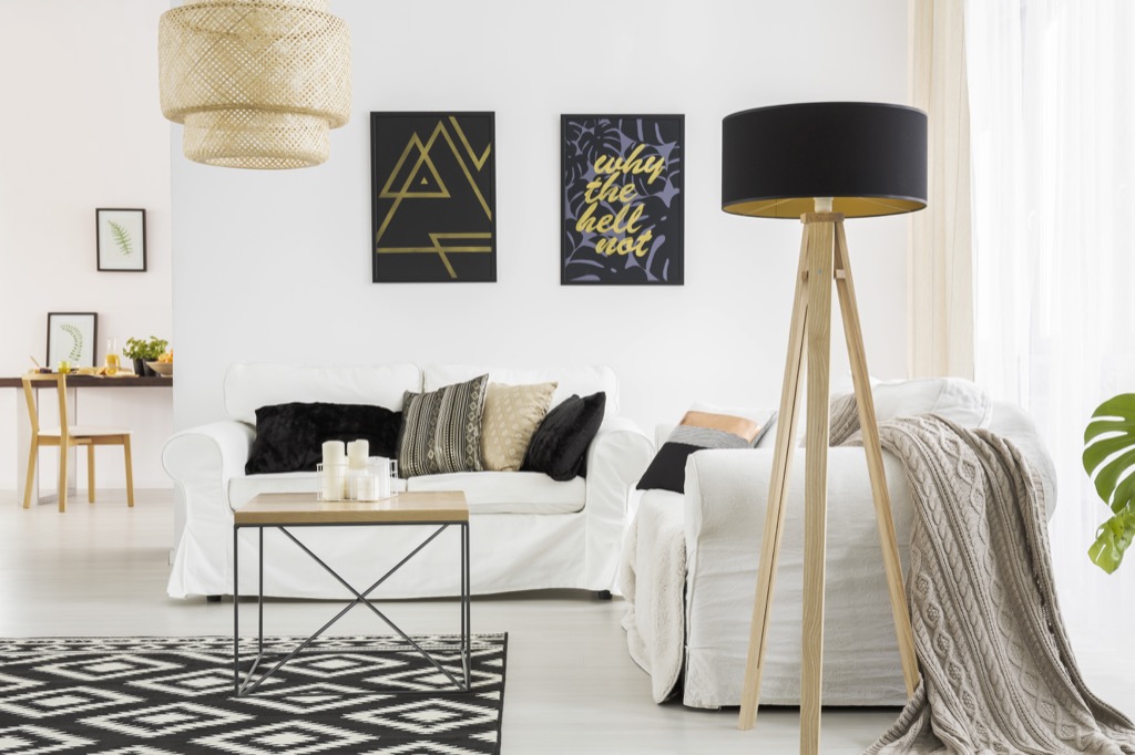
It may seem as though keeping your furniture against the walls of a room would make it seem bigger by enlarging the center space, the opposite is often true. To make your home look more spacious, move your furniture a few inches to a foot away from your walls to create the illusion of greater depth in the room.
14
Open shelving refreshes a dated kitchen.
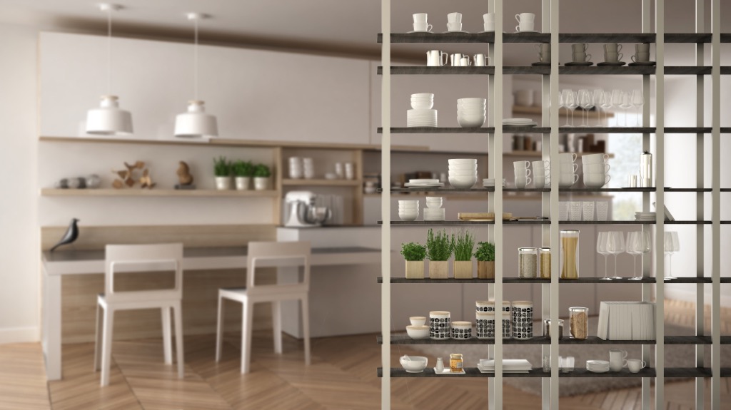
You may have seen pages full of open shelving in your favorite design magazine, but in real life, open shelves are more appealing in theory than they are in practice. After all, while magazine spreads may show shelves topped only with small groups of perfectly-matching plates and mugs, in real life, you likely have an assortment of mismatched dishes, cups, and utensils that frankly look better behind closed doors.
15
You should update your home according to new trends.
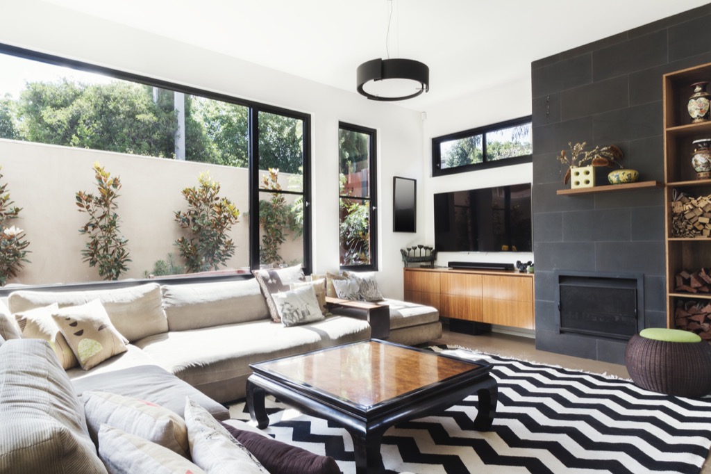
While design magazines make it seem as though everybody updates their home according to new trends, doing so in real life is rarely a good idea. “[Ignore] all trends, ‘colors of the year,’ and advice on what’s in and what’s out that doesn’t feel right to you or result in making you happy with your space,” says Gianna. “It’s all fleeting and results in a tremendous amount of revised and discarded stuff. Good design is livable, comfortable, and mutable.”
16
All floor plans need to be opened up.
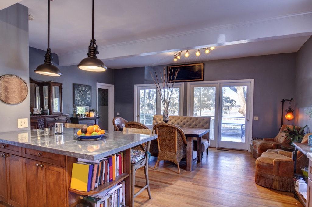
Are open floor plans convenient and attractive in some cases? Absolutely. However, not every home lends itself to an open design scheme, and in fact, the closed kitchen is having a resurgence, so think twice before wielding that sledgehammer.
17
Traditional window treatments look more elegant.

Your grandmother may have insisted on full valance, curtain, and tie-back sets, but if you’re going for a more modern look, you might want to ditch the traditional window treatments entirely. To get more light into your home and modernize your space, sheer, floor-length curtain panels will serve you better in the long run.
18
Smaller furniture items, like nightstands, need to match.
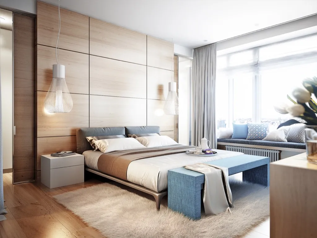
Though you may think of pieces like nightstands as a pair, if you want to make your design scheme more modern or personal, try opting for two distinct pieces, suggests Gianna. Not only will this give your rooms an eclectic feel, it will break up some of the monotony brought on by overly-matching homes.
19
Every wall needs something on it.
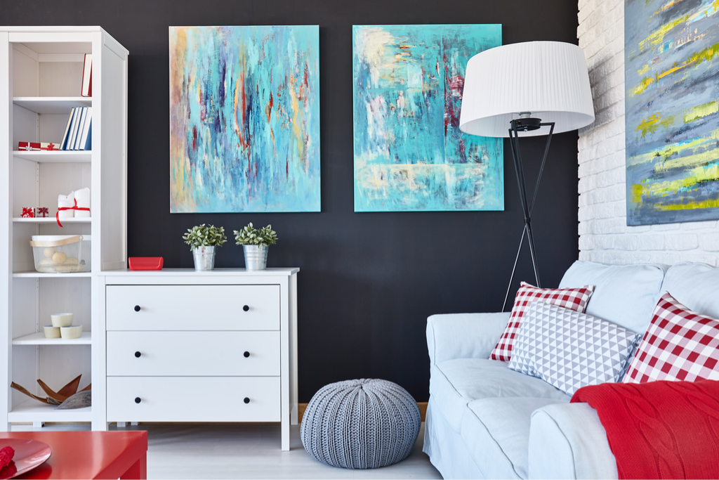
While some people genuinely believe that a home is not fully decorated until each wall bears its own piece of décor, adhering to this supposed rule only stands to make your home look cluttered. Having just a few items hung in a single room can make it appear more spacious and less chaotic, while leaving less damage for you to repair when you redecorate, as well.
20
There are specific design rules you have to adhere to.
The biggest mistake people make when decorating their homes? Believing that there are specific design rules that everyone should follow. “I’m not only a design professional in real life, but I also teach interior design so take it from me: there are no hard and fast rules—at least not for people who are interested in comfortable, livable, design that works for them,” says Gianna. “Trust your gut and always consult a professional who is not married to ‘rules.'”