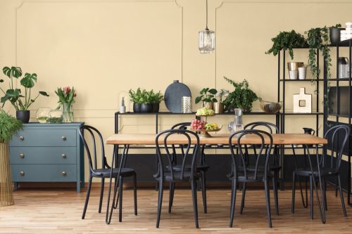
I’m an Interior Designer and Here’s How I’d Use the 2024 “Colors of the Year”
Choosing a color for your home can be overwhelming, with endless possibilities to consider whenever you walk into Home Depot or Lowe’s. To help narrow your choices, every year, top paint companies weigh in on what they think will be the color to rule them all, drawing inspiration from different sectors like art and fashion. Some of the 2024 “Colors of the Year” have already been released, providing fresh ideas if you’re looking to update the walls in your home in the coming months.
But while you may be interested in revamping your paint game, you might not be sure where to apply each of the selections. That’s why we asked Stephanie Duncan, senior home designer for Opendoor, to tell us where she’d use each of these shades.
“According to Opendoor’s 2023 Home Decor Report, subdued color palettes continue to be a priority for homeowners. After all, a neutral canvas makes it easier for potential buyers to envision their lives in the space,” Duncan tells Best Life. “These preferences show themselves in the common colors selected by paint companies for the 2024 Color(s) of the Year. Different shades of blue and green were the top picks, likely because the two can be used as both variations of neutrals as well as bolder accents, giving owners the best of both worlds.”
Read on to find out where Duncan suggests applying 11 “Colors of the Year” in your home.
RELATED: “Moody” Paint Colors Can Increase Your Home’s Value, New Study Says.
1
Behr: Cracked Pepper
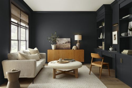
Behr’s selection for 2024 is Cracked Pepper, a bold shade in the black color family. It’s a great choice for your home if you’re into an edgier aesthetic, Duncan says, noting that you could use this “soft black hue” on a bathroom vanity.
“Pair it with gold hardware for an upscale look,” she recommends.
Not doing a bathroom reno? You can also use Cracked Pepper in more common spaces, like the dining room or living room.
“I can also see it used in a dining room to create an elegant and intimate space,” Duncan says. “It can provide a dramatic backdrop for your dining table and decor, allowing your furnishings and tableware to stand out. This bold color can also serve as an excellent option for painting a brick fireplace, where it can create a striking and modern focal point in your living space.”
2
Valspar: Renew Blue
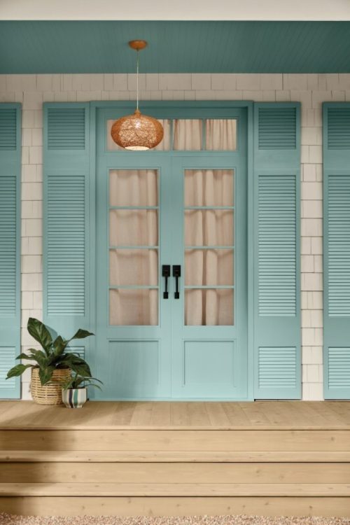
For Valspar, the Color of the Year is a bit more mellow. Their pick, Renew Blue, is described as a “nourishing, green-influenced blue that creates a sense of peace wherever you place it.” As for why they chose the subdued blue, Valspar states that it can help us few less overwhelmed by creating a more peaceful atmosphere.
According to Duncan, this color choice would be a great fit outside of your home.
“For this soothing blue with green undertones, I’d use it as a front door color—or even as an exterior color—for a touch of personality,” she says.
RELATED: The 10 Worst Paint Colors for Your Home, Experts Say.
3
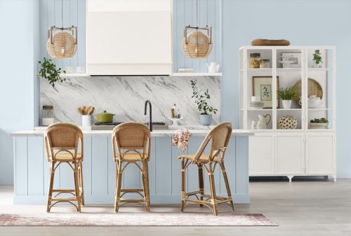
C2 Paint: Thermal
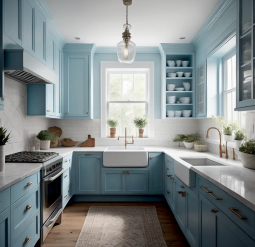
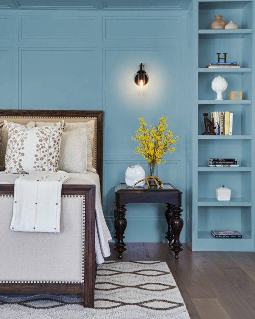
C2 Paint also chose a hue in the blue family: Thermal. The color is described as a “fluid, refreshing blue that’s both invigorating and calming.”
In Duncan’s opinion, this shade is pretty versatile.
“This pale blue works great as a neutral wall color in a bedroom, kitchen, guest bedroom, nursery, or kids’ room,” she says.
4
Benjamin Moore: Blue Nova 825
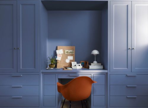
Benjamin Moore went with a bolder choice in the form of Blue Nova 825. According to the company’s website, the shade is an “alluring mid-tone that features an enchanting duality, capturing the spotlight with endlessly classic appeal.”
Per Duncan’s recommendations, try out Blue Nova 825 in the kitchen or on cabinets.
“For this eclectic color—somewhere at the intersection of blue and violet—I’d incorporate it into a kitchen,” she says. “Jewel tones like this one work beautifully as painted cabinets.”
RELATED: 6 Color Updates to Make Your Home Feel More Expensive, Experts Say.
5
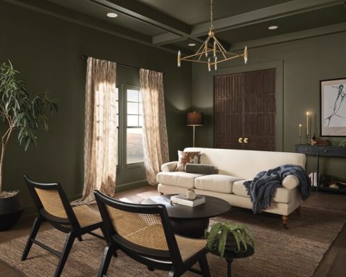
Dutch Boy Paints: Ironside
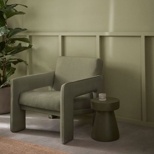
According to Dutch Boy Paints, the most popular color for 2024 is in the green family. The company describes Ironside as “the perfect backdrop for showcasing furniture, art and accessories.”
In Duncan’s opinion, Ironside would work well in one of your home’s common areas.
“Sage green has been a trendy take on neutrals for a few years now, and this deep olive is a new evolution of that trend,” she says. “I can see it as a kitchen or living room main or accent wall color for a bold statement.”
6
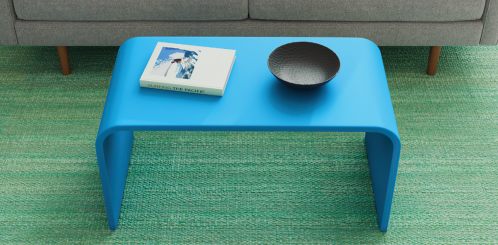
Krylon: Bluebird
We’re back to the blues with Krylon’s choice for 2024: Bluebird. The bright shade “both uplifts and comforts,” according to Krylon, incorporating the colors of both oceans and lakes to foster a calm atmosphere.
Duncan cites Bluebird as a bolder option, which would work for your front door or as an accent piece of furniture in a child’s room or nursery.
RELATED: 3 Things That Make Your Home Look Tacky, Interior Designer Warns.
7
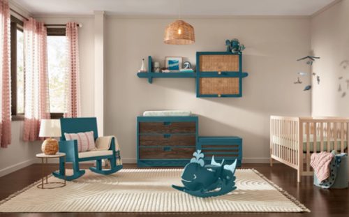
Minwax: Bay Blue
Also incorporating natural elements is Bay Blue, Minwax’s selection for Color of the Year. It’s a blue-green that “expands our connection to water and wellness,” the company says.
“This playful blue color immediately makes me think of accent pieces indoors and out—and it’s so versatile,” Duncan says. “I can see it as painted wooden shelving in a nursery room, a front door color, painted kitchen cabinets, and even a bathroom vanity.”
8
Sherwin Williams: Upward
Sherwin Williams’ choice, Upward, is more subdued than both Bluebird and Bay Blue, incorporating silver and gray undertones.
The paint company describes Upward as a “breezy, blissful blue,” which like so many other colors on this list, is intended to have a calming effect to clear the mind.
Because it’s lighter and more relaxed, it would work in different parts of the home, but Duncan suggests starting in the kitchen.
“For this coastal-inspired denim blue, I’d first use it on kitchen cabinets, or as an accent color on an island in a coastal home,” she says. “It’d also work great as a front door color—or even as an exterior color paired with white trims—for a touch of personality.”
RELATED: I’m a Property Expert and These Are the 5 Things That Devalue Your Home.
9
Glidden: Limitless
Glidden stands out from the crowd with Limitless, which is a pale neutral that’s “anything but yellow.” The company points out that gray has dominated the decor space as the go-to neutral, but Limitless offers a welcome change as a warmer hue. According to Duncan, this warmth can also put your guests at ease.
“This honey-beige color is bright and cheerful, a great choice for a front door that makes guests feel welcome and right at home,” she says.
10
Dunn-Edwards: Skipping Stones
Water-themed hues really are all the rage, and Dunn-Edwards’ choice, Skipping Stones, is in line with this theme as well.
It’s a “serene and steely blue with hints of green and gray” that’s “meditative and energizing like the sea,” per Dunn-Edwards’ website.
“For this blue shade with hints of green and gray, I’d use it as an accent wall color in a space that calls for rest and/or relaxation,” Duncan says. “A living room or sitting room can come alive with a bright splash of color like this one.”
11
Graham & Brown: Viridis
Rounding out this list is Graham & Brown’s for Color of the Year. According to the company’s website, Viridis is a “muted green color” that embodies the “fertile and green hills around us.”
Graham & Brown notes that it’s great in entertaining spaces and entrance areas—and Duncan has similar thoughts.
“This muted green would work perfectly as an accent wall in a living room,” she says. “I can also see it used for kitchen base cabinets with white uppers and gold hardware.”
For more home advice delivered straight to your inbox, sign up for our daily newsletter.
