23 Terrible Home Design Mistakes That Shrink Your Space
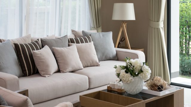
Whether you’re living in an apartment or house, virtually everyone wishes they could make their space look bigger. Unfortunately, in attempting to stay abreast of current home design trends, many people inadvertently make space-shrinking design mistakes in the process. However, it’s not just loading rooms with oversized furniture that can make your home look smaller. If you’re eager to maximize your space and keep your home looking stylish, here are the mistakes top interior designers want you to avoid. And for more interior errors to sidestep, check out these 23 Bad Home Design Choices That Cause Damage.
1
Pushing furniture against the wall
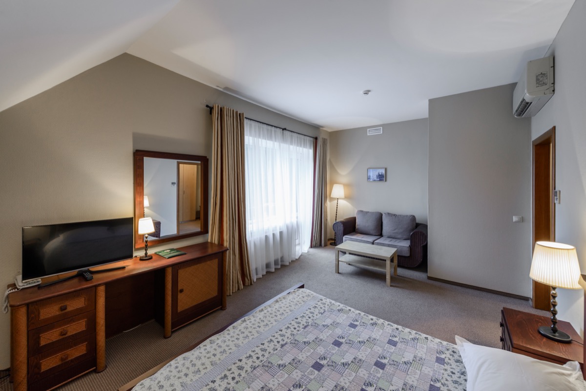
While it may seem like pushing your furniture up against your walls would create more open space in the center of a room—thus making it look larger—it can actually visually shrink your space.
To avoid creating the illusion of a Lilliputian living room, interior designer Mollee Johnson, owner of Style 1519, recommends moving furniture two to three inches away from the wall to create a shadow. “This gives the illusion of depth and makes the room feel larger,” she explains. And if you want to make your home appear more spacious, discover these 30 Home Design Tricks That Will Make Any Room Look So Much Bigger.
2
Painting the whole room a dark color
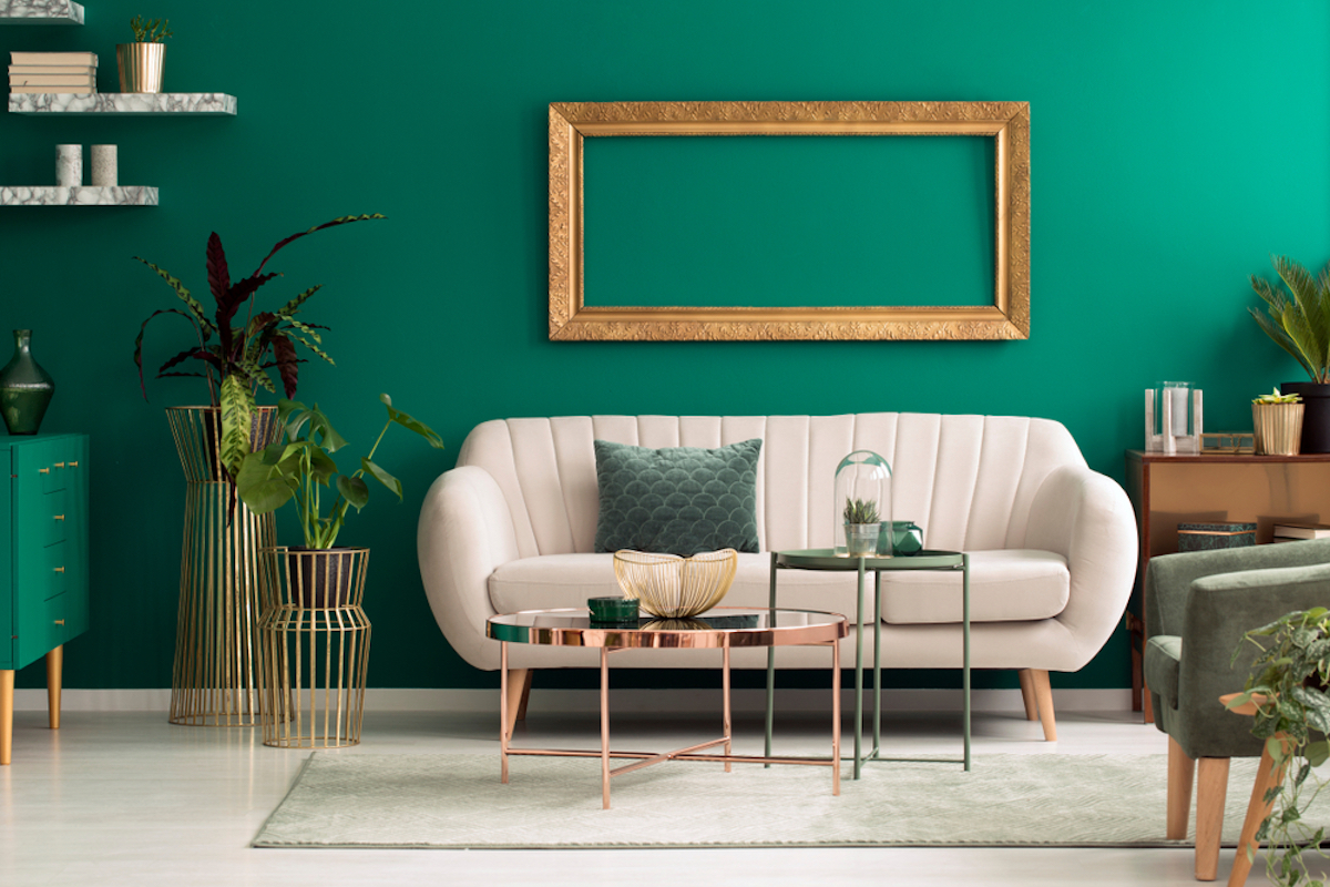
Moody blues, grays, and dark greens may give a room character, but you’ll want to avoid using those deep hues on every wall. “Painting the entire room a dark color can close [it] in quickly,” says Johnson. If you want to maximize your space, Johnson recommends painting only two walls opposite one another in dark colors, which will “visually push the walls out, making the room feel bigger than it is.”
3
Filling every area of a room with furniture
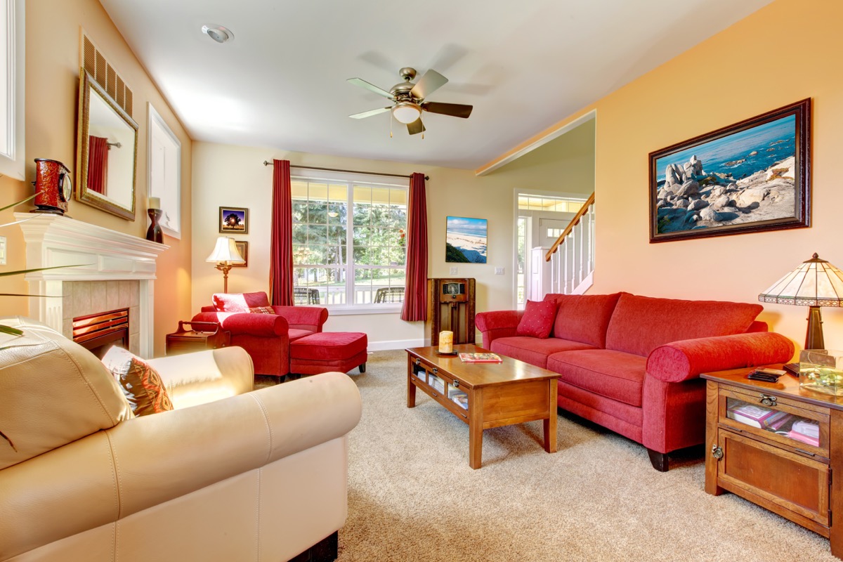
Want to make your home look larger? Try compiling vignettes in your space instead of filling rooms to the brim with furniture.
“Spreading all of the furniture out in a room gives the eye no place to rest and can make even a decent size room feel small and cluttered,” explains Johnson. If you want to rectify the mistake, Johnson suggests grouping furniture on a rug to create a space for conversation.
4
Using high-contrast wall and trim colors
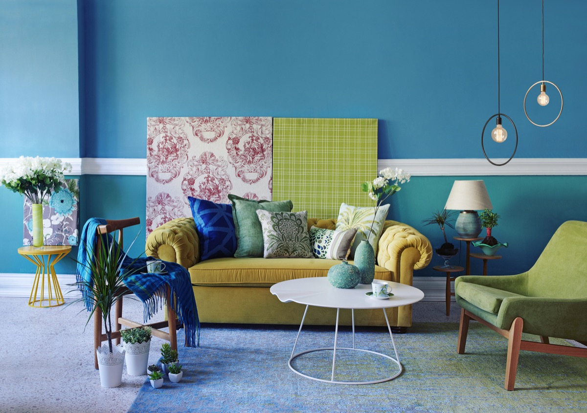
A dark wall with a light trim may look good, but it can create “a chopped up or disjointed feeling” that shrinks your space, says designer Tina Huffman with Greenhouse Studio. To expand your space visually, Huffman recommends having only a medium to low contrast between your wall color and trim. And if you’re eager to upgrade your space, start with these 50 Elegant Home Design Ideas From Interior Design Experts.
5
Using bright colors on your wall
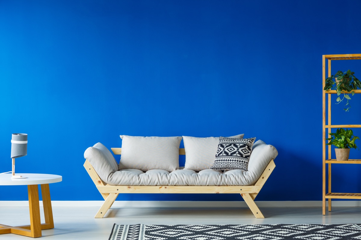
That fluorescent hue on your walls may brighten up your space, but it’s shrinking it at the same time.
“Paint that’s too bright and saturated can make a room feel overwhelming and like the walls are closing in,” says Huffman. If you want to make your space less bland, she recommends using pops of color in the form of pillows and accessories instead.
6
Layering rugs
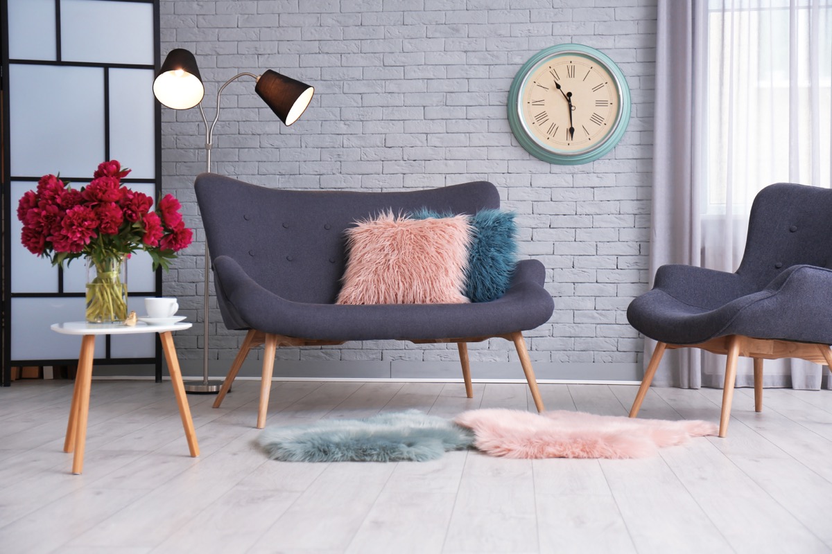
The more small rugs you have in a single space, the smaller it’s likely to seem. To make your home appear larger, “Create a clean frame for your smaller room by placing one rug so that it’s six to 18 inches under the front legs of the sofa and chairs,” suggests Huffman.
7
Painting your walls white
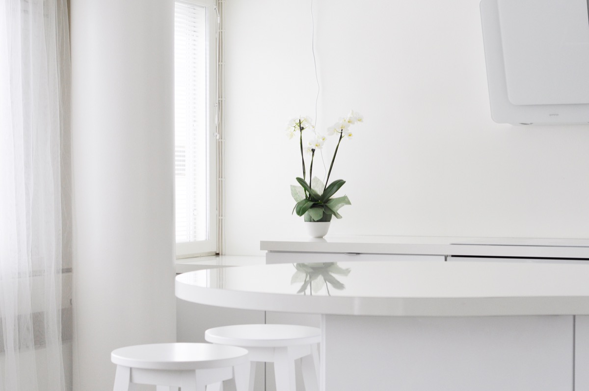
While lighter colors tend to make spaces feel larger than their darker counterparts, going all-white in a room can actually make it look smaller.
“Color on walls draws your eye to the whole space,” explains Marie Graham, founder and owner of interior design and staging company The Refreshed Home. Graham notes that having contrasting furniture in similar hues to your wall color can help “reduce visual bulk.” Want to take your own home into the modern age? Try the 20 Best New Home Design Trends of 2020, According to Interior Designers.
8
Not hanging any art
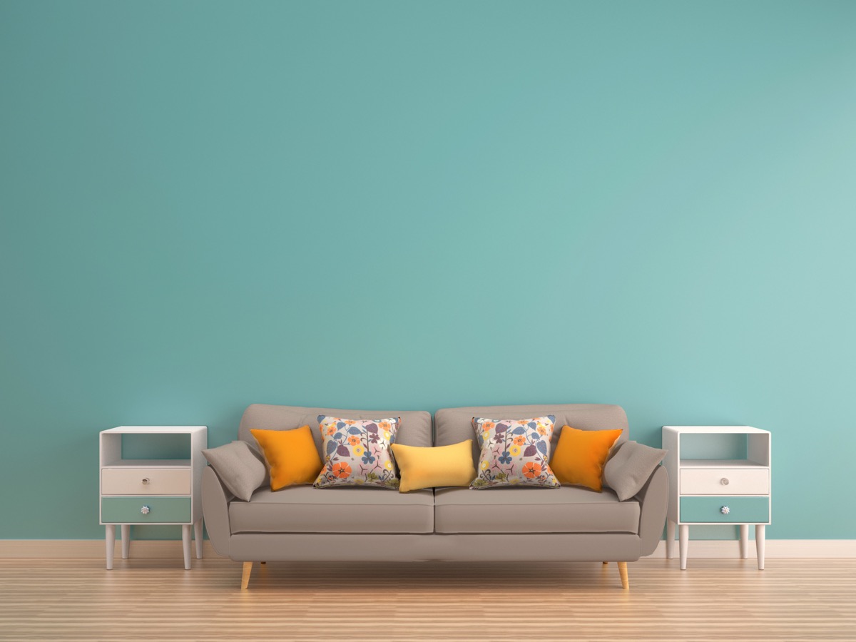
Visual clutter doesn’t make your space look bigger, but blank walls can actually have a similar space-minimizing effect.
“Art draws the eye up, and to the whole space, better balancing the room” by reducing the visual contrast between the furniture and walls, explains Graham.
9
Leaving windows uncovered
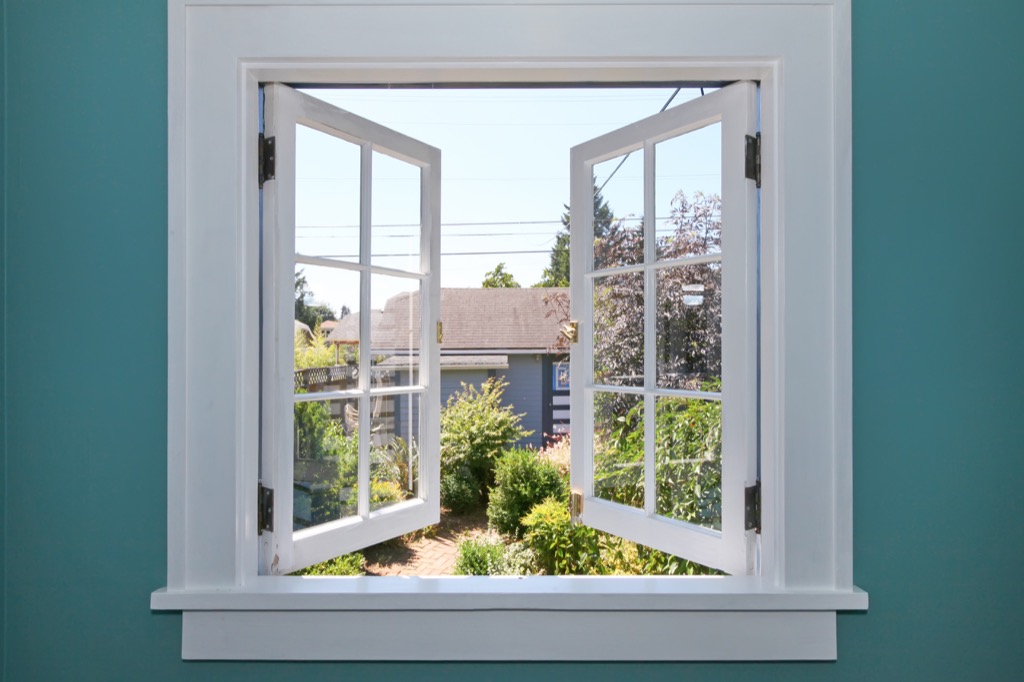
Keeping your windows uncovered may maximize your views, but it’s diminishing how large your space seems in the process.
“Fabric framing—not covering—the windows makes the space and the windows feel bigger,” explains Graham.
10
Hanging large ceiling fans
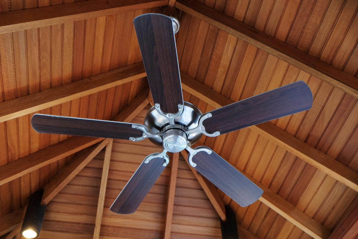
Keeping your home cool and making your space look larger don’t have to be mutually exclusive.
“[Ceiling fans] skew the room tremendously and create shadows no matter where you are,” says Graham, who recommends a white fan or low-profile task lighting instead.
11
Relying on track lighting
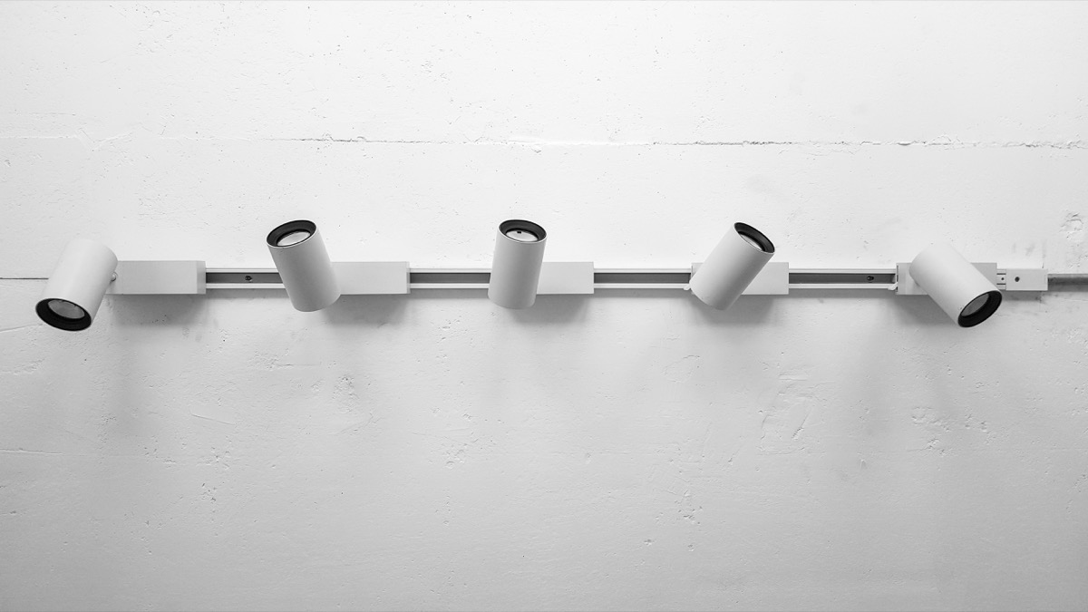
Track lighting isn’t just outdated—it’s also shrinking your space.
“It creates hot spots, shadows, dark corners, and little usable light,” says Graham, who notes that low lighting in general can make a space feel smaller.
12
Using only floor lamps
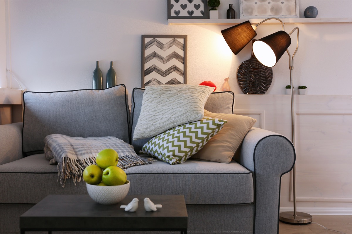
Floor lamps alone may not be enough to brighten up your space—and they could be minimizing its visual real estate, too. “Insufficient or badly placed [floor lamps] create an imbalance,” says Graham, who notes that while these may light your ceiling brightly, they offer little light to the rest of the room, making it look small and dark.
13
Adding too many patterned items
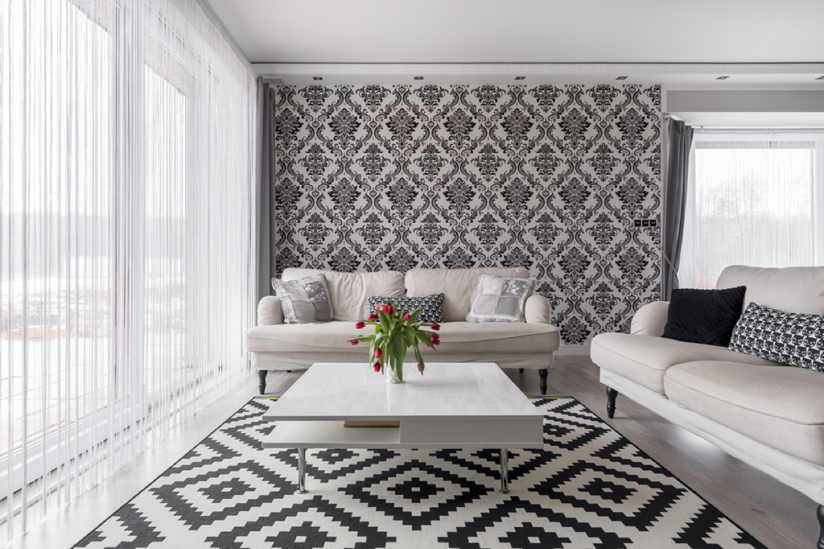
If you want to make your space look larger, it’s time to pare down your patterns.
“The busier the pattern, the smaller the space will feel,” says Graham. To avoid this mistake, Graham recommends opting for mainly solid walls and textiles, using patterned pieces like pillows as accents instead.
14
Putting furniture in front of windows
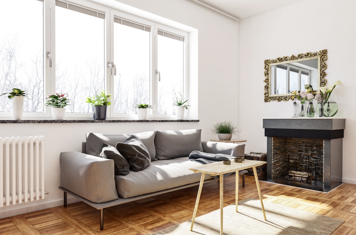
Putting furniture in front of your windows may seem like an effective way to limit clutter in the center of your room, but it’s also shrinking your space.
“This cuts off both light and depth,” says Beverly Solomon, creative director of Beverly Solomon Design. To avoid this critical error, “You should attempt to harmonize your indoor décor with your views.”
15
Breaking up sight lines
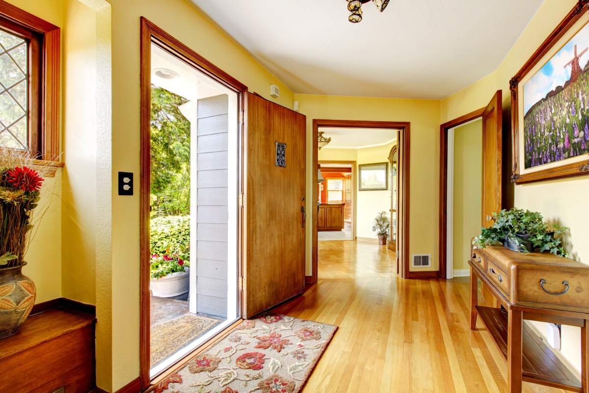
One of the biggest mistakes people make when decorating their home?
“Not creating the longest lines of sight from entry to the far end” of a space, says Solomon. To avoid breaking up long lines of sight and inadvertently shrinking your space, limit the amount of furniture you keep in entryways and avoid placing furniture in the dead center of larger rooms.
16
Putting too many objects in a single room
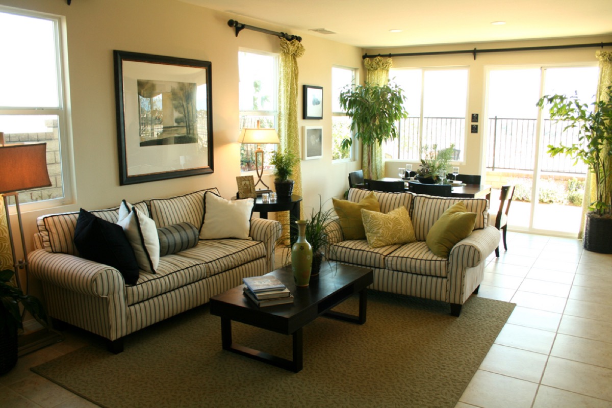
Want to make your house look bigger? It’s time to tackle that clutter. “Filling a room with too much stuff can make a room look smaller,” says Solomon. However, it’s not just mess that can shrink your space—cluttering a room with too much furniture can have the same effect.
17
Hanging oversized art
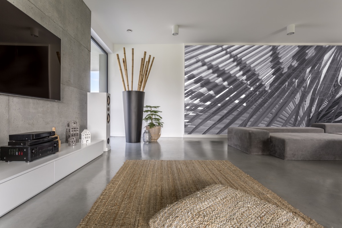
If you want to avoid shrinking your space, think small when it comes to your wall accessories.
“Having art and décor that is too big for the room or wall” can immediately make any space look smaller, says Solomon. Instead, try to consider the scale of your walls and leave some empty space around anything you choose to hang.
18
Relying on dark colors
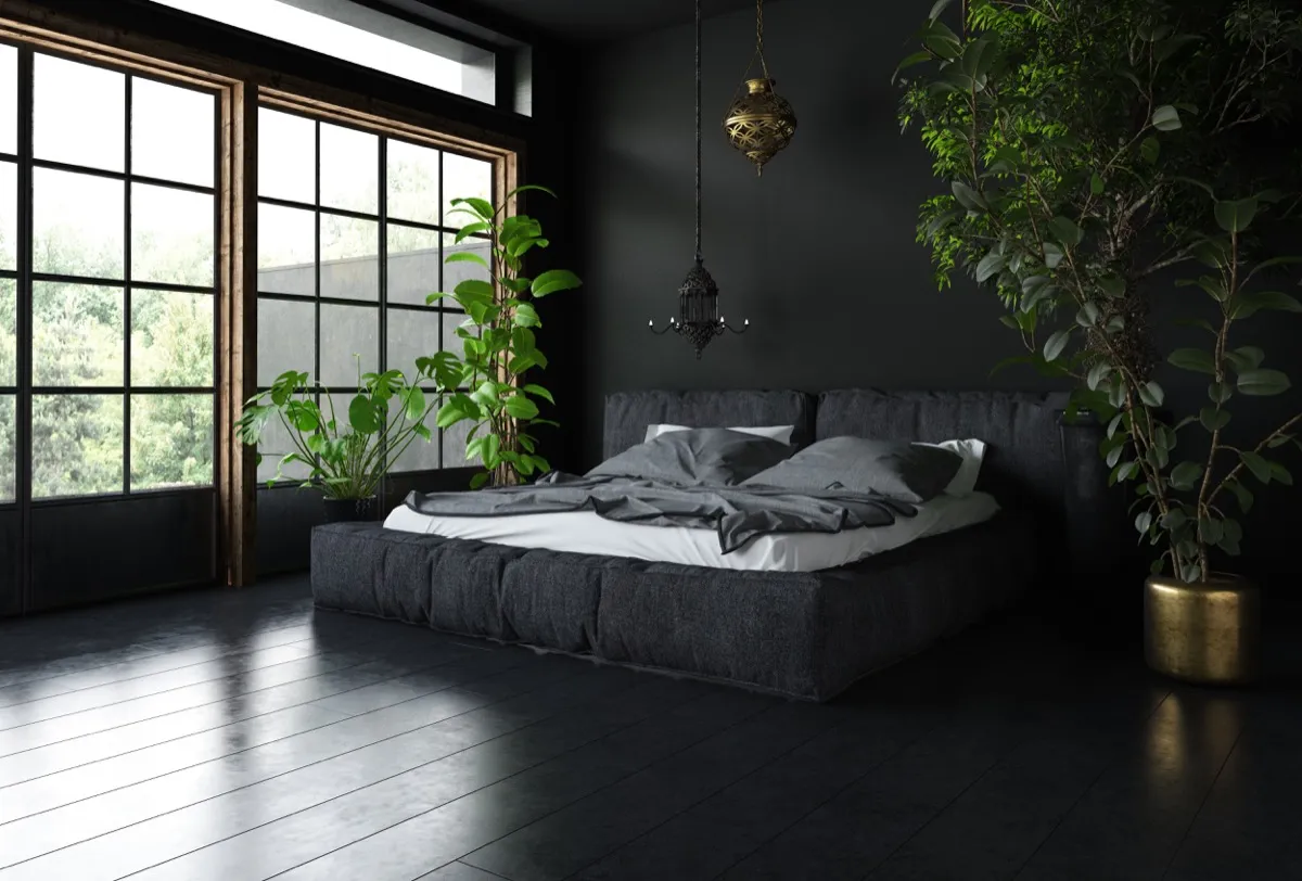
Darker hues may be more forgiving when it comes to cleaning, but they’re not doing your space any favors in terms of size.
“Using dark furniture, flooring, and paint can make the room look smaller,” explains Solomon.
19
Putting pieces of furniture right against each other
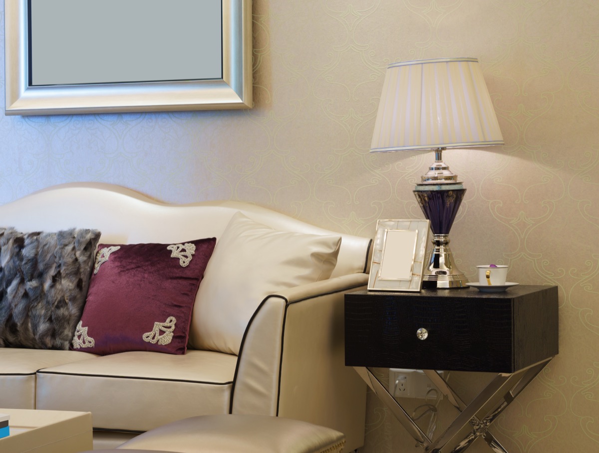
That side table pressed against your sofa may be small, but it’s still capable of seriously minimizing your home’s visual footprint.
“Allow for some air between the furniture to help with an easy flow and look,” says Kalina Todorova, head interior decoration stylist for BoConcept. If you can’t space out your existing furniture, Todorova recommends reconsidering what you keep in a given space and nixing an item or two.
20
Setting out too many tchotchkes
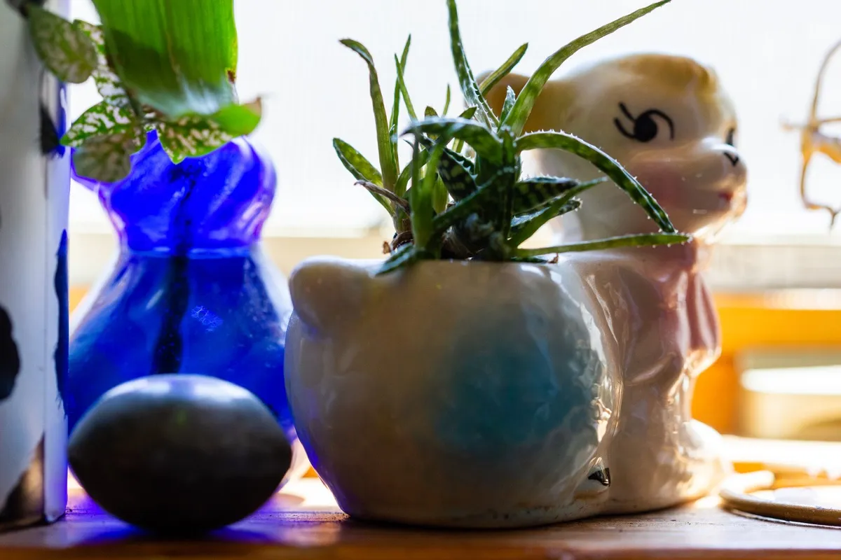
Just because you’re proud of your collections doesn’t mean they should occupy every surface in your home.
In addition to reducing the number of items you have on display, “Placing the things that you don’t need or use every day in enclosed cabinets… is a good way to keep the room well-organized and decluttered” while maximizing visual space, says Todorova.
21
Avoiding reflective surfaces
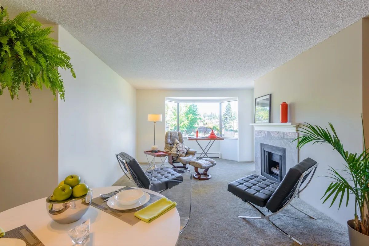
While the era of entirely mirrored walls and furniture has come and gone, going entirely matte with your furniture and paint can seriously shrink your space.
“Mirrors and reflective surfaces can create the illusion of depth thus making a room feel larger,” says Todorova. If you’re not keen on adding too many mirrors to a room, Todorova also says that small tables with reflective surfaces can have a similar space-enlarging effect.
22
Installing mismatched flooring
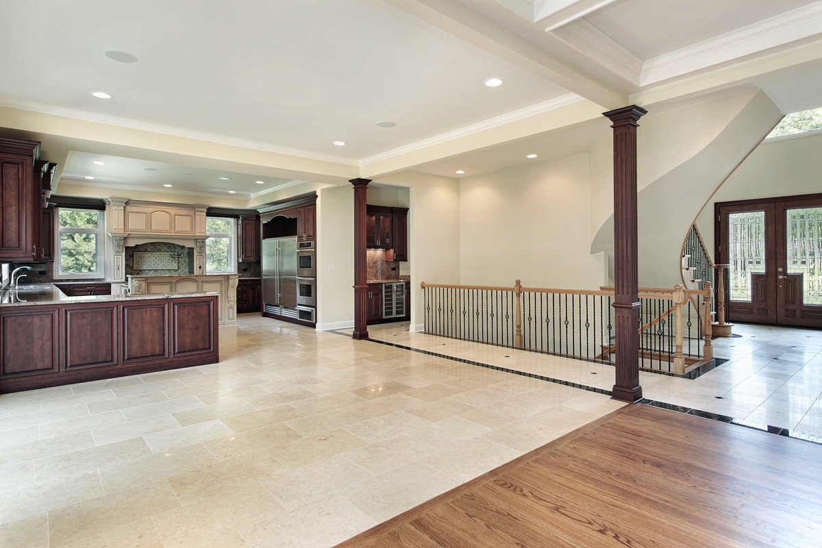
If you’re wondering why your space looks small, it could be your choice to install two different types of flooring in adjacent rooms.
“Having seamless floor transitions from one room to another can make your space look more visually expansive,” explains designer Sarah Barnard, WELL AP + LEED AP.
23
Using bulky storage
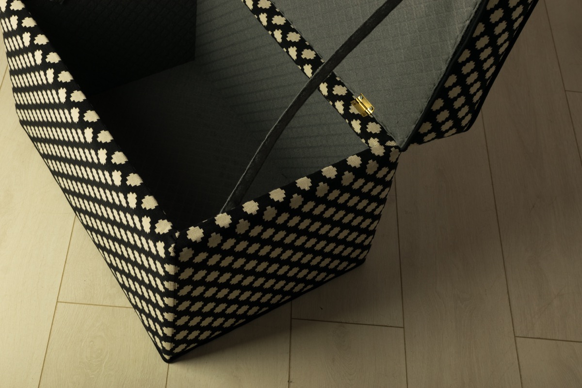
While minimizing visual clutter can help make your space look larger, that’s not the case if your storage solutions are just adding to the problem.
“Relying on organizational units or storage boxes that you won’t intuitively use will often add clutter instead of minimizing it,” explains Barnard.